Naam Agency. 2019

As digital creative director, I have spent the last 12 years at Naam Agency designing and strategizing all of our digital marketing efforts, including our website.

Read more+

Every two years, I completely redesign our website, and in 2019 I created this version. One of the things I wanted to help stand out was the homepage hero by showing off our mobile design skills.

Additionally, my objective was to visualize our switch in services towards (web)app design within the services and case studies pages.

Introduction
Services
UX/UI Design
Prototyping
Webflow Development
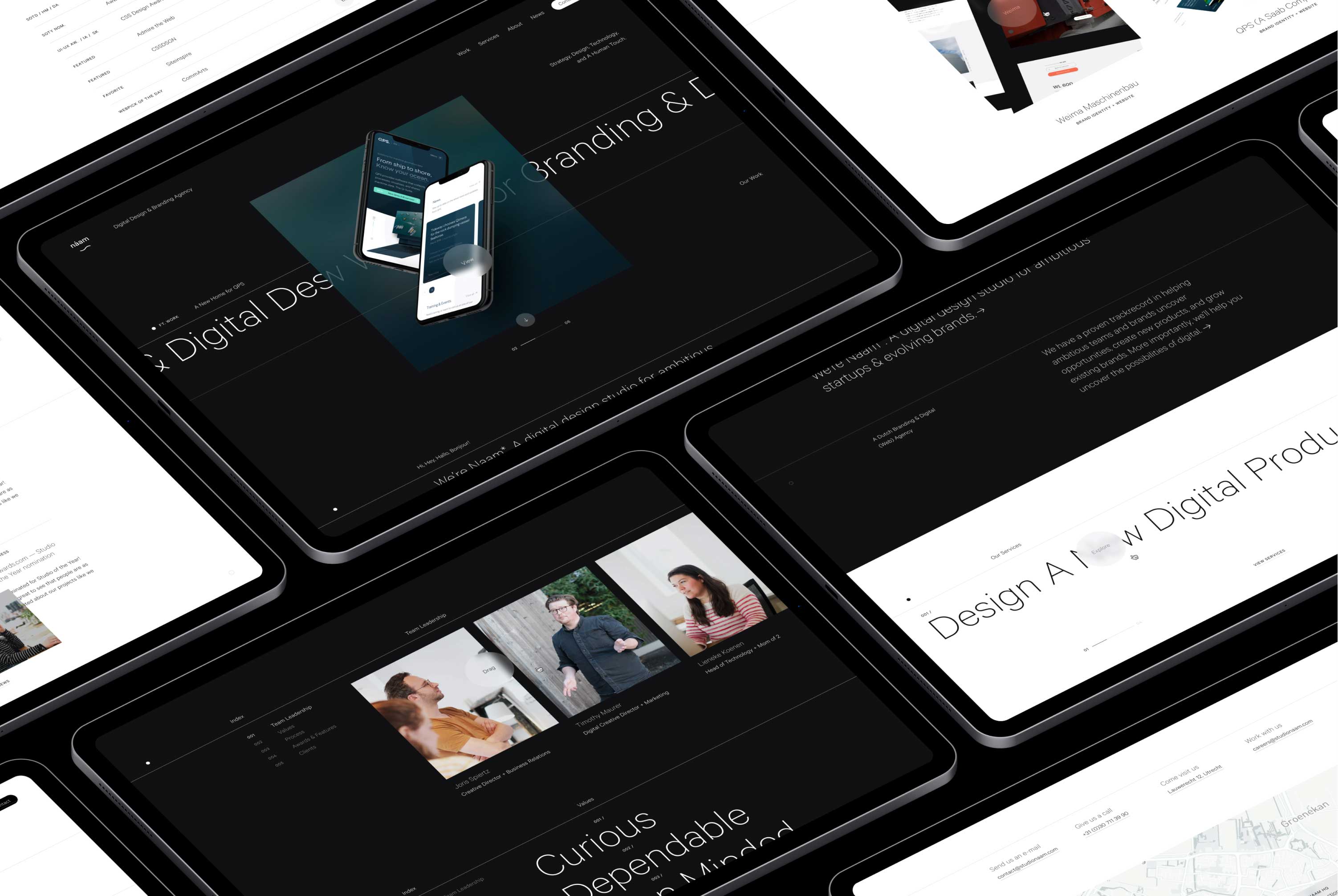
Multiple tablets on a dark background showing various elements of the Naam Agency design
Multiple pages of the design.
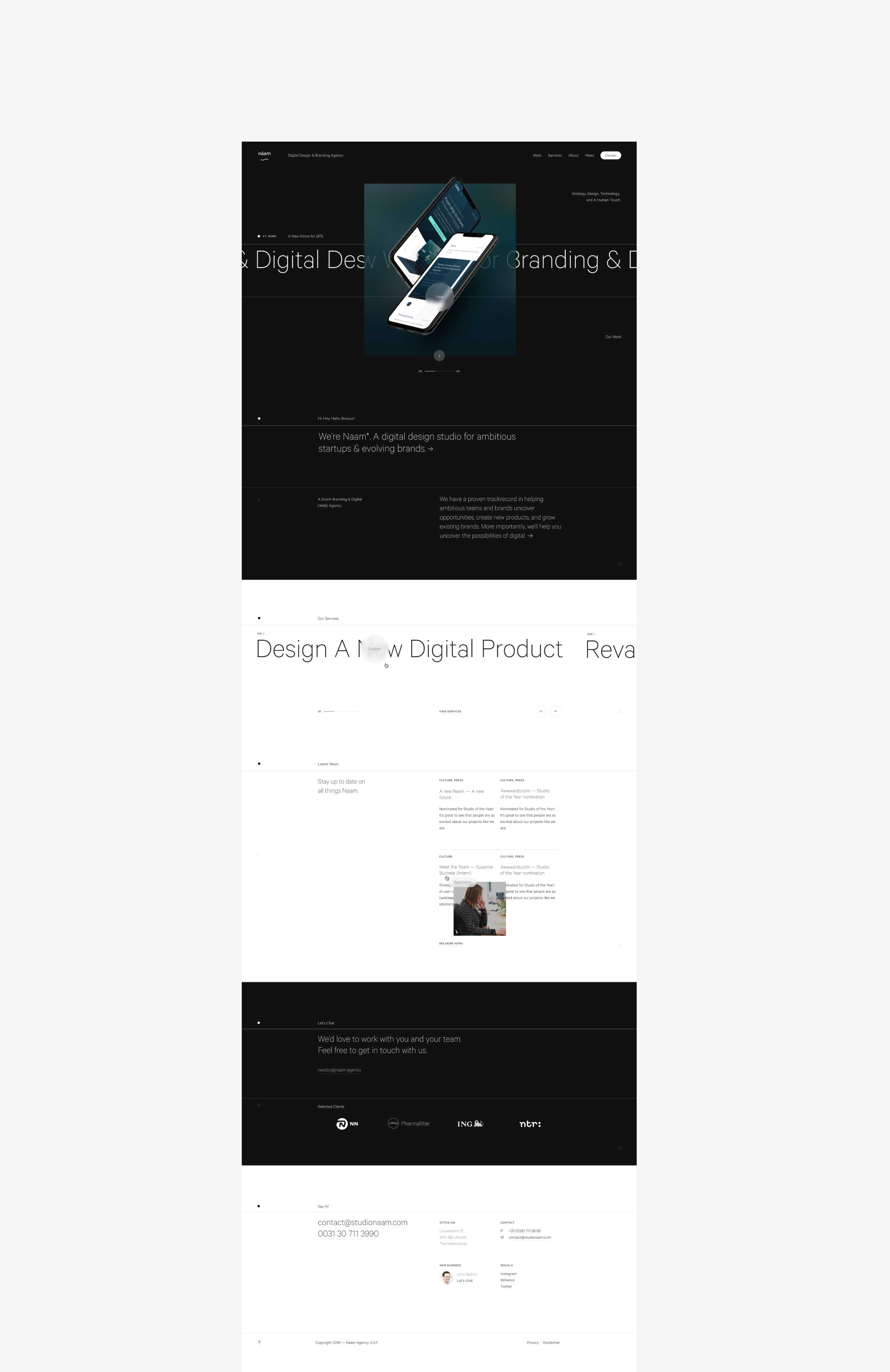
Full-page screenshot of Naam Agency homepage design
Full-page screenshot of the homepage.
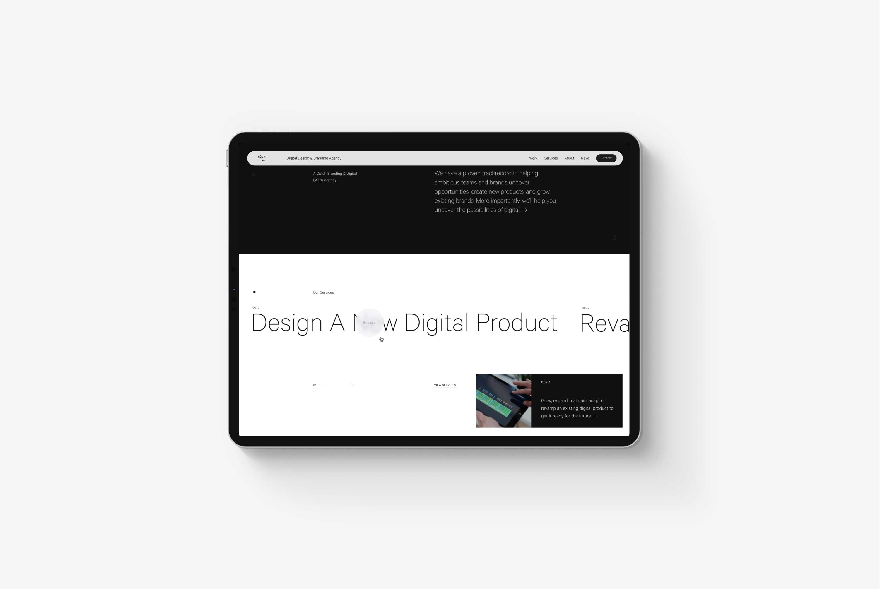
Tablet on a grey background showing the Naam Agency homepage service section design
Services section on the homepage.
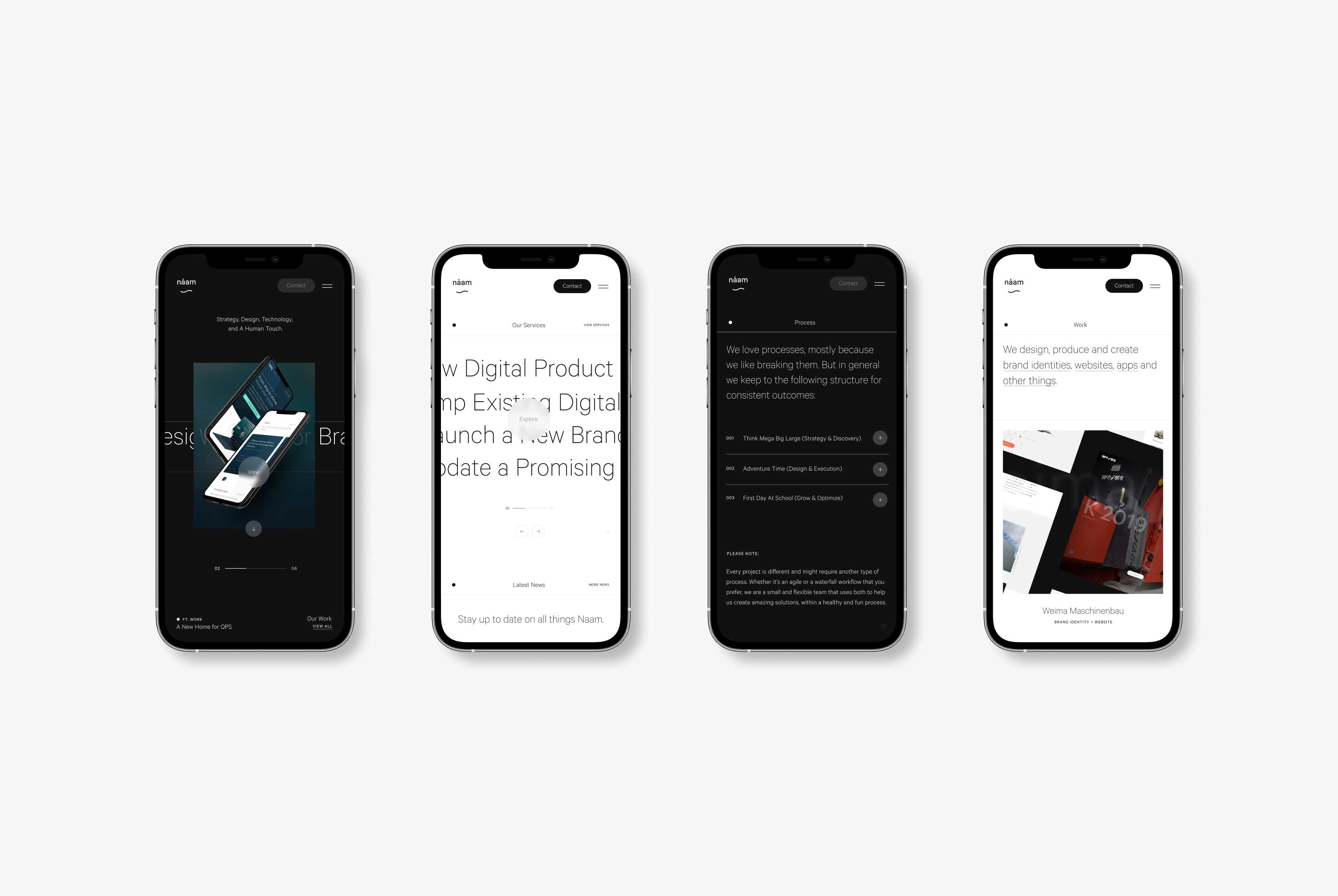
Four phones displaying the responsive design of Naam Agency
Responsive design.

About Time

A personal touch is crucial for creative agencies. We partner with our clients; we don't just work for them. We work with them. So we must be on the same page value-wise.

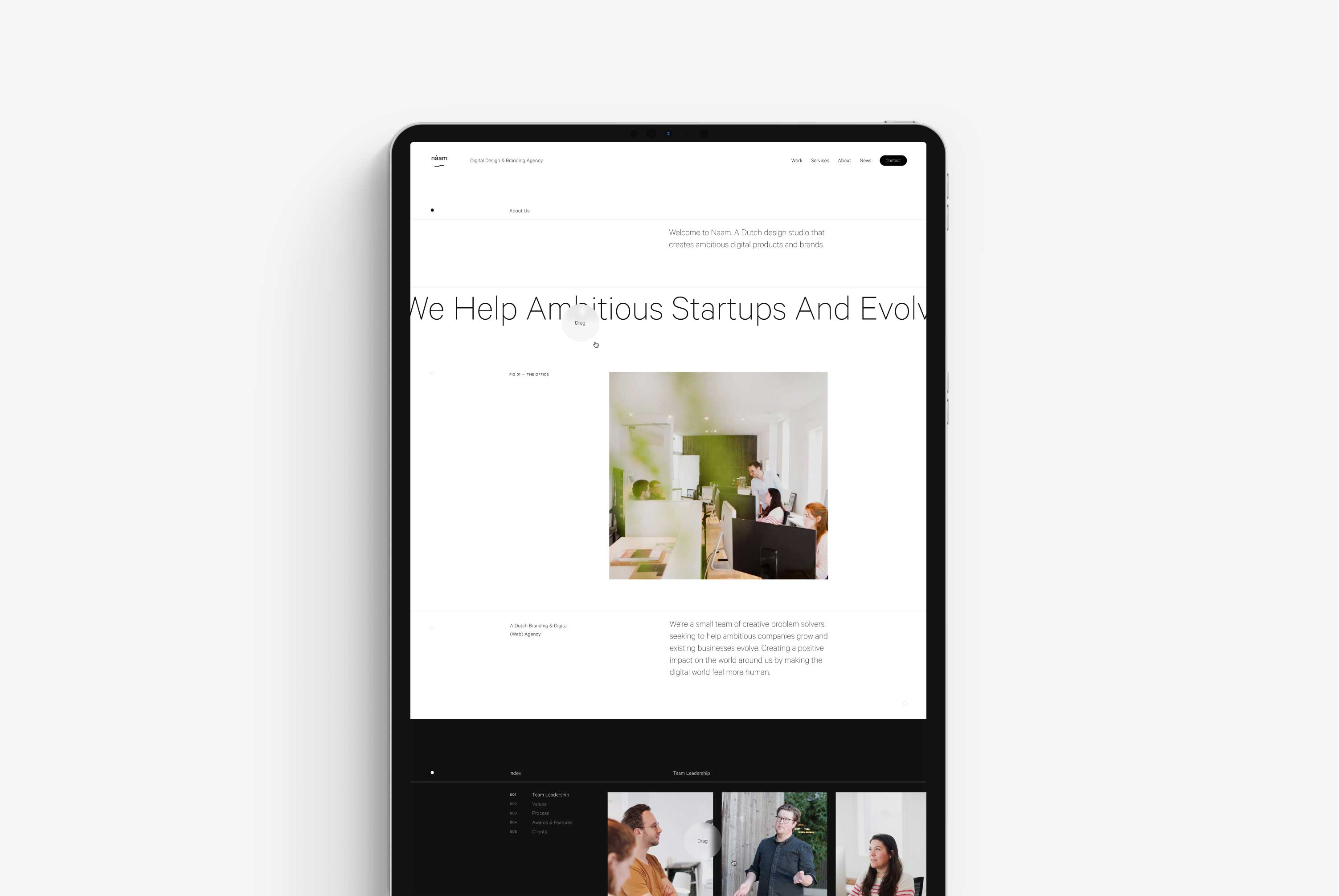
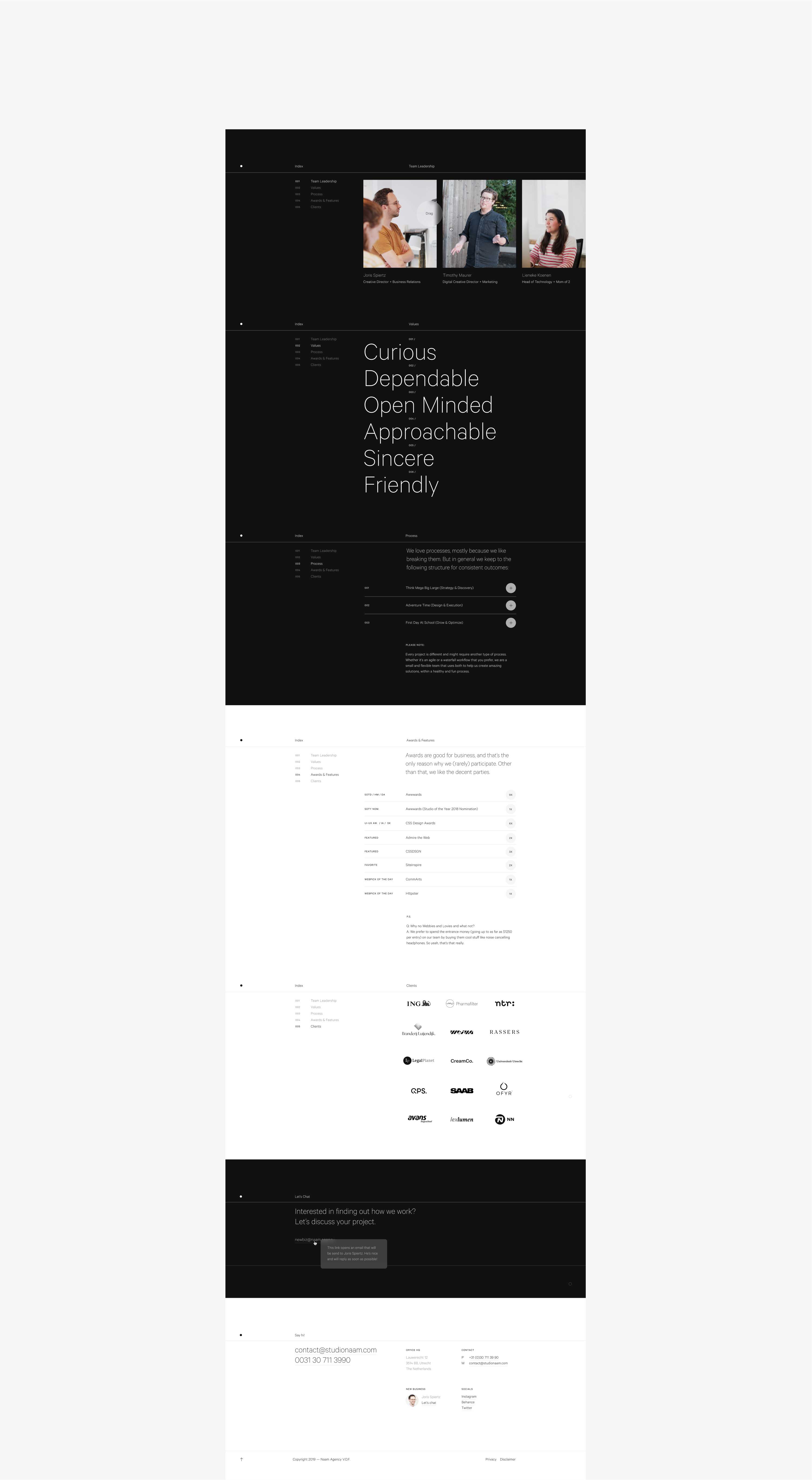
The about page shares our values, explains how we work, and why we do what we do. Essentially, it's meant to pre-select high-quality clients.
Explore ↓
A tablet on a grey background showing the Naam Agency about us design
About us page.
Full-page screenshot of the bottom section of the About Us page design for the Naam Agency website
Full-page screenshot section of the about page.
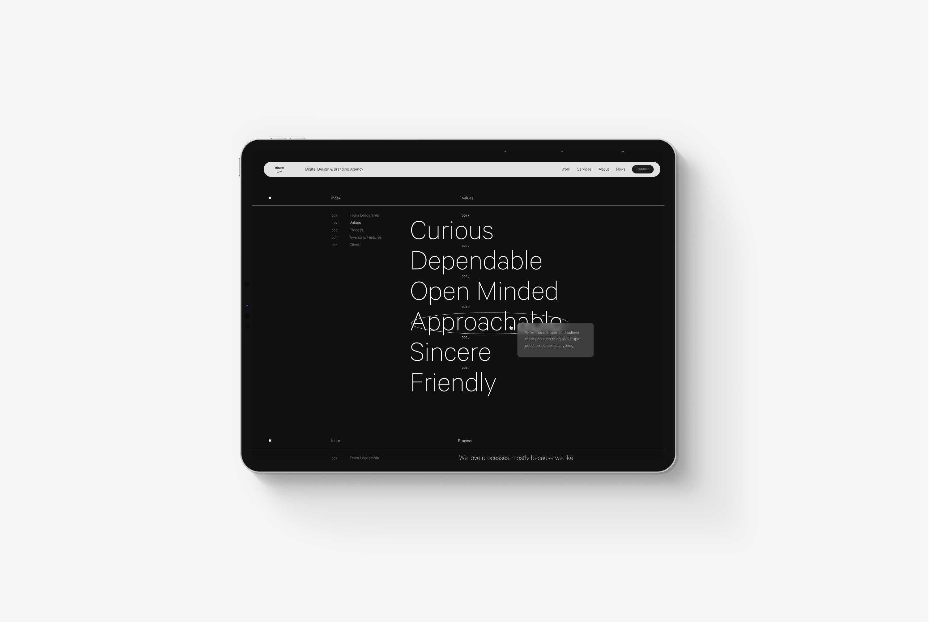
A tablet on a grey background showing the hover over state of the values section of the about page design of the Naam Agency website
About page, values section with active hover state.

Case Studies

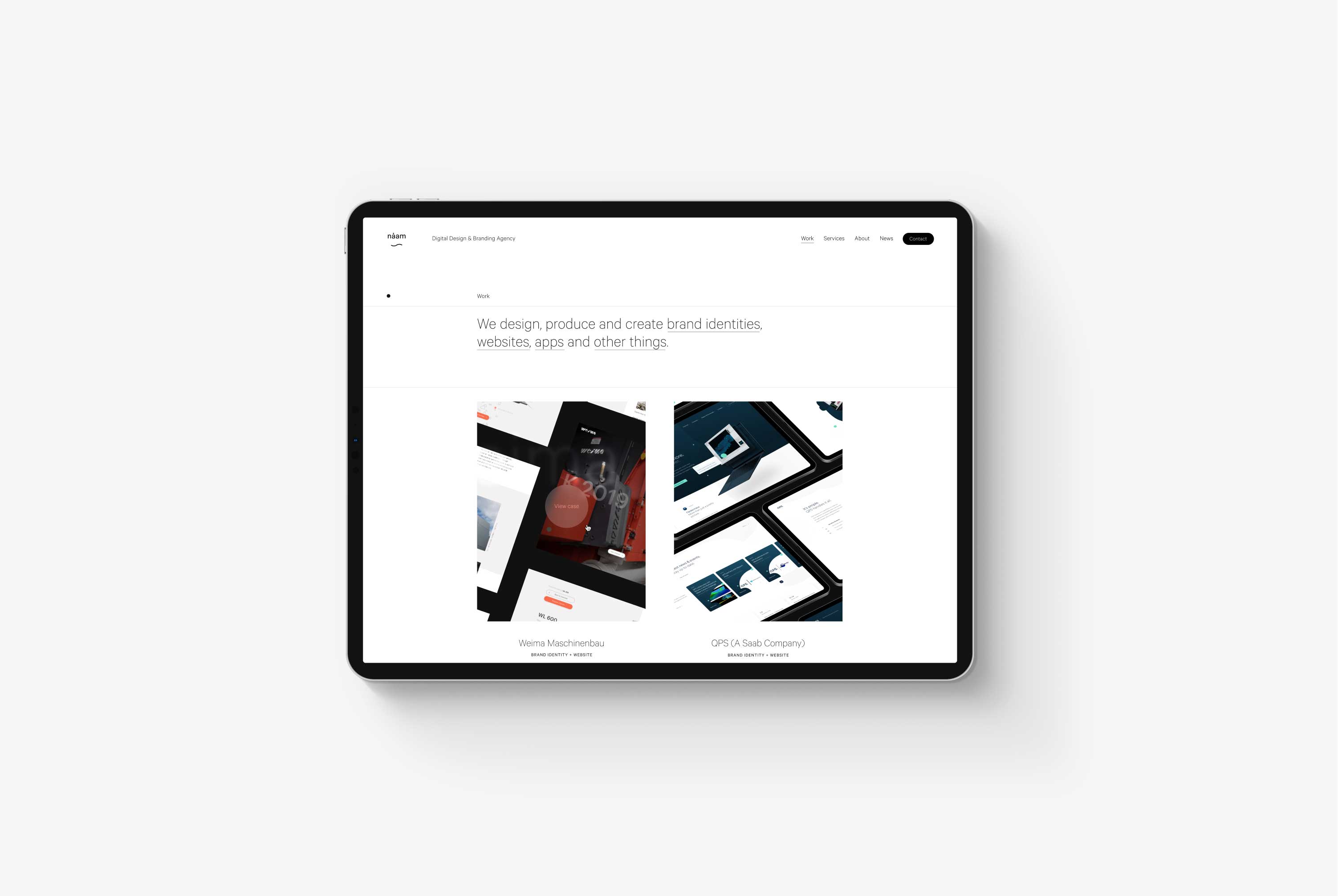
Case study pages are one of the essentials of any portfolio website. They showcase the work we love making and will help our business grow. However, the creation of the case studies is time-consuming and needs to stay consistent, so I built a system to help us keep the same tone of voice, writing structure, use of mockups, and technical requirements.
Explore ↓
A tablet on a grey background showing the case study overview page of Naam's website
Case Study page.
Multiple long-form screenshots of Naam Agency's case study pages on a grey background
Case study overview and detail pages.

Components

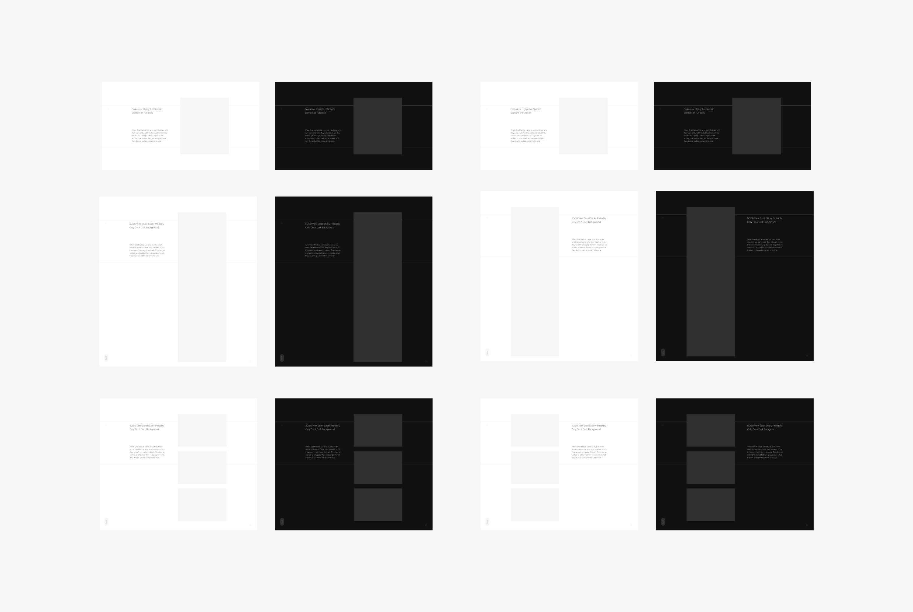
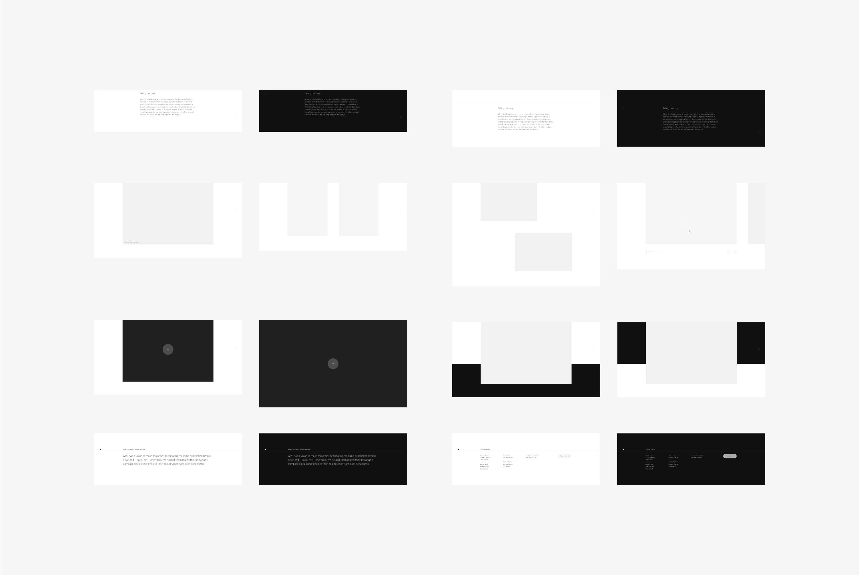
All of our case studies consist of multiple modules. To help our team create new and content-rich components, I made a shared Figma file that takes care of all structural design, allowing them to focus entirely on the story of the case study.
Explore ↓
Components used to build Naam Agency's case study pages
Case Study modular components.
Components used to build Naam Agency's case study pages
Case Study modular components.
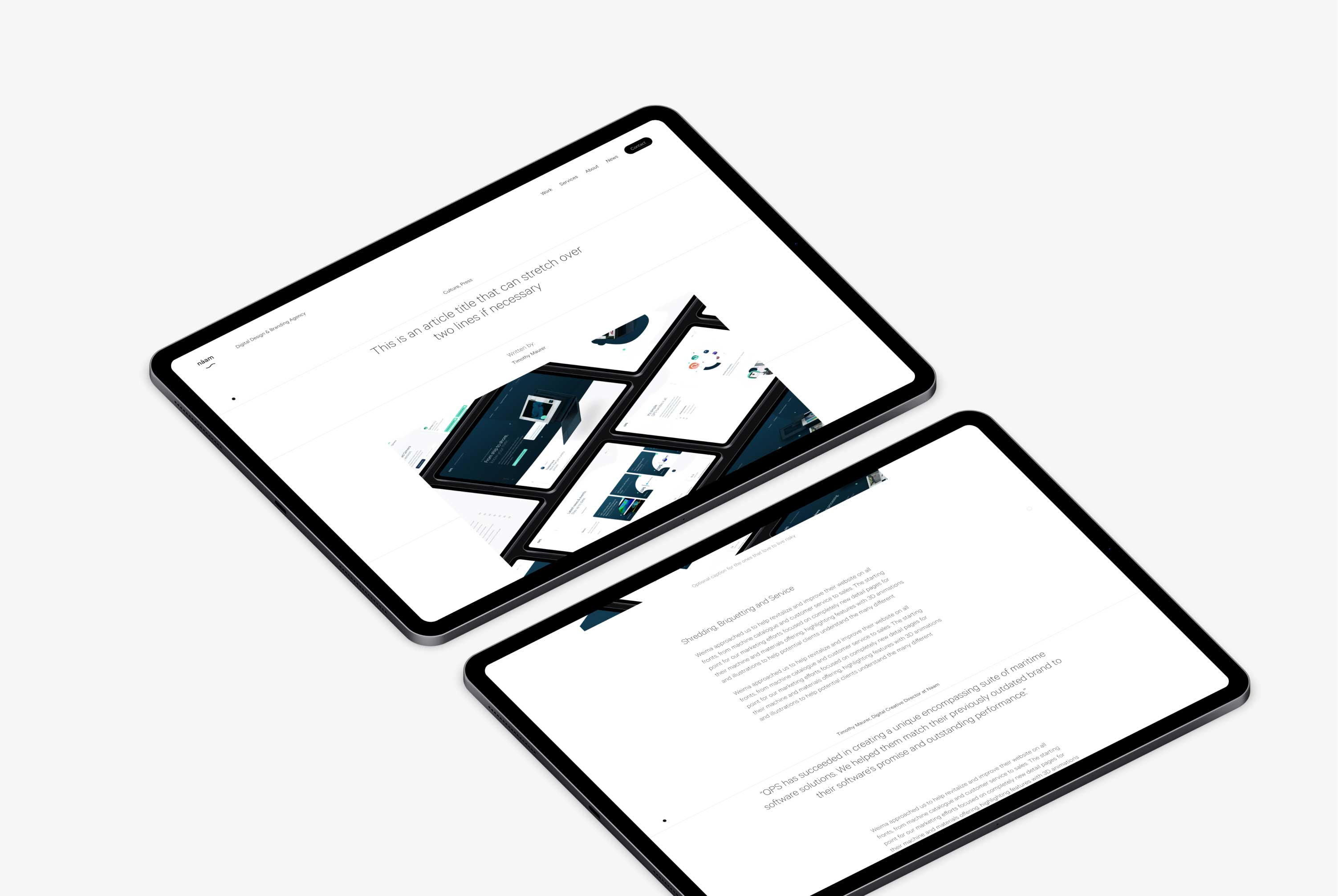
Two tablets on a grey background showing Naam Agency's article page design
Article detail page.
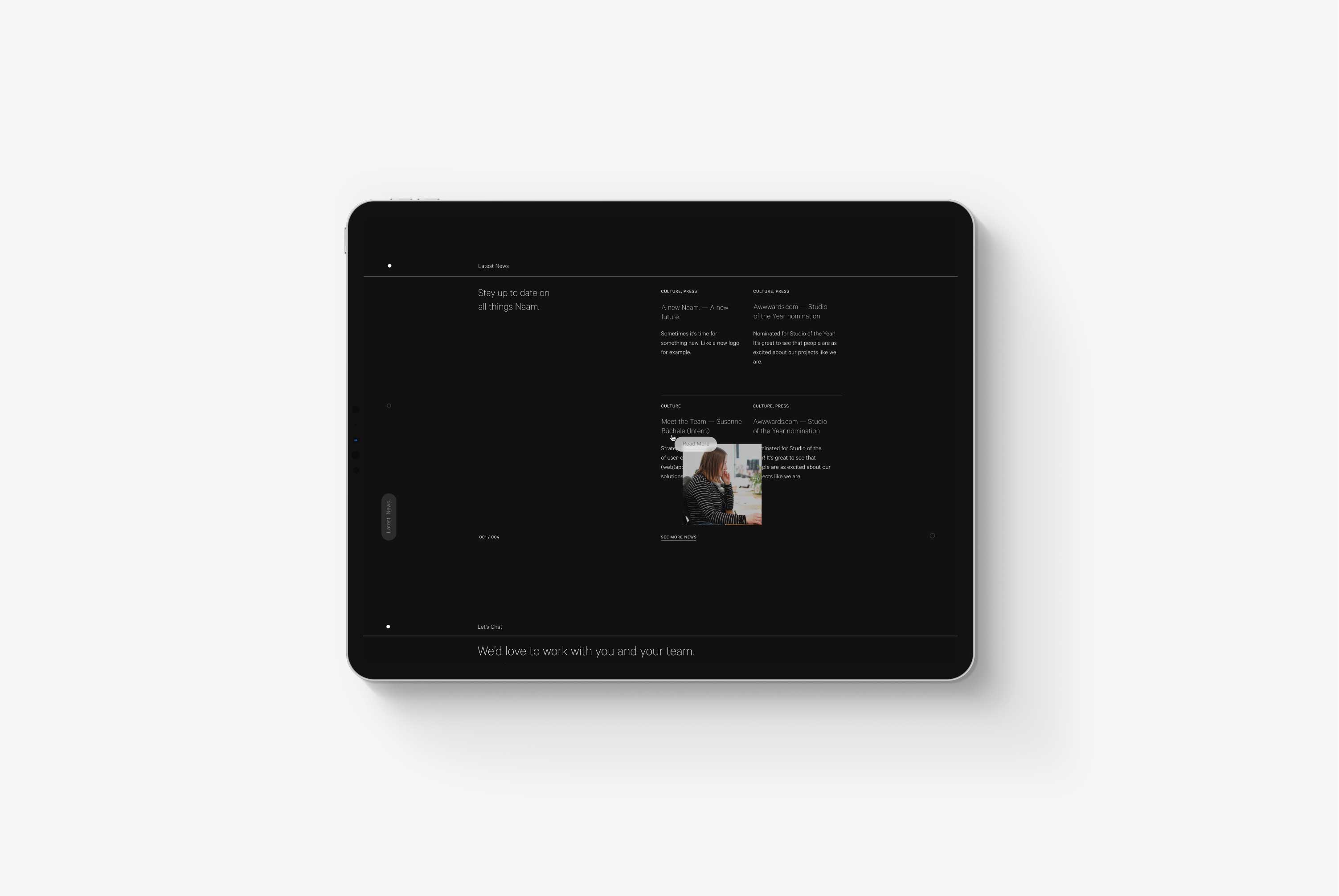
A tablet on a grey background displaying Naam Agency's Latest News section
Latest News section with hover state.
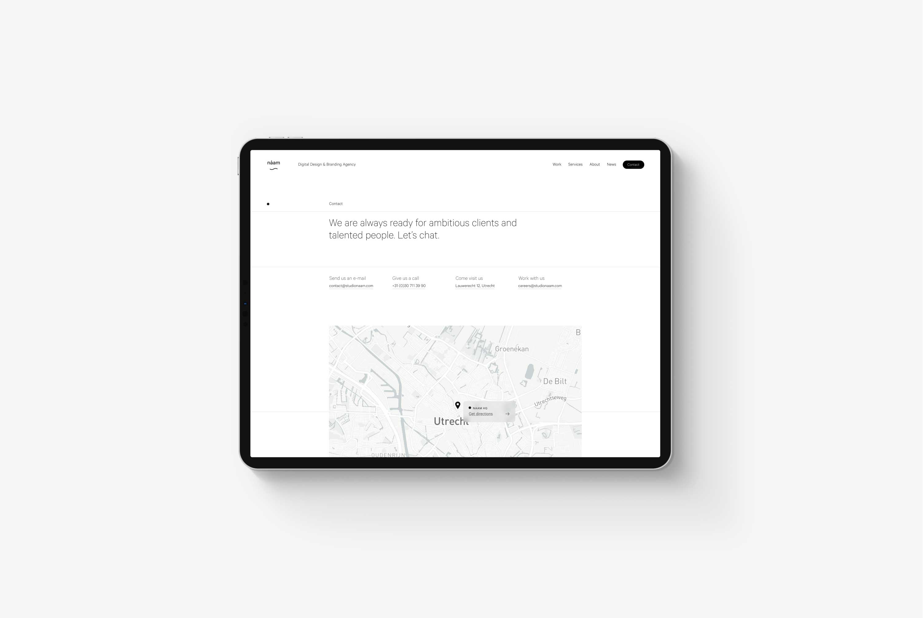
A tablet on a grey background displaying Naam Agency's contact page
Contact page.
Client
Naam Agency
Services
Digital Design Systems
Case Study Protocols
Information Architecture
Prototyping
User journey mapping
UX/UI Design
Webflow Development
Sector
Creative Agencies
Year
2019
Details
Design
Timothy Maurer
Development
Timothy Maurer
Strategy
Timothy Maurer
Joris Spiertz
Lieneke Koenen
Creative Direction
Timothy Maurer
Team
Agency