Weima.
Weima produces machines that help recycle and repurpose materials.
They are one of Europe’s leading manufacturers of solutions for waste recycling, such as shredders, drainers, and briquette presses.
Read more+
Weima requested a complete overhaul of their outdated marketing material to bring them into the modern day. Through a brand new custom-made website and design guidelines, we helped Weima improve the communication of their innovative, ecological, and trusted services to an existing audience of established companies.
The design shown in this case study is a slightly updated version of the original site design from 2017 and the 2020 update. In addition, it contains a few usability improvements and presents a more consistent design language.
Prototyping
Information Architecture
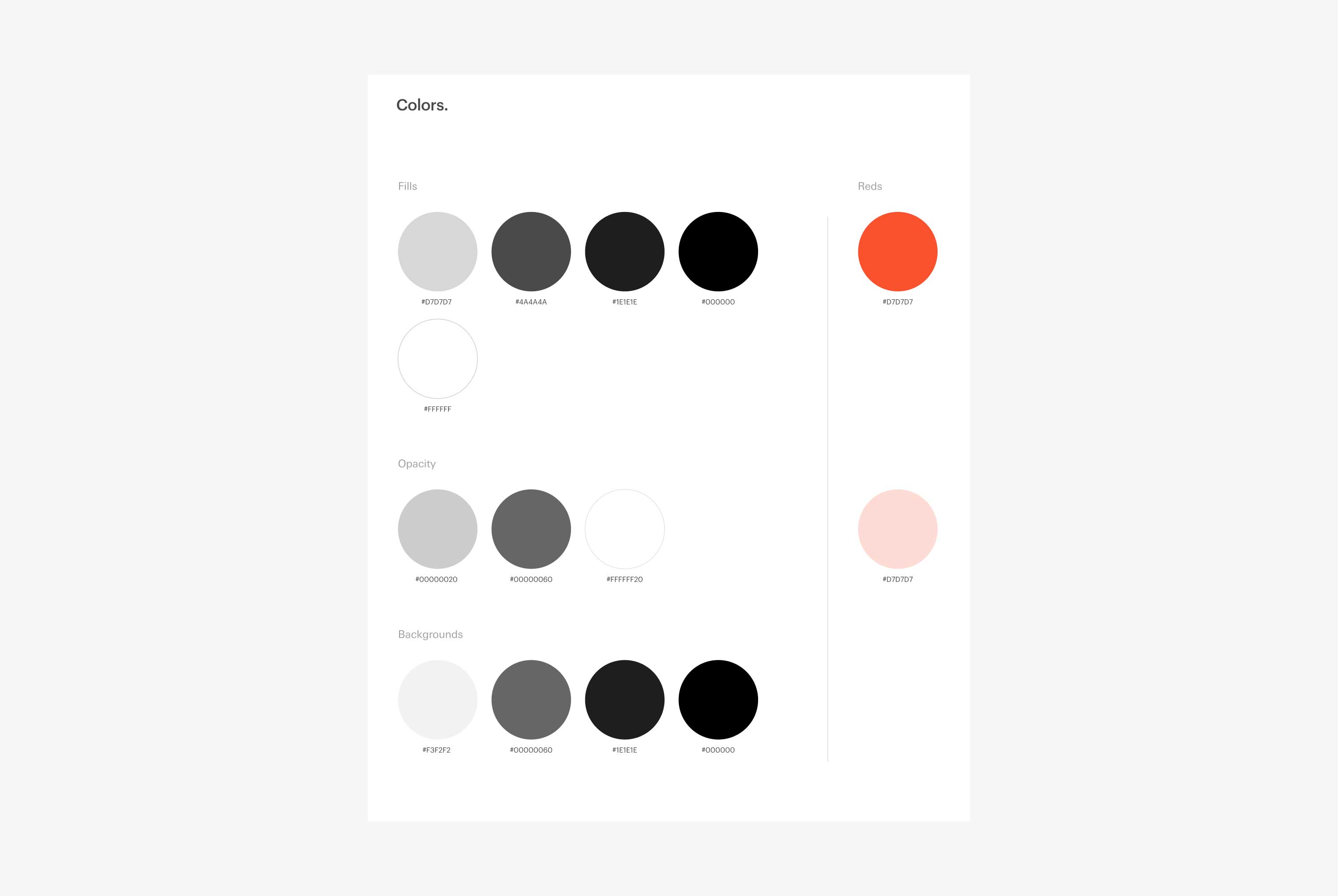
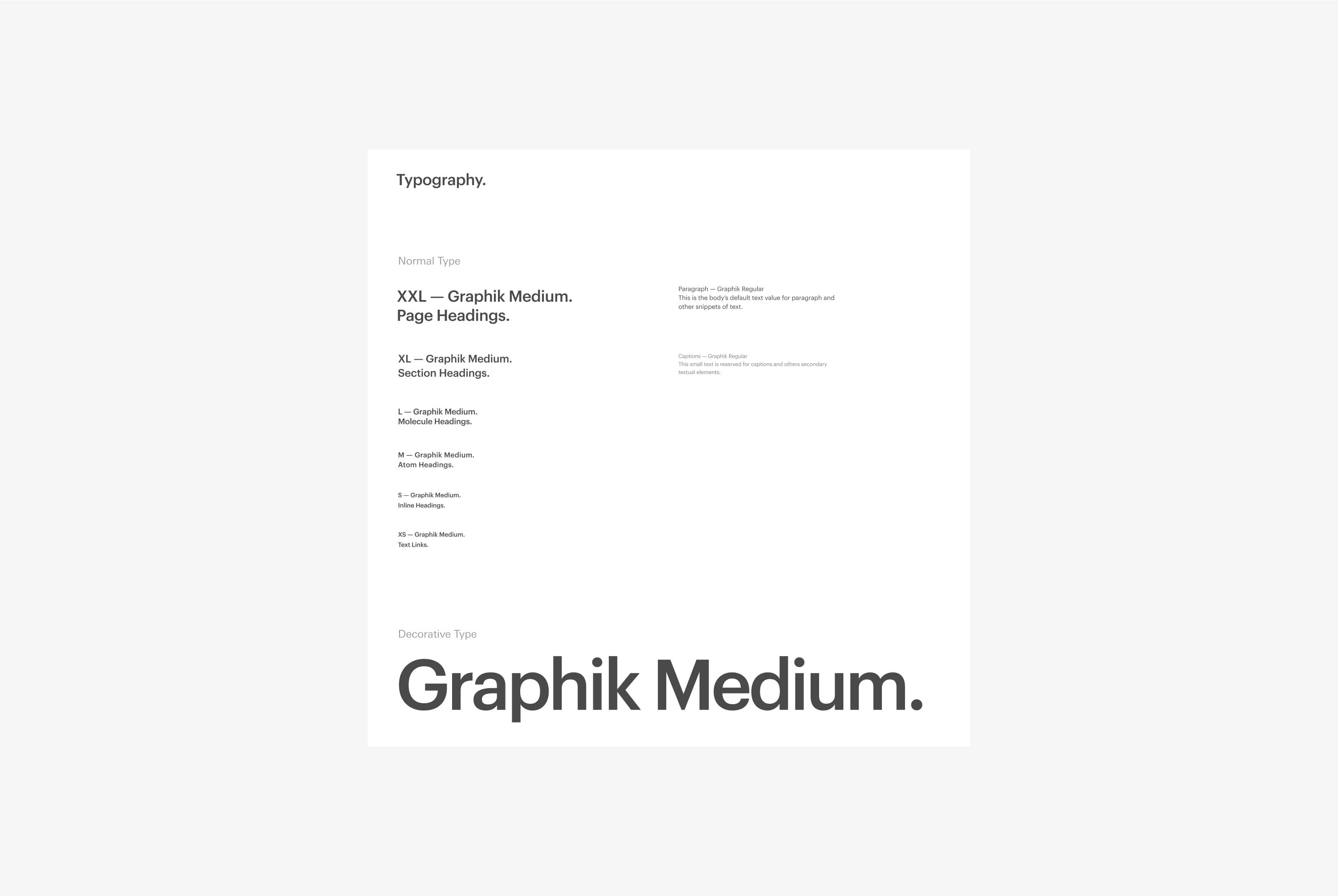
Design System
Creative Direction
Challenges.
During the process we created a few main questions to help us structure our information, and keep the user & business needs in mind.
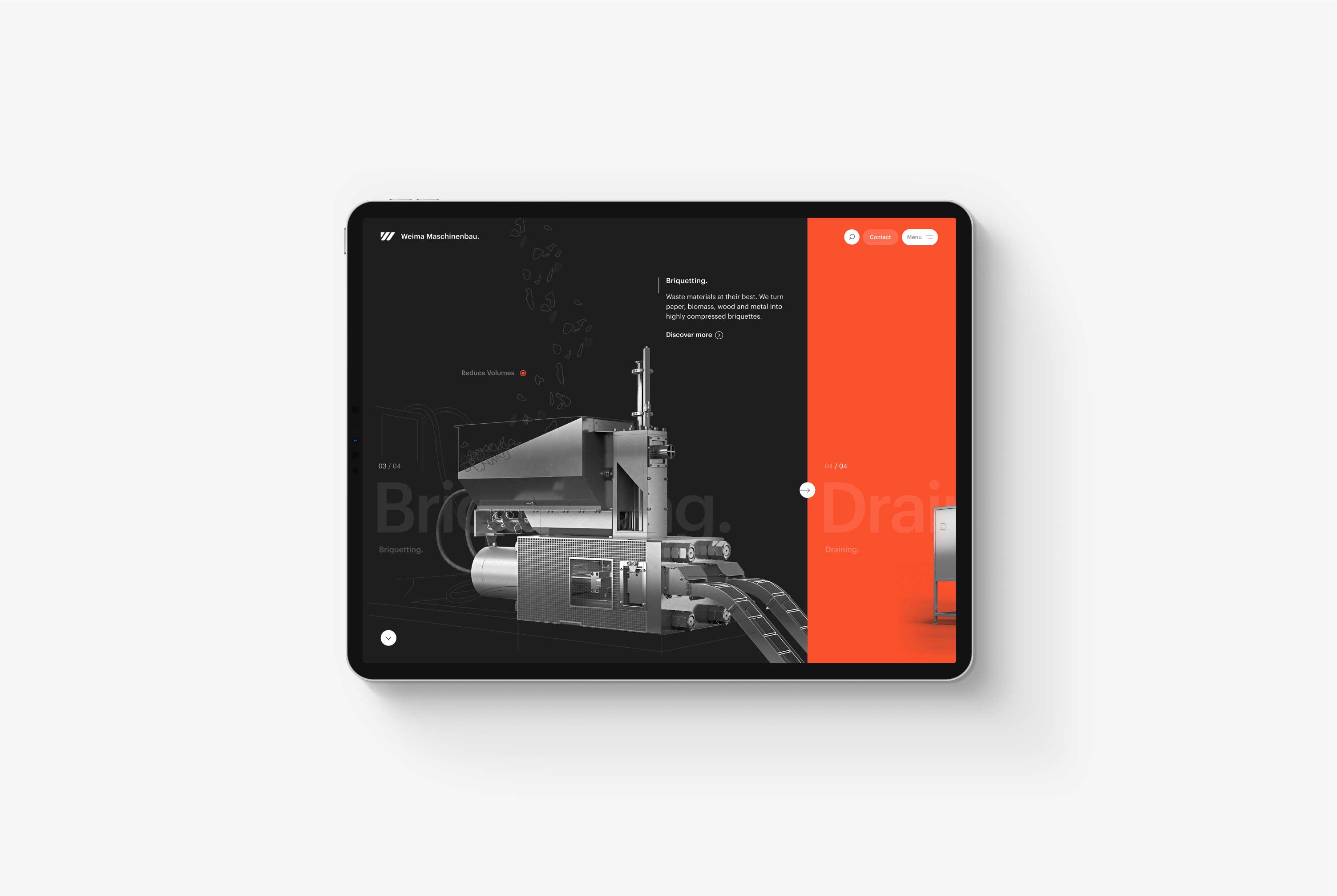
Excite and surprise.
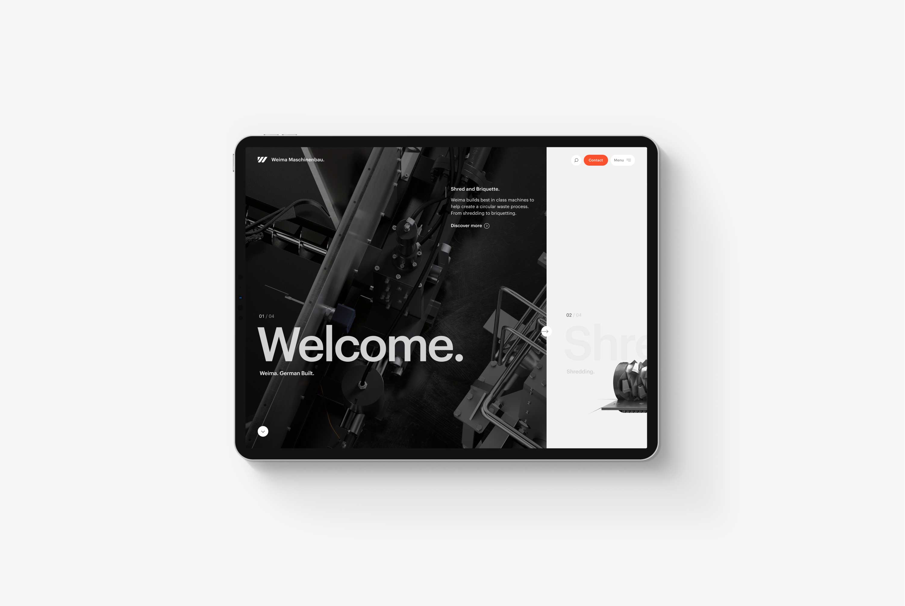
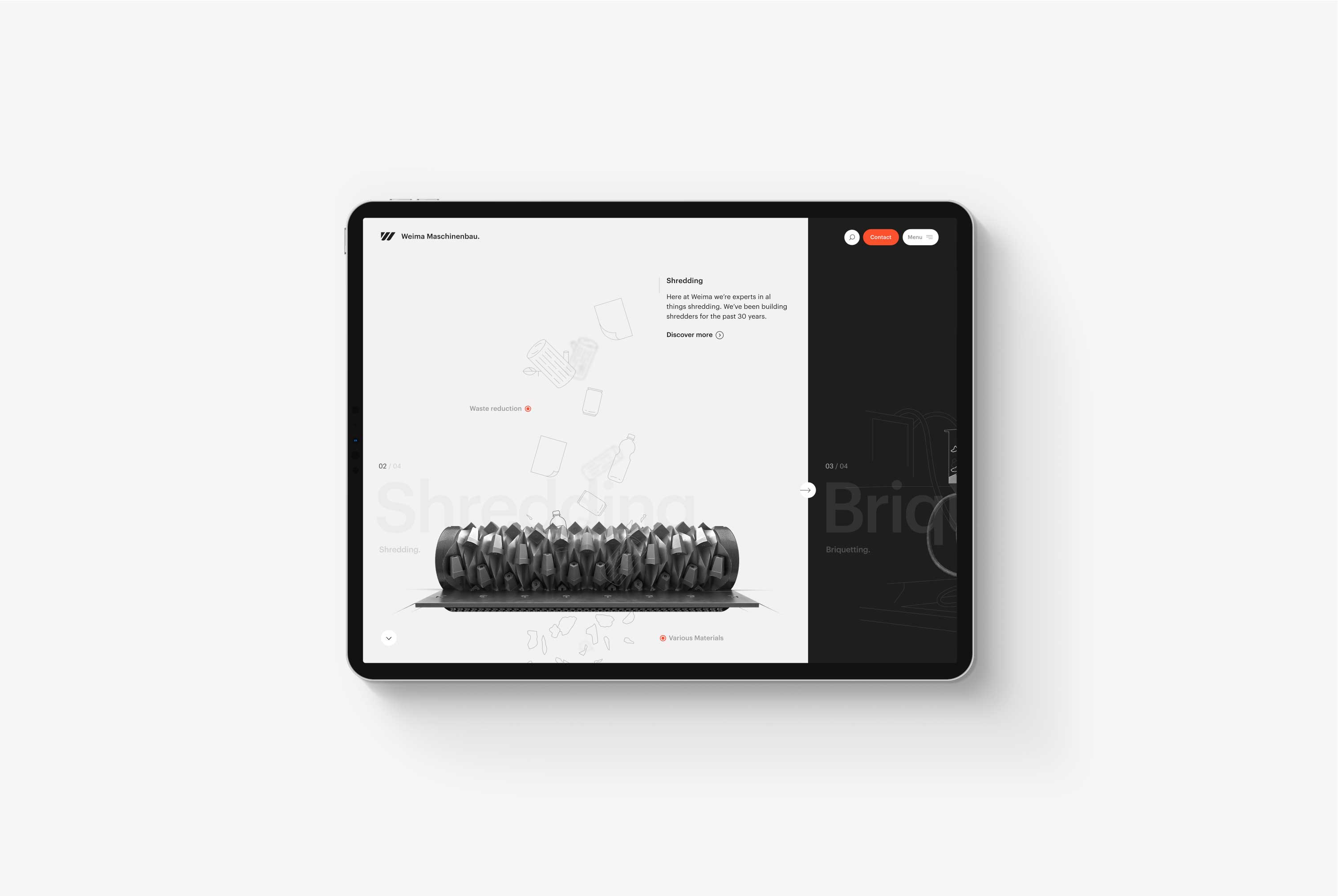
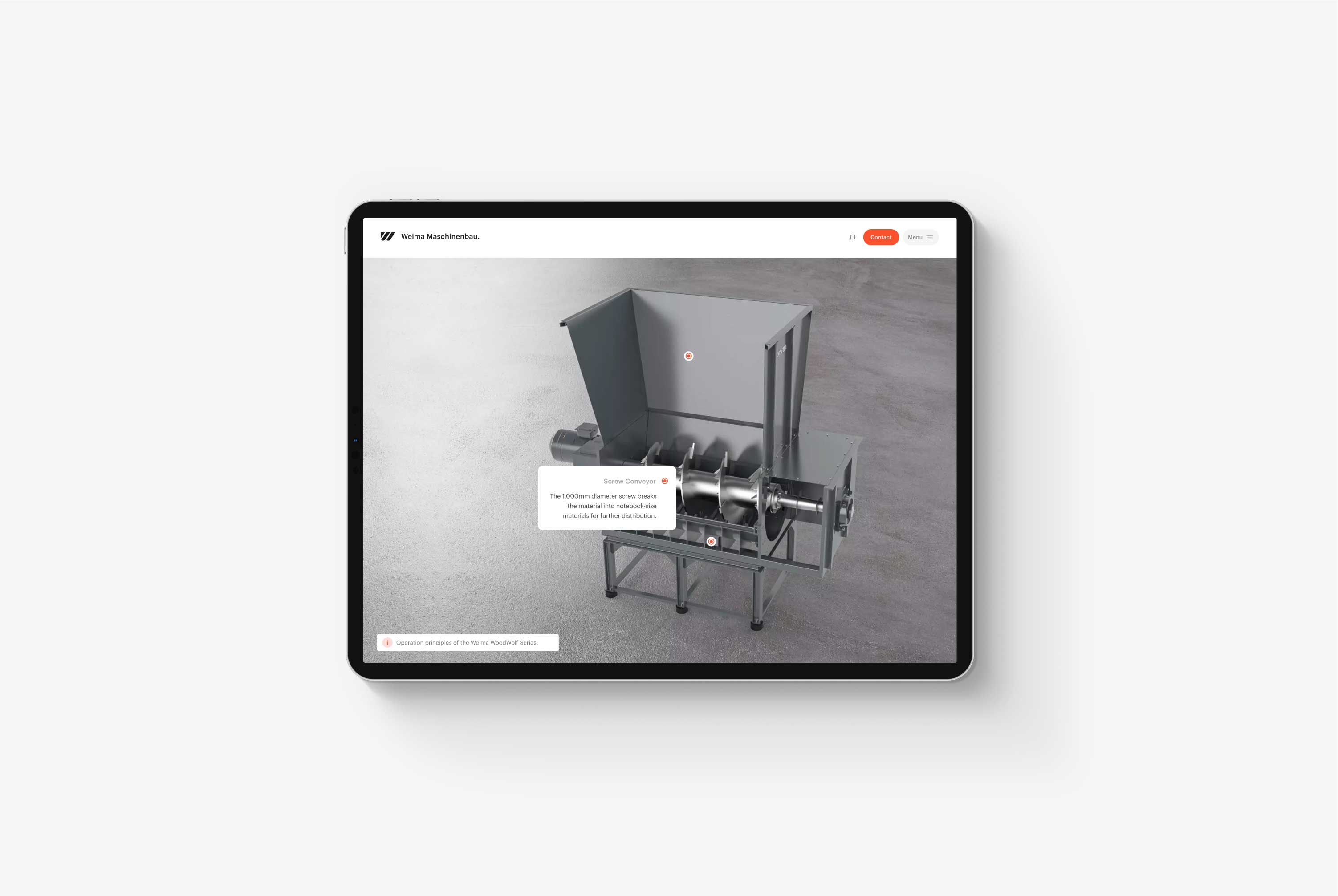
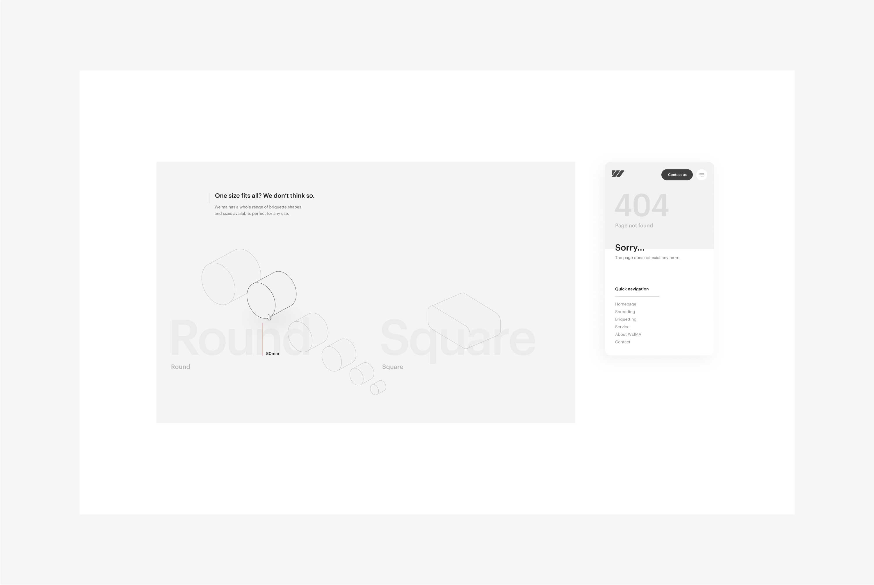
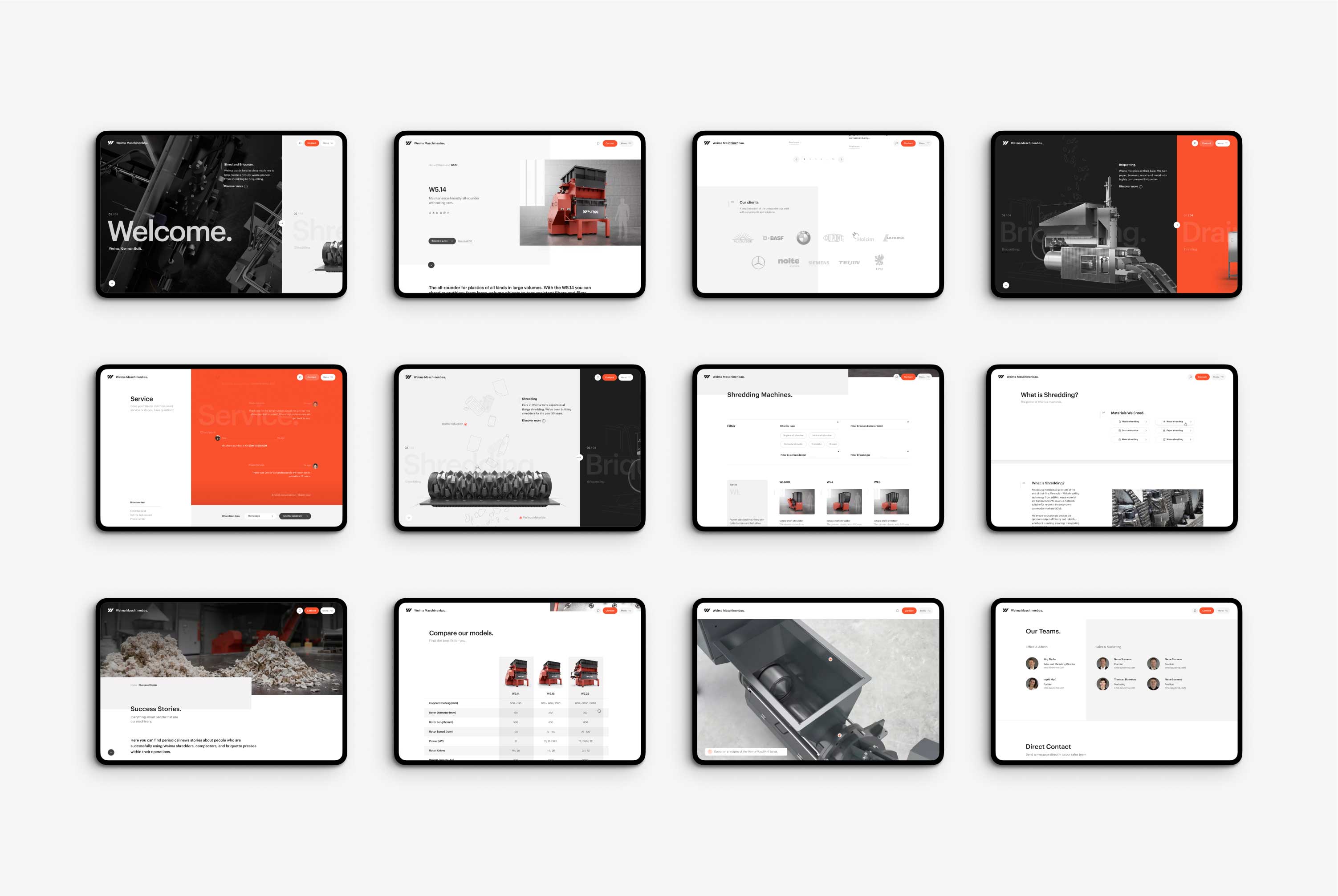
Weima's new website brings its machinery and service right to the forefront. With large interactive 3D animations — created together with VFX studio The Outpost — it's easy to take notice of Weima's key offerings. For example, Weima's innovative engineering is highlighted by showing various machines' inner workings in a compelling, visual way.
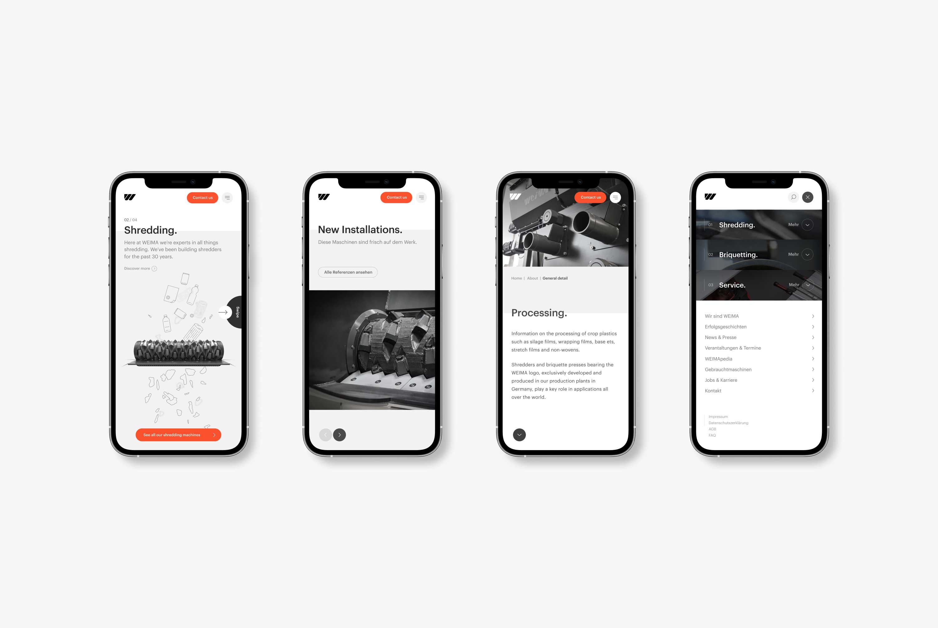
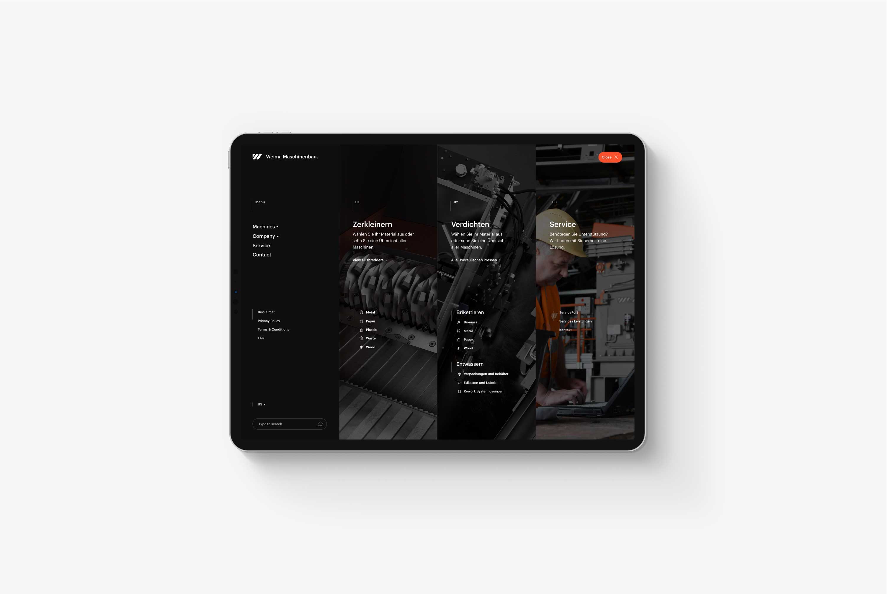
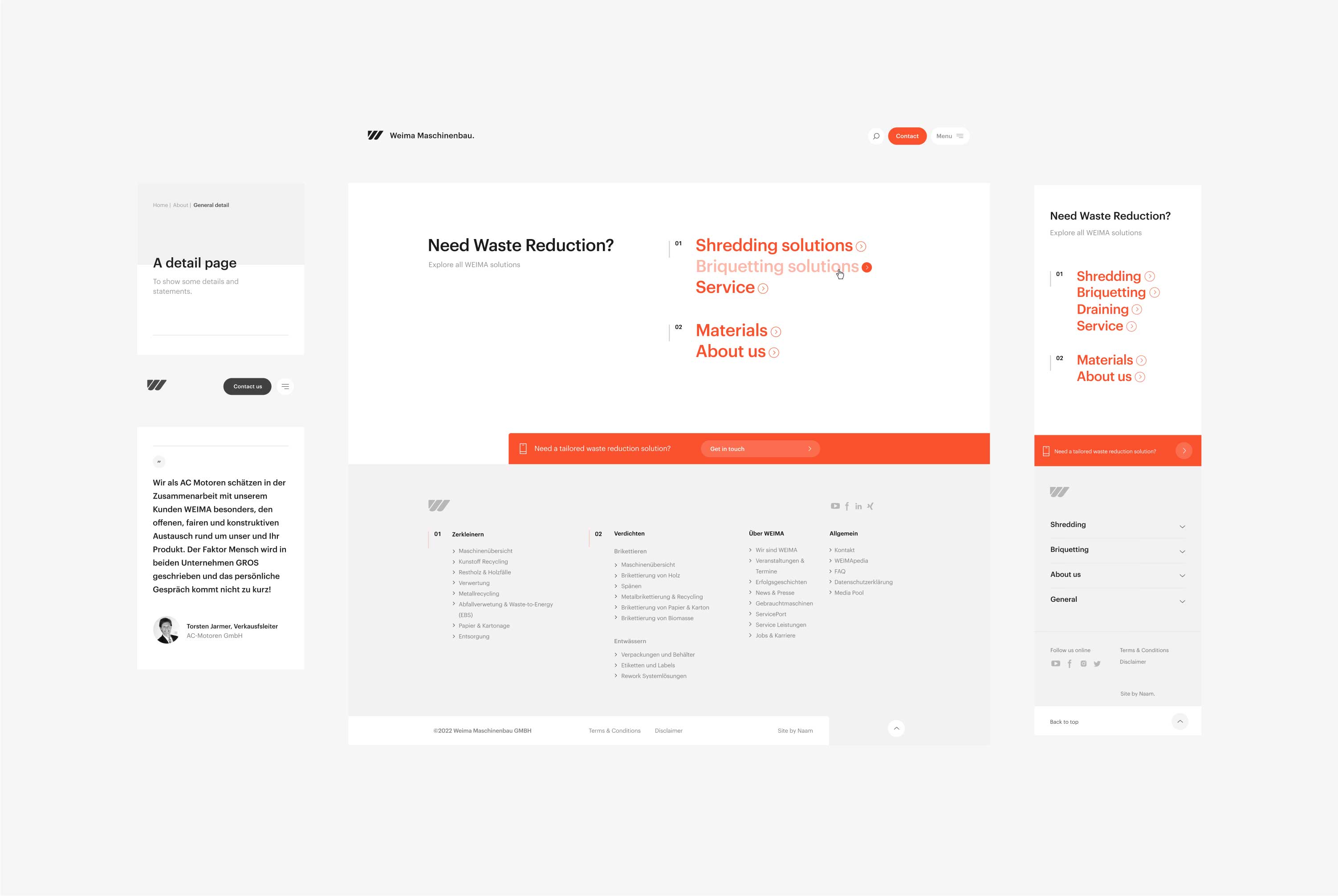
The full-page (mega)menu of Weima's new menu contains three main sections. Research showed that most visitors preferred to navigate these sections first, so we were tasked to make them as easy to find as possible. As a result, we used visual hierarchy design patterns to clarify essential typographic elements sucessfully.
Marketing Landings
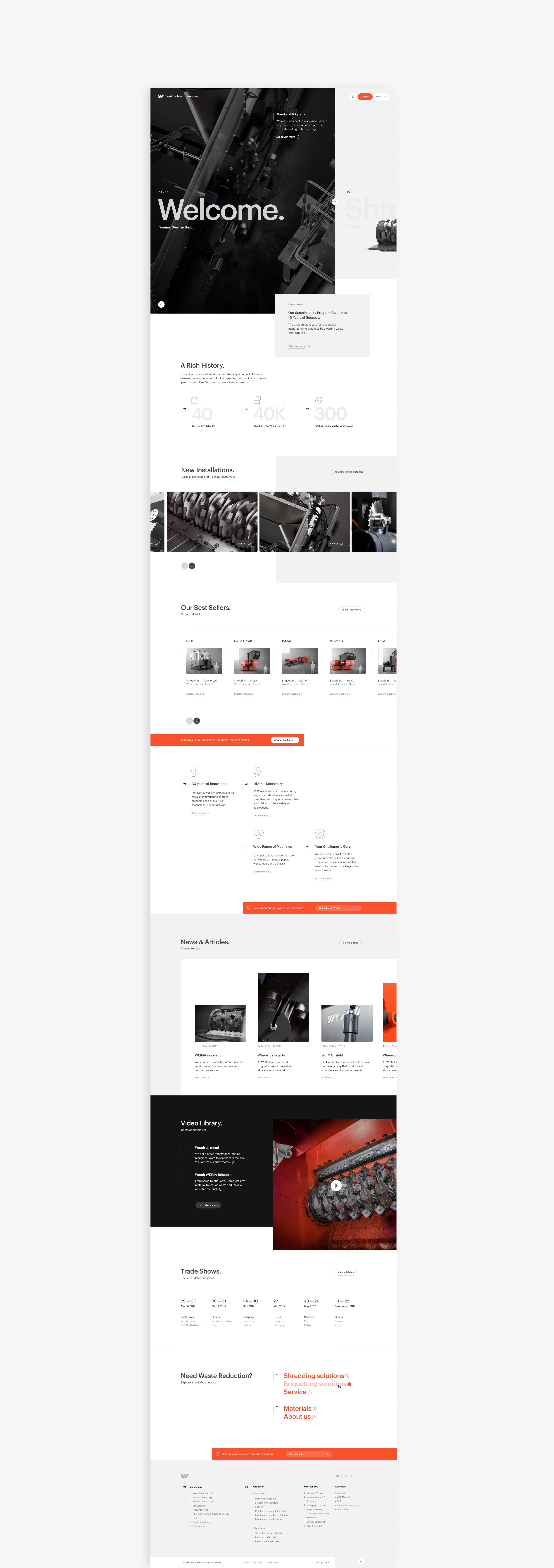
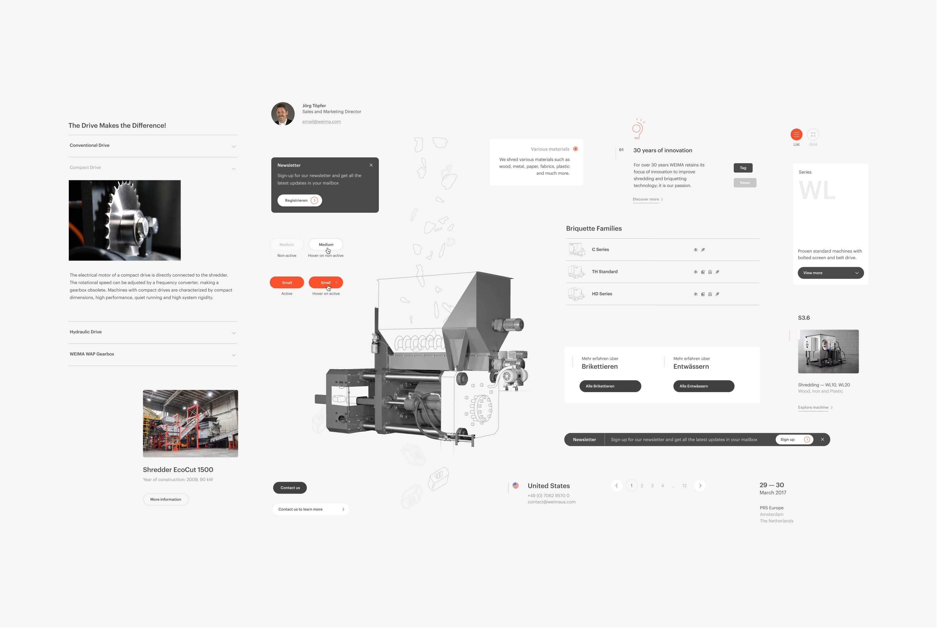
The first significant update to the website happened in 2020. After a few years of gathering user data, Weima USA contacted us requesting more flexibility. As a result, we rebuild a selection of pages with modular components with which the marketing team can now compose new pages quickly. Additionally, this opens the possibility for Weima to AB test or, for example, try different marketing techniques to improve conversion.
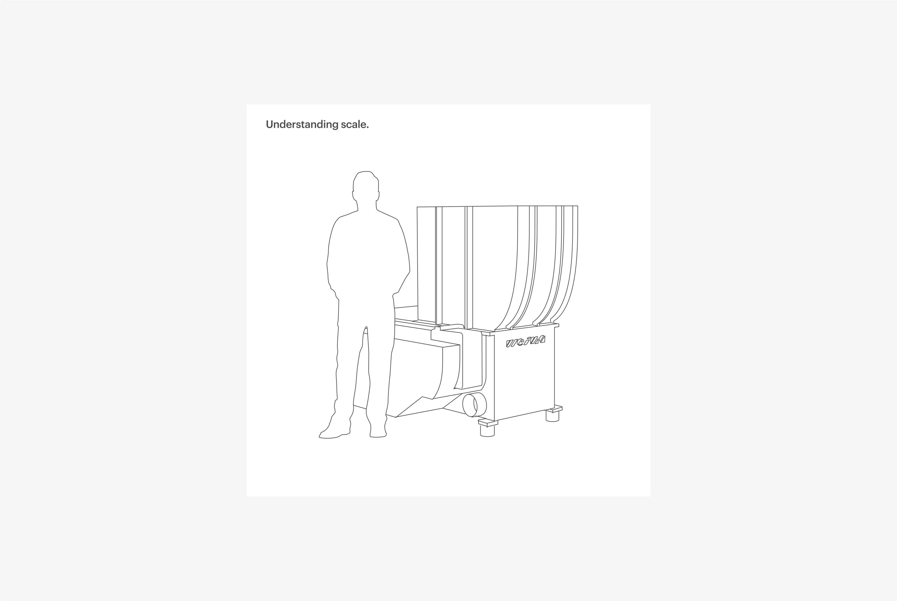
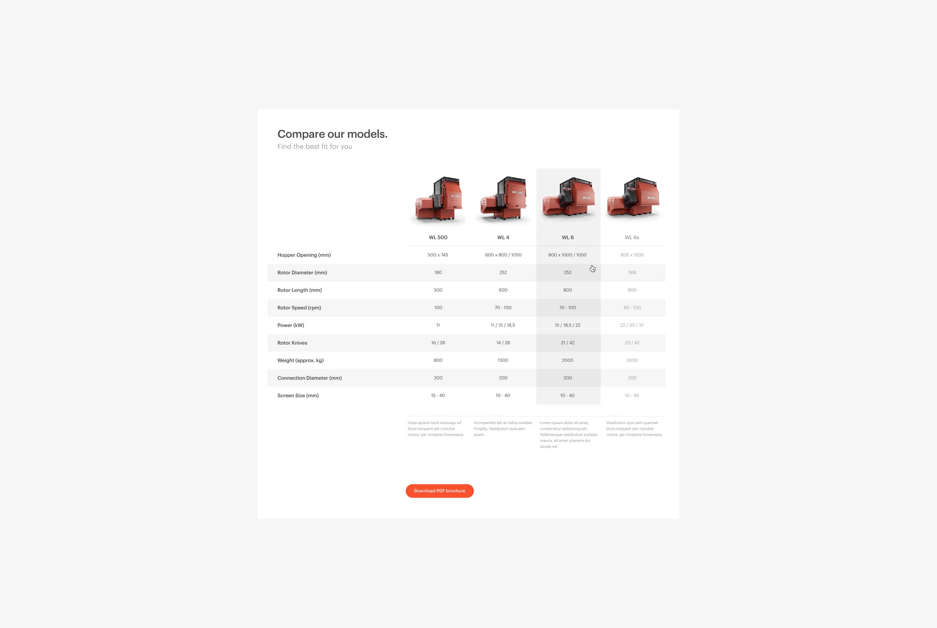
Upon assessing Weima's main competitors, we found an opportunity that could set Weima apart. By showing the full scope of their product catalog and replicating much of the Weima in-person showroom experience on the website, we knew that we could potentially convert interested managers into buyers because, traditionally, managers would come to the Weima showroom to learn all about these details. Now, they could do that from the comfort of their desk.
Machine Overview
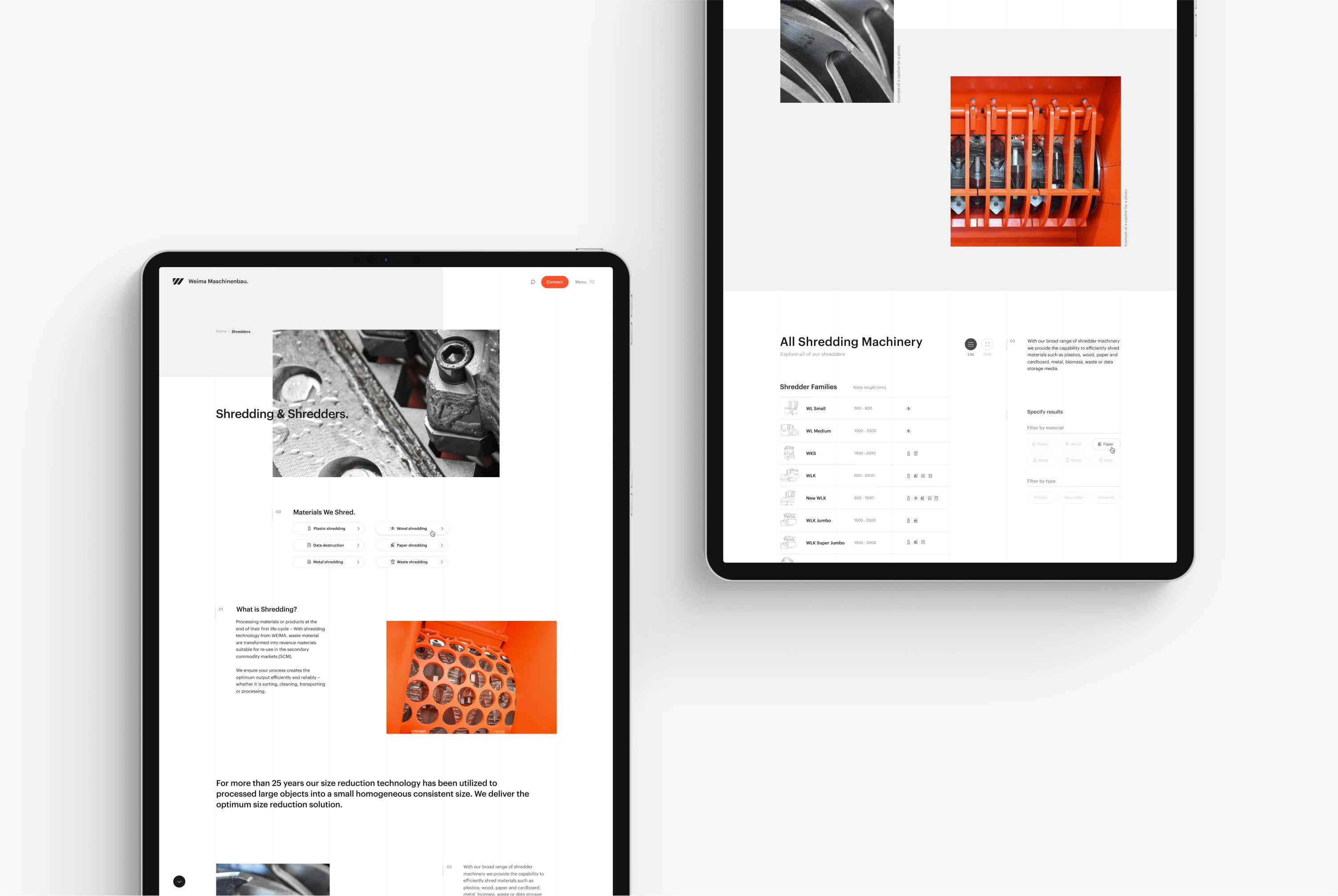
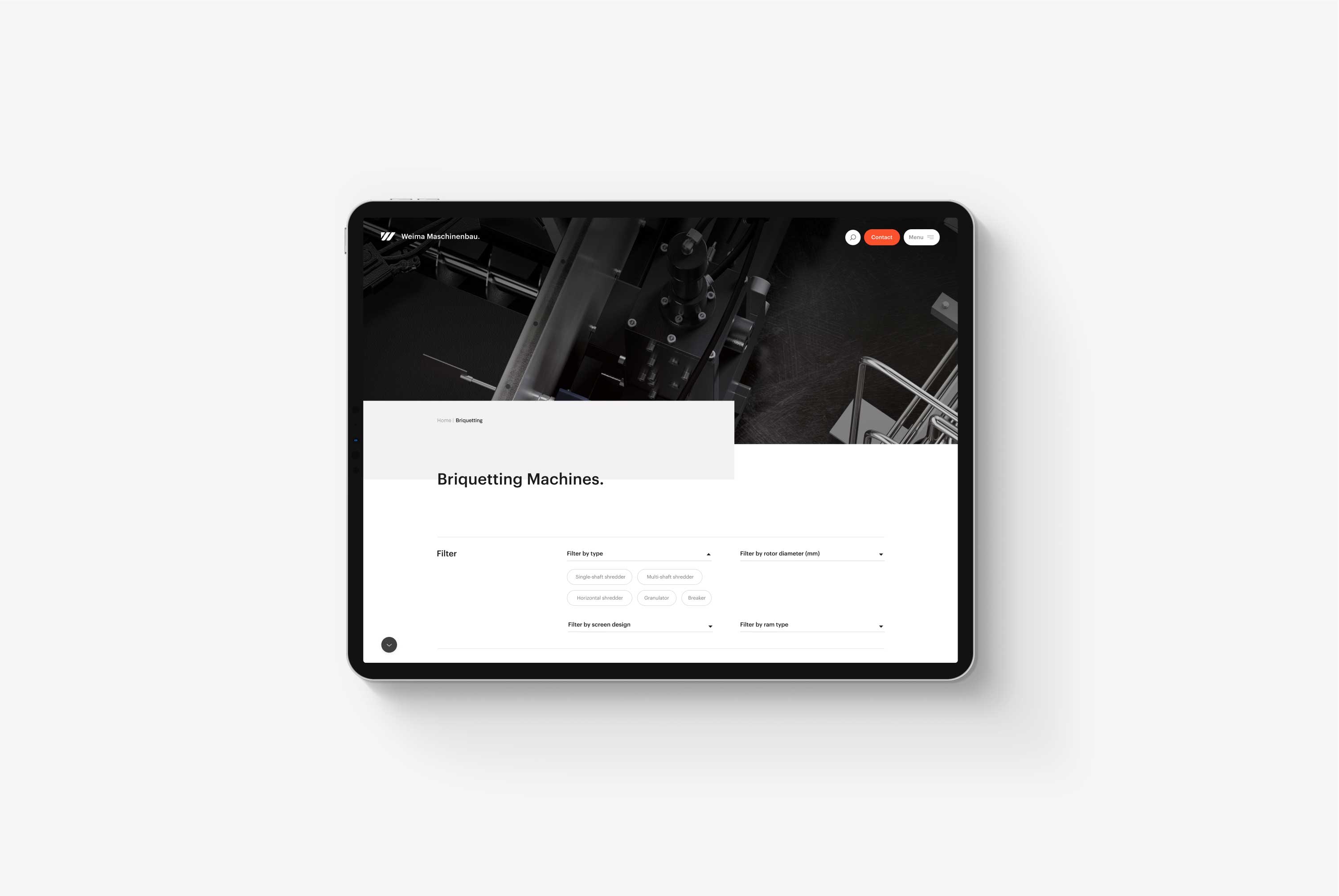
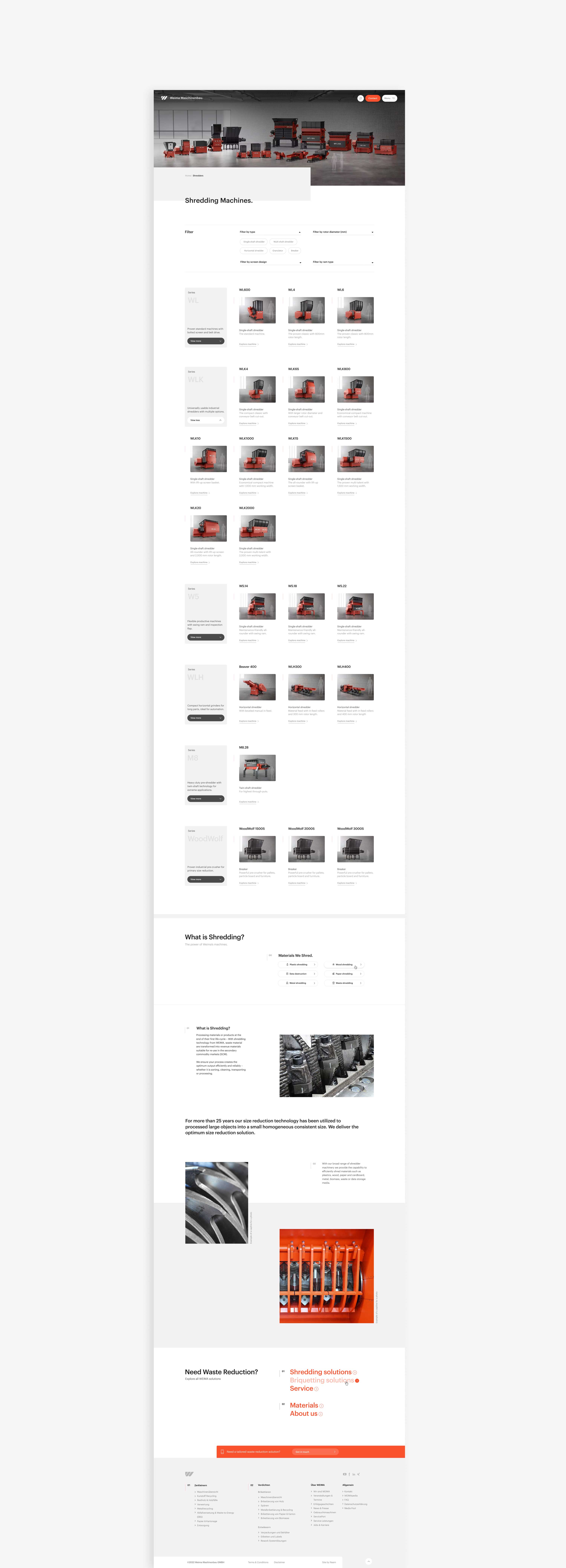
With the 2020 update, Weima announced they were renaming all of its machines. This way, it would be easier for clients to understand the various growing product groups. As a result, we completely redesigned the Machine Overview pages to accommodate this change and set Weima up for the future.
The new design includes clear product group sections, easy sorting filters, and improved scannability. At the bottom, we've kept essential information that adds another layer of SEO value.
Machines & Materials
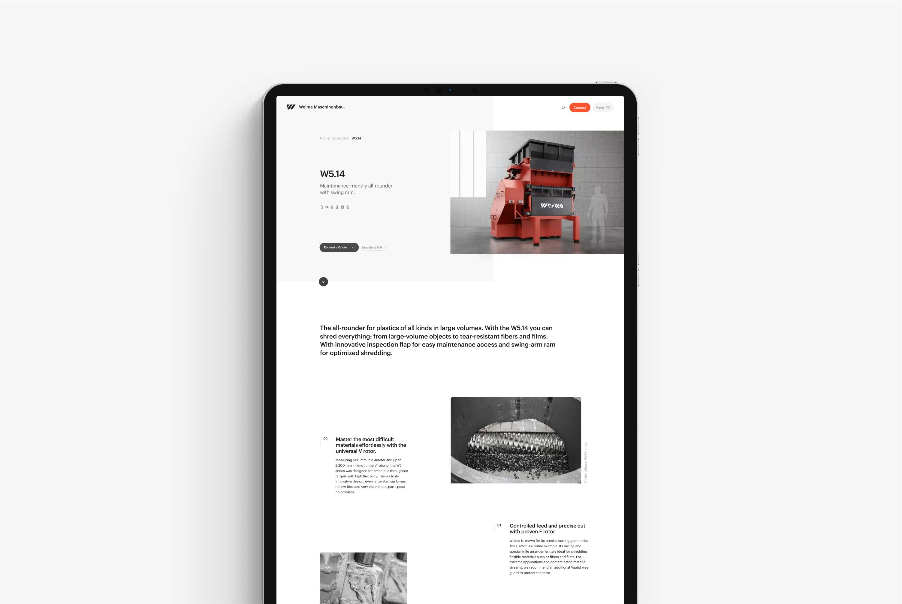
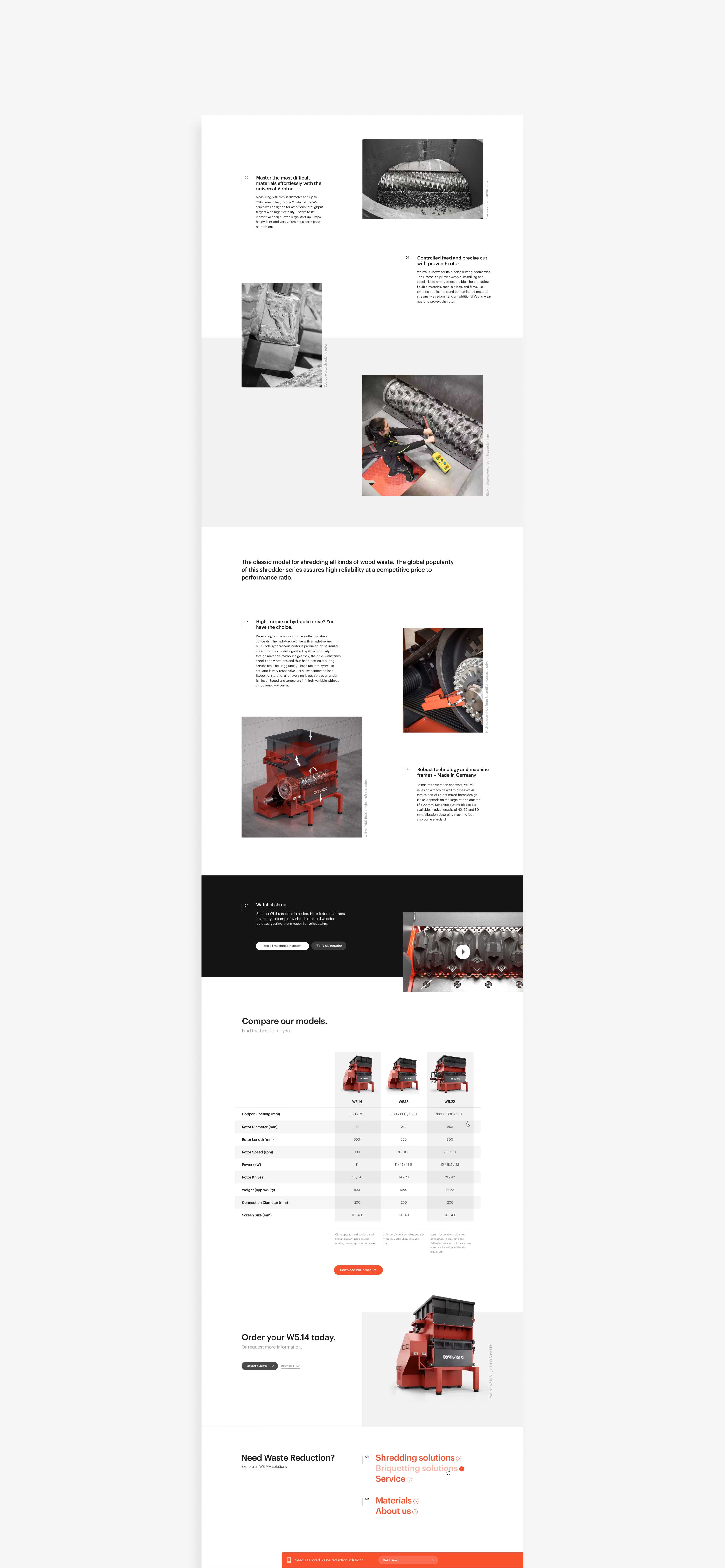
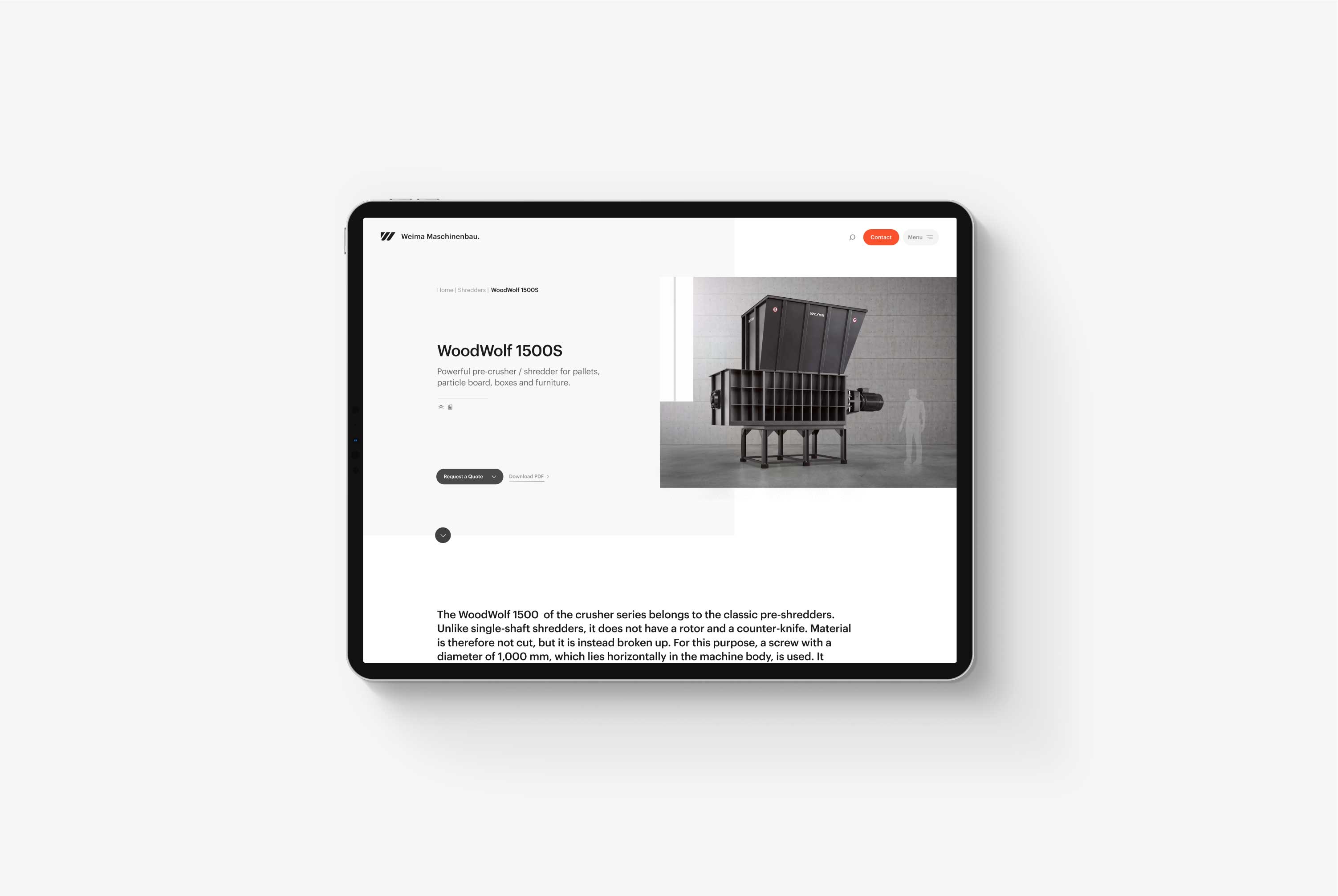
Next, we integrated the new component-based design system across the various detail pages. This feature helped Weima explain, in detail, the many differences between their machines and the materials they process. To find out which machine works best for you, we created unique detail pages focusing solely on the materials.
Success Stories & News
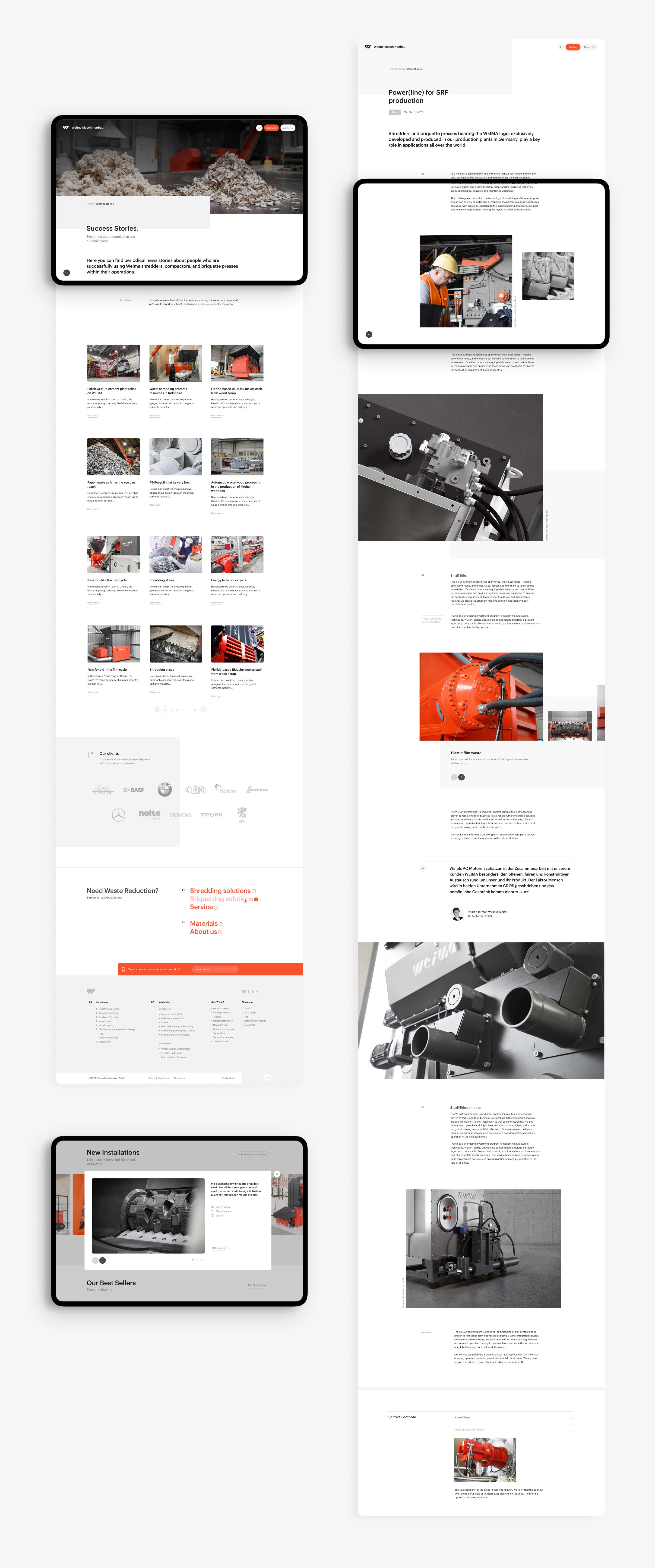
Success stories highlight how Weima's customers use and integrate their machines. On the surface, they utilize the same page template as the News pages.
As opposed to the news pages, the Success stories help customers visualize one of Weima's machines in their shop or production hall, and are full of raving reviews by owners.
Knowledge. Just A Click Away
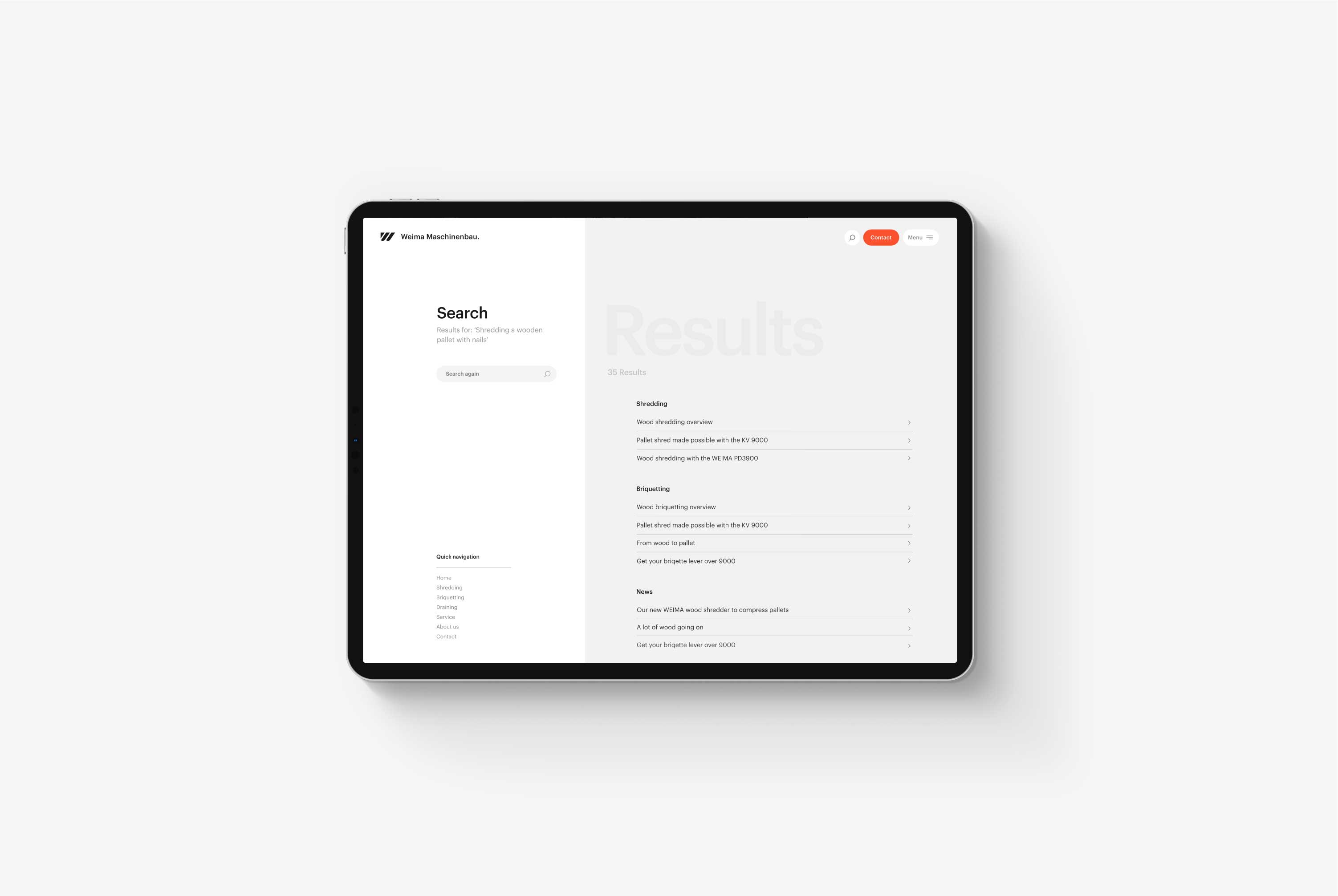
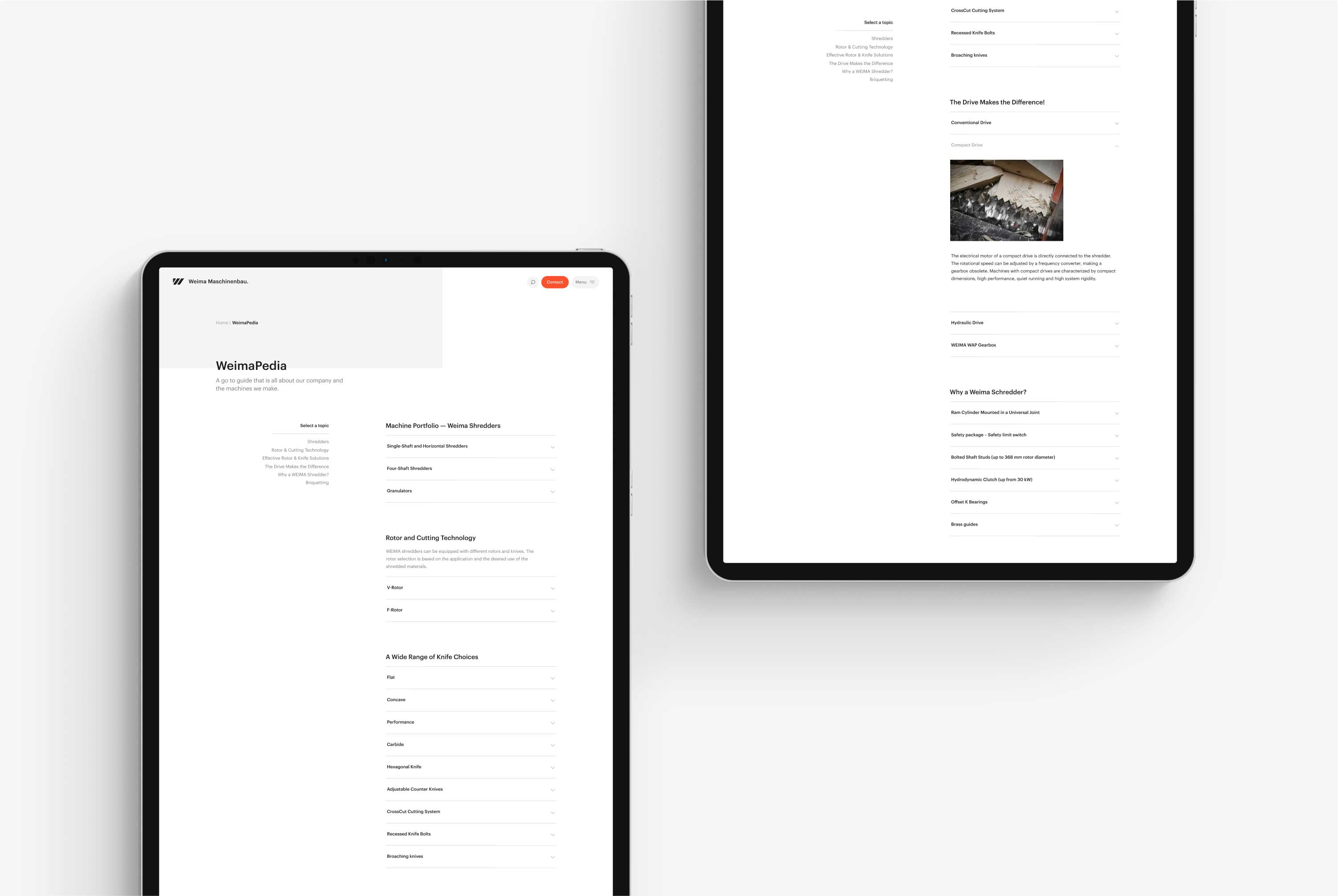
WeimaPedia has been around for a long time. Previously, it was a website on its own, but with our 2017 redesign, we integrated it into the main website. Not only for its content's findability but also because the WeimaPedia page hosts a lot of written information that is great for SEO.
WeimaPedia contains all information about accessories, terminology, maintenance, and much more. Ultimately, this page solves numerous support questions, so the user doesn't need to contact Weima.
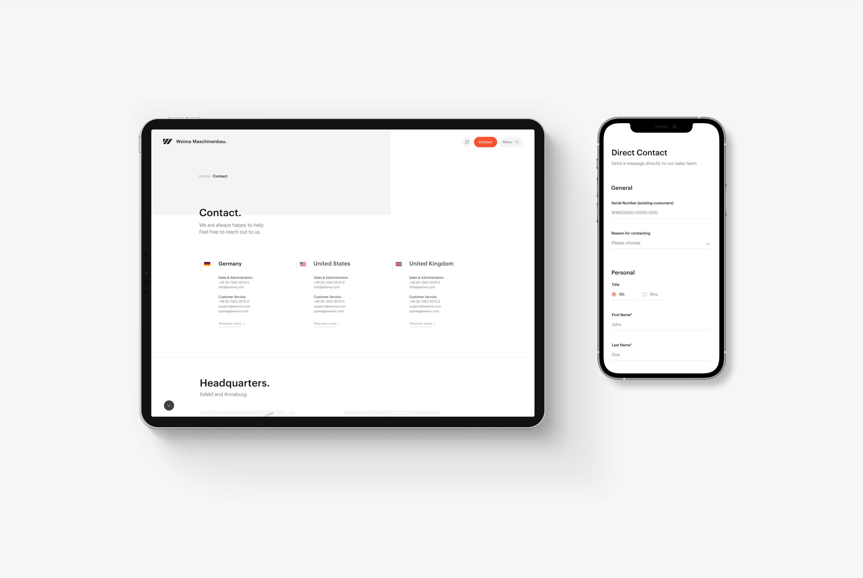
Service & Contact.
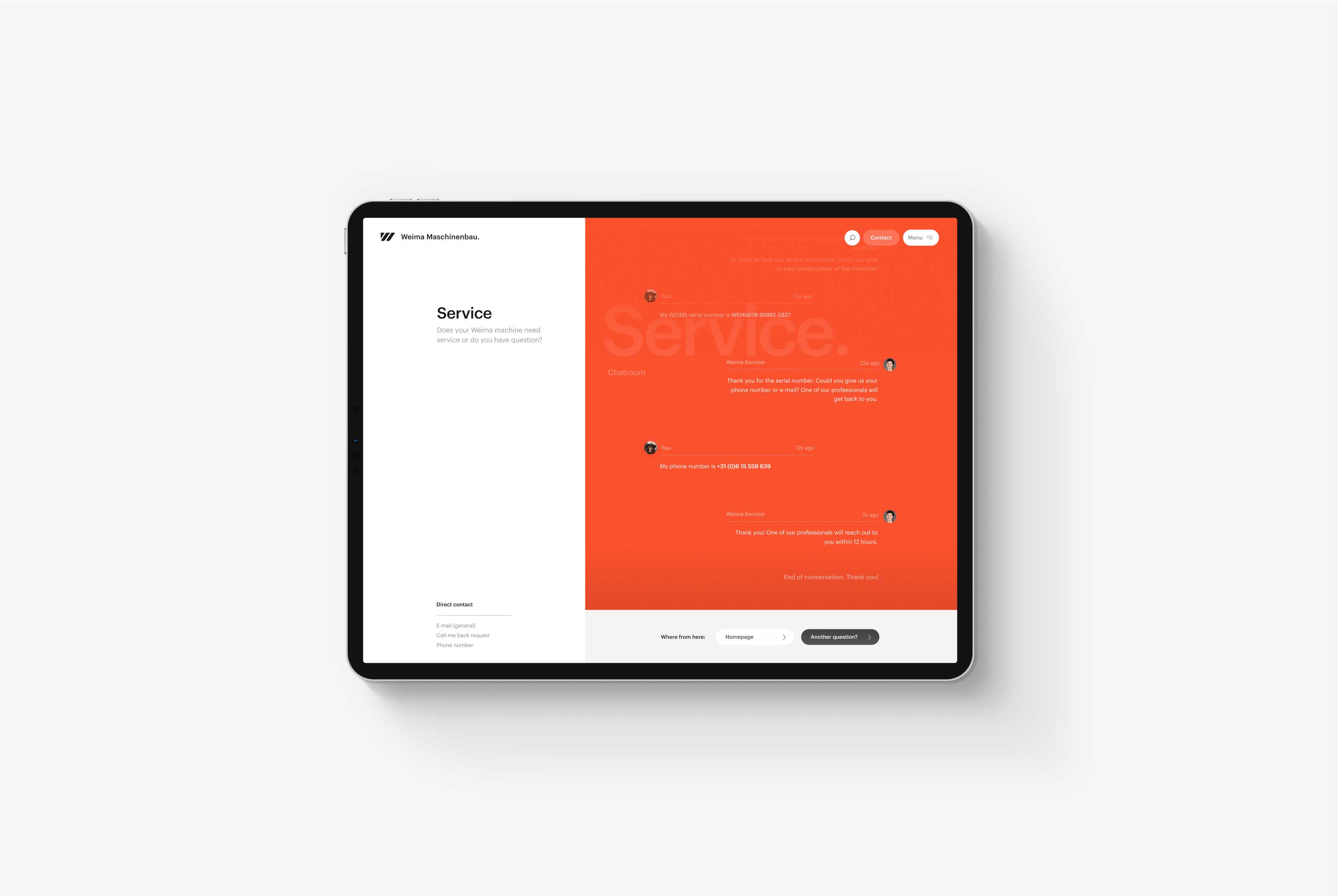
Service is a crucial part of increasing the lifespan of a Weima machine. As such, Weima provides excellent service programs accessible via the website. For example, to book an appointment for your machine, a user can open the Support chatbot, leave their serial number, and either schedule an appointment or request new parts.
When designing the new website, we purposely made the Support functionality visible. There should be no doubt that Weima is there to help you, whether you need a custom solution to adapt a Weima machine to an existing production line, require maintenance for an existing machine, or want to ask a question.
Summary
Weima has been a client of Naam for years and remains a client to this day. In the meantime, the design has been featured many times and won multiple awards, from CSS Design Awards to Awwwards SOTD.
More importantly, Weima has grown, and the website has evolved. Although I can't comment on specific numbers, the design sets Weima apart from the competition in a significant way, which is invaluable.
Weima was one of my favorite projects to work on, but it also felt great to do my part in helping the circular economy and supporting recycling efforts. A valuable industry that we need in these times.
Prototyping
Information Architecture
Design System
Creative Direction
Joris Spiertz
Ellie MacLeod
Beau Ter Steege
Jaoa Bairrada
Joris Spiertz