Huddi.
Huddi empowers small businesses to run successful e-commerce ventures. They reduce significant upfront costs by offering a monthly subscription and support model for any Shopify shop they deliver.
As a result, their clients receive a fully operating and fully supported Shopify webshop within two months without investing a large sum of money upfront.
Read more+
Huddi approached me to create a new visual identity and digital presence that would establish Huddi as a leading authority in subscription-based Shopify services.
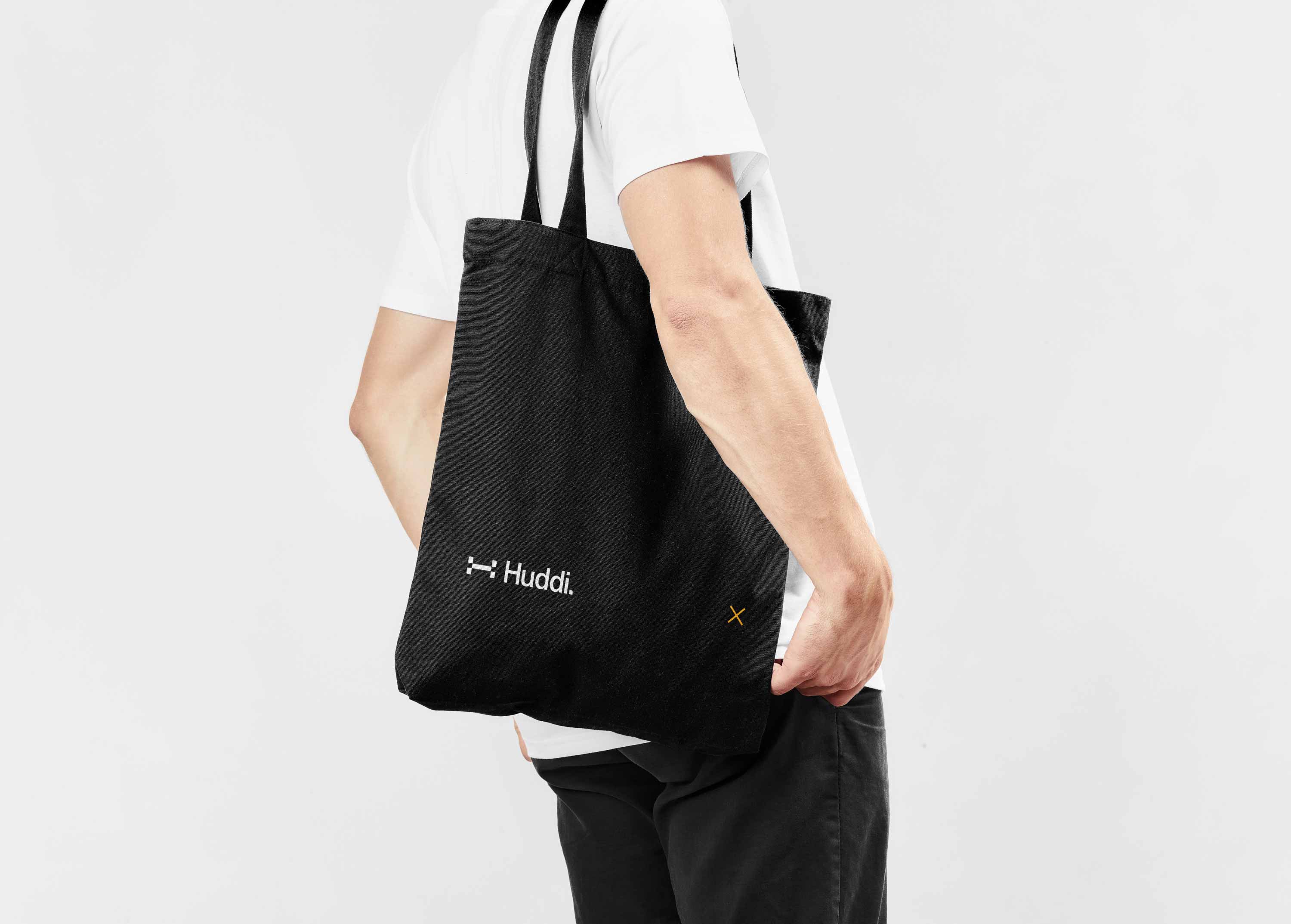
Led by a clear tone of voice and unique 'H' marquee, the result is grounded in clarity, flexibility across a wide range of applications, and humanity, by adding a photographic element to all brand touchpoints.
Prototyping
Webflow Development
Brand Identity


Product Page
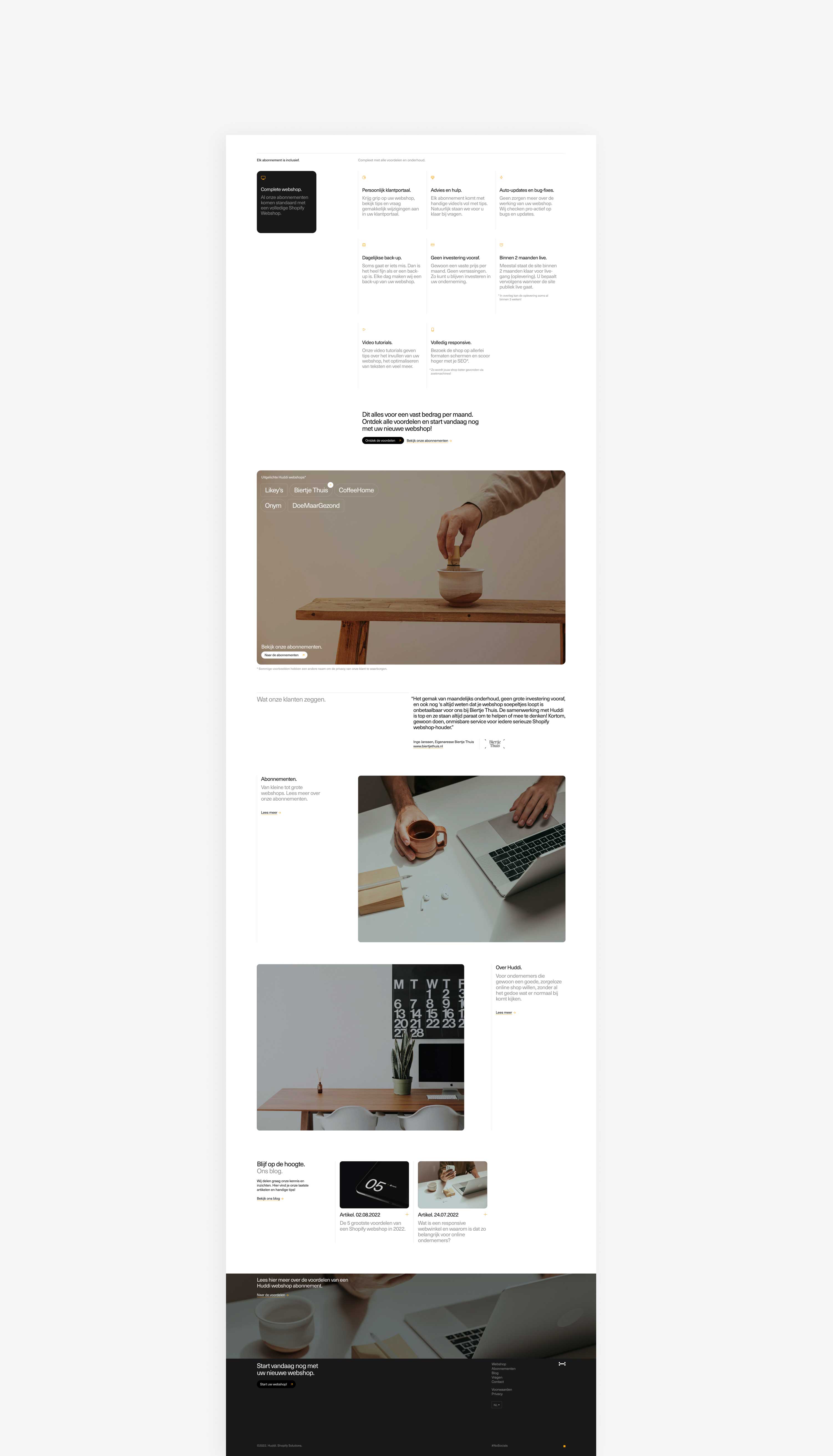
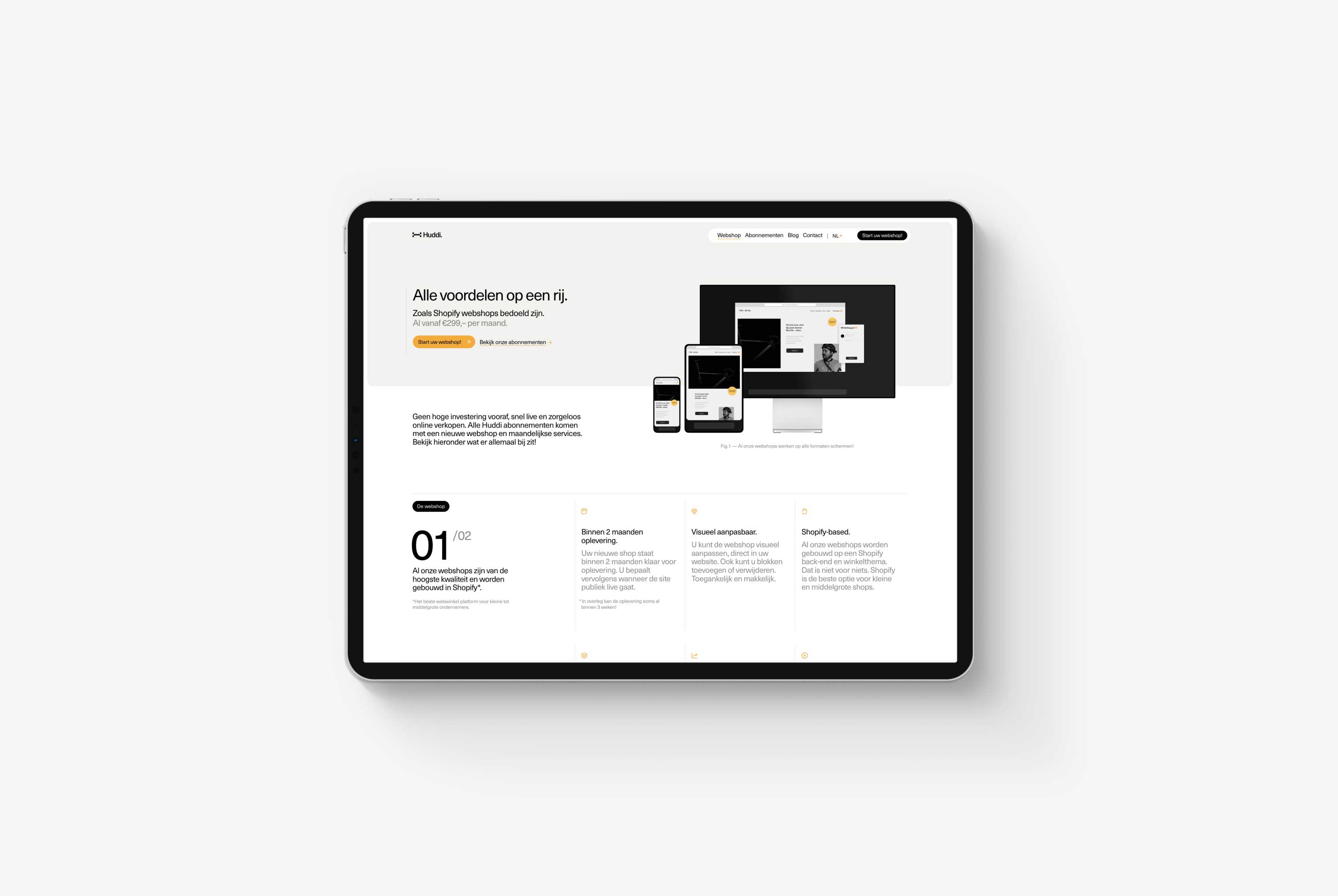
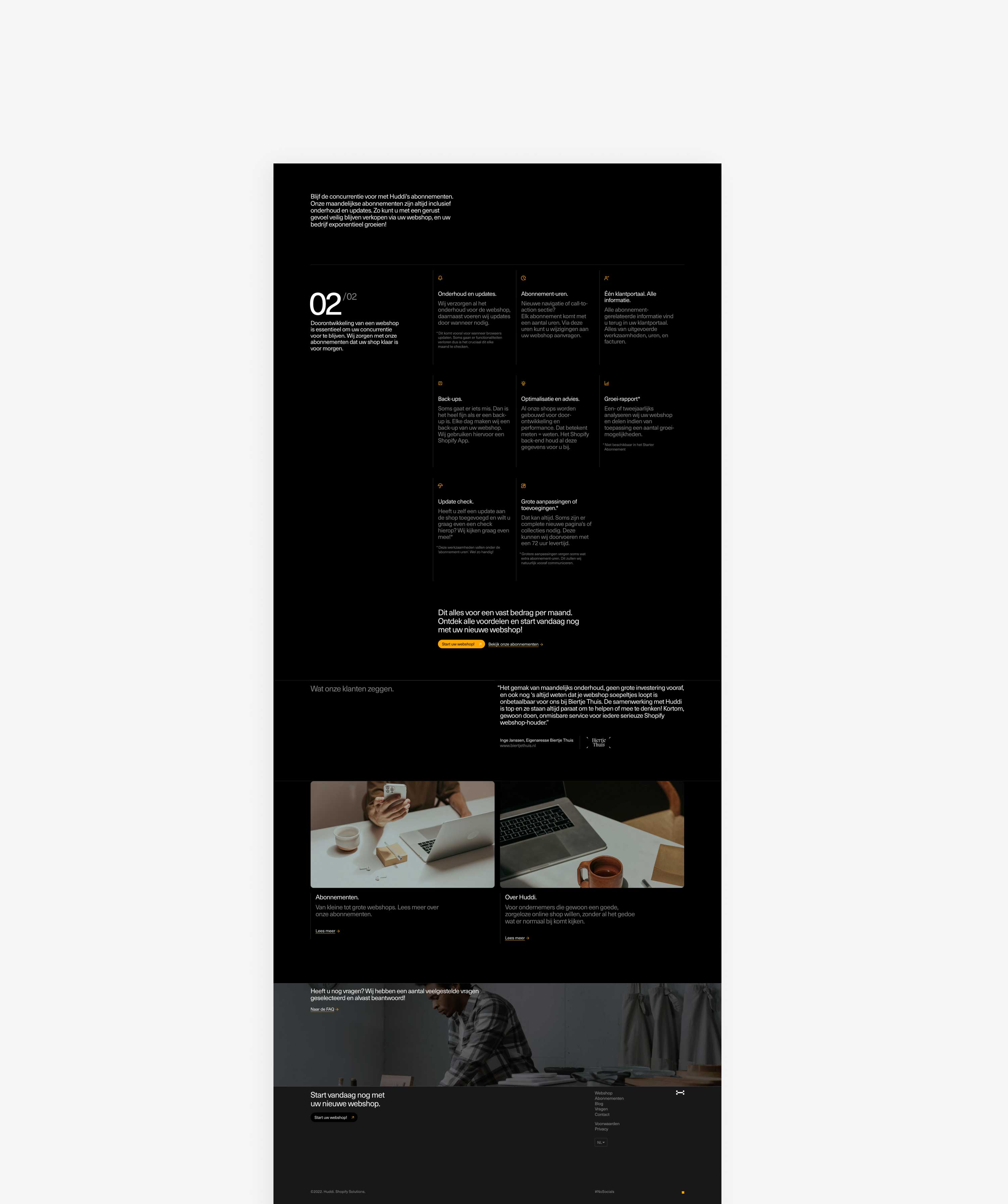
Huddi's services offer a lot of significant benefits for customers. On its dedicated product pages, they get to highlight all the perks of getting an e-commerce subscription.
Two sections make up the page; one focuses on all the webshop features included in the subscription, and the other focuses on service and maintenance.
The page's primary goal is to reduce doubts regarding owning a webshop, which can be daunting initially. We wanted the potential customers to know that Huddi's got your back, whether it's a design issue or an update gone wrong. There's no need to worry.


Design System and future Dashboard
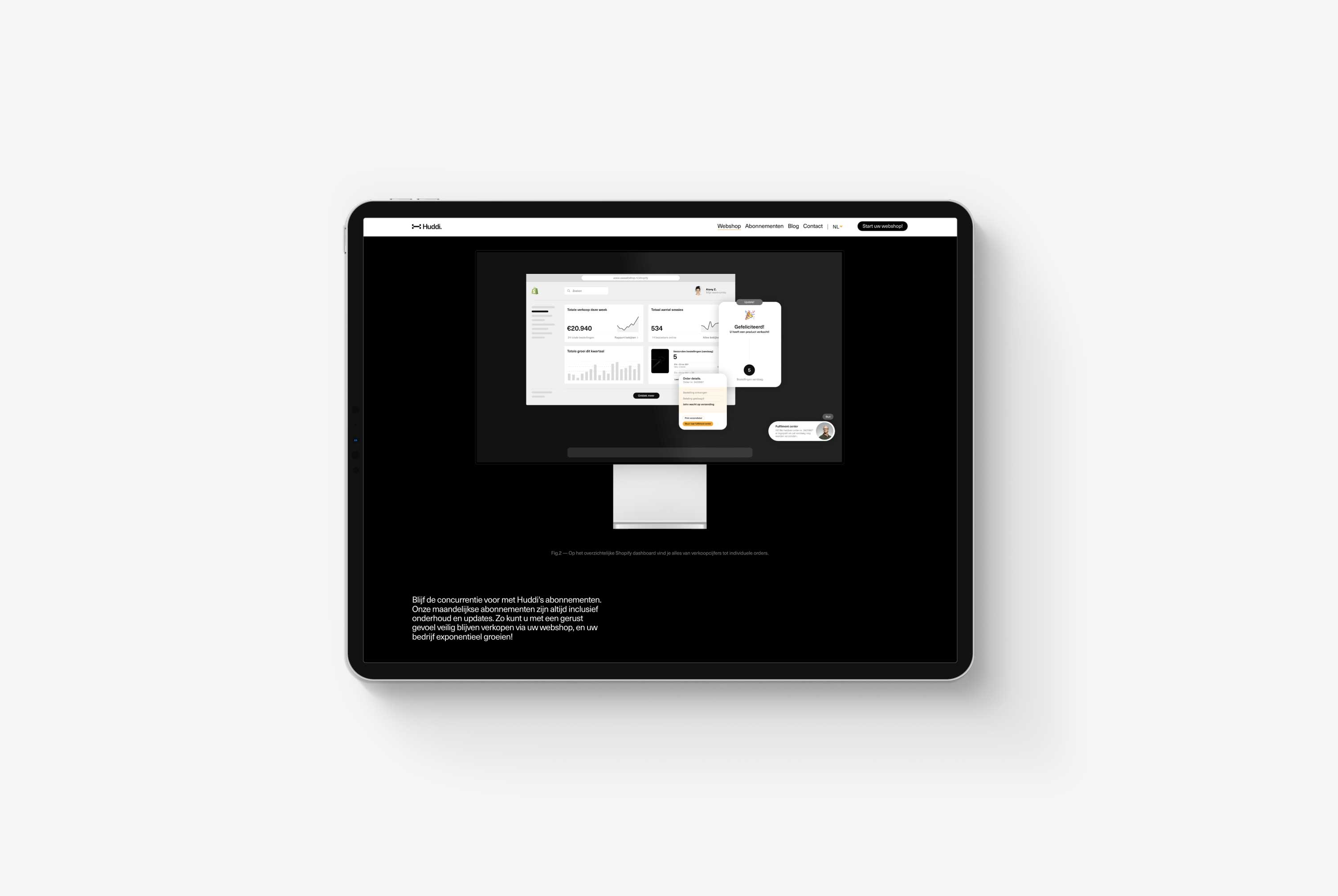
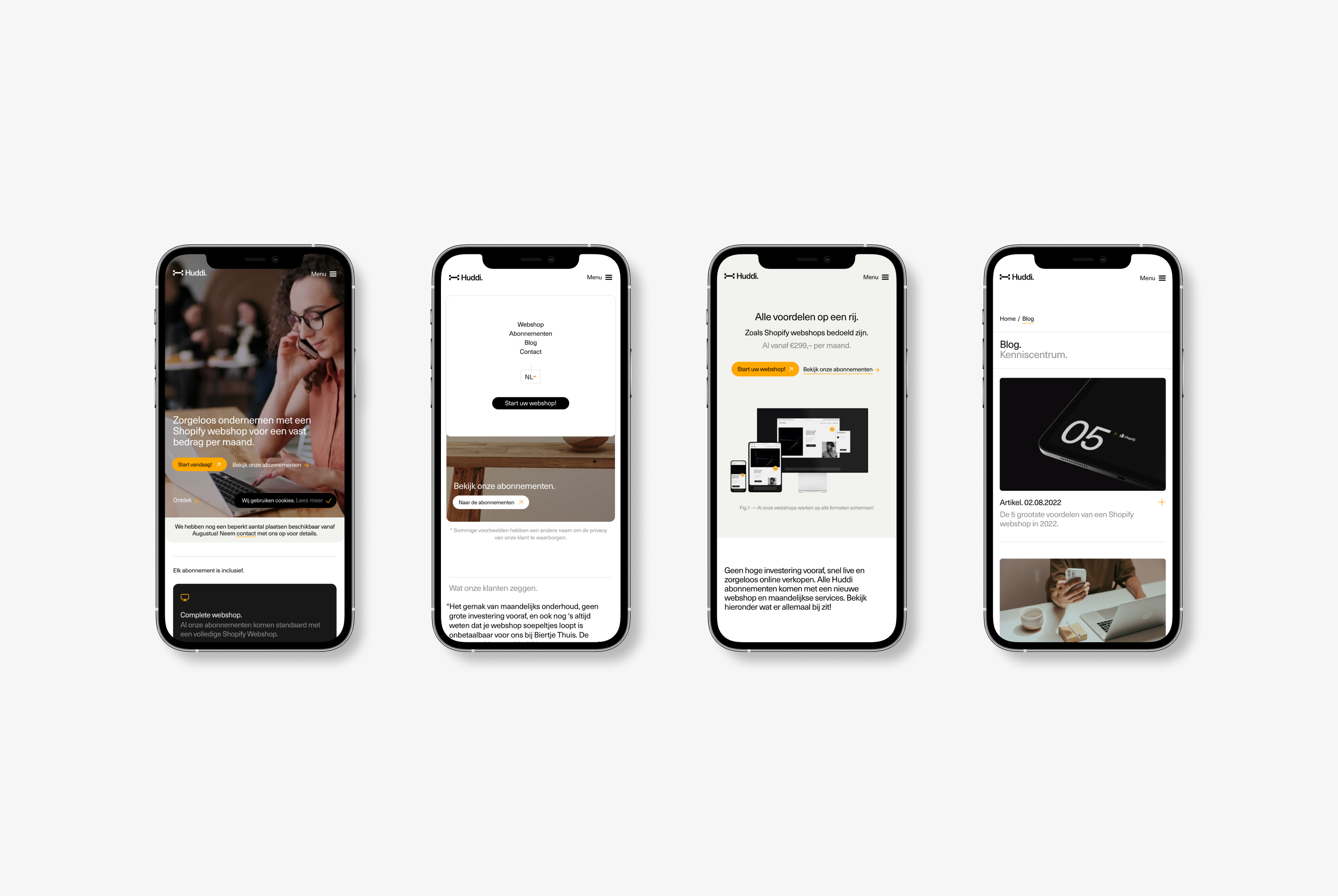
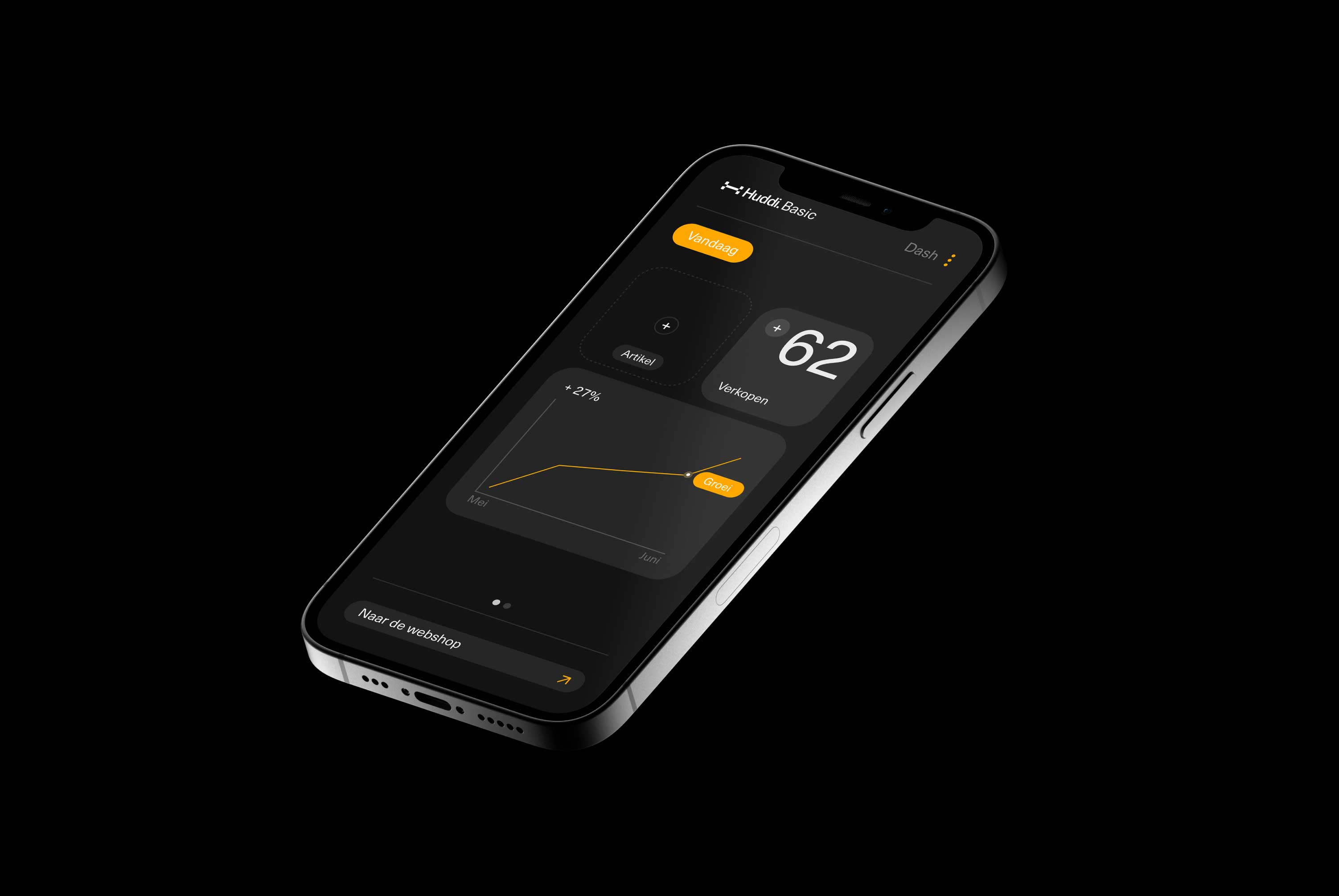
Webflow's updated components allowed me to build a modular system that would benefit future updates greatly. When designing a design language or system, it is crucial to imagine where the brand might go. Because Huddi's services will include a detailed Dashboard in the future, I've already enclosed several modules and guidelines to help boost my progress when the dashboard design starts.


Generating an Audience.
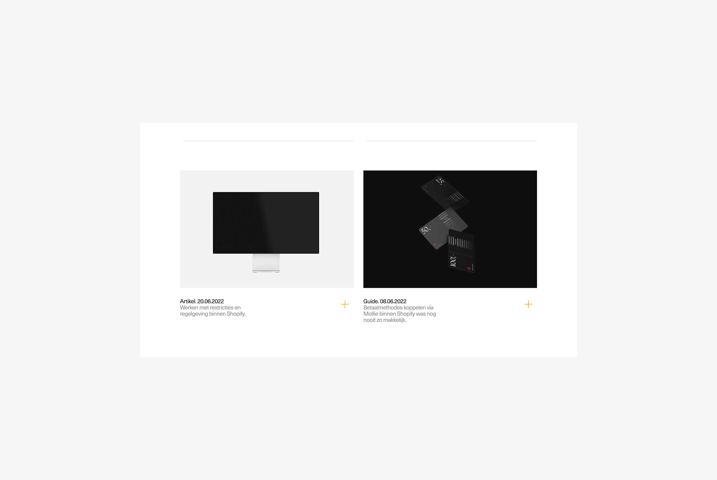
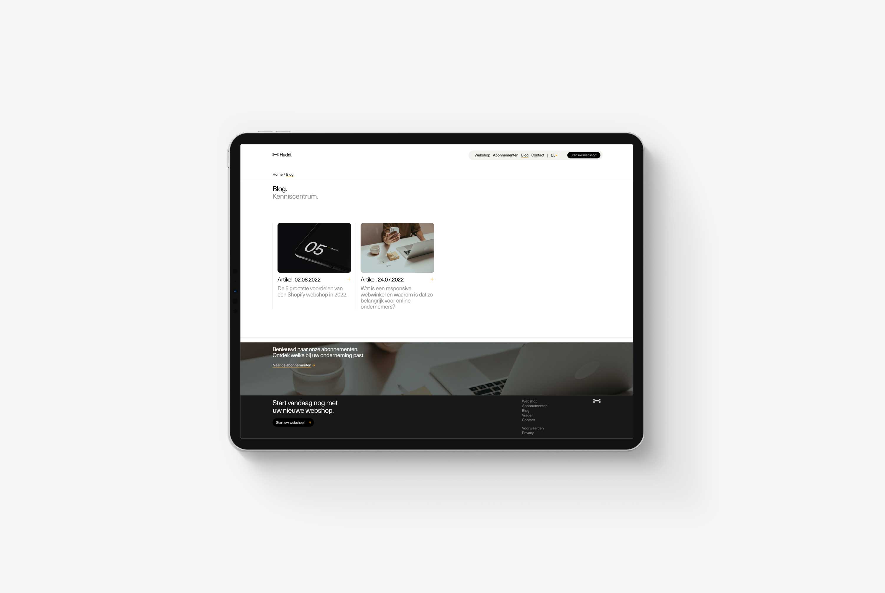
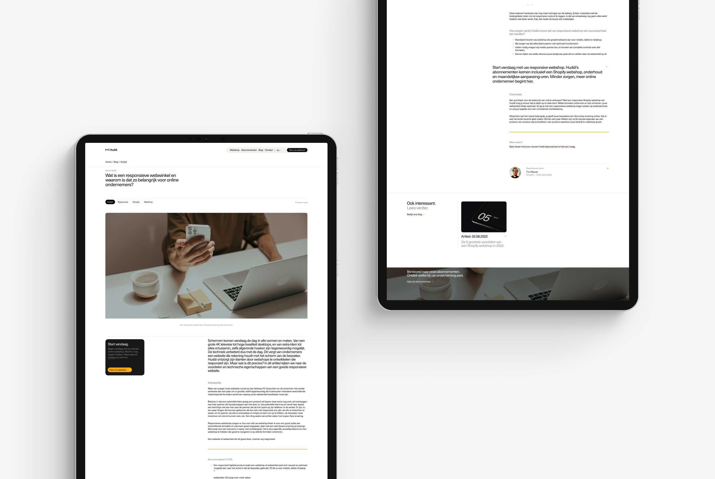
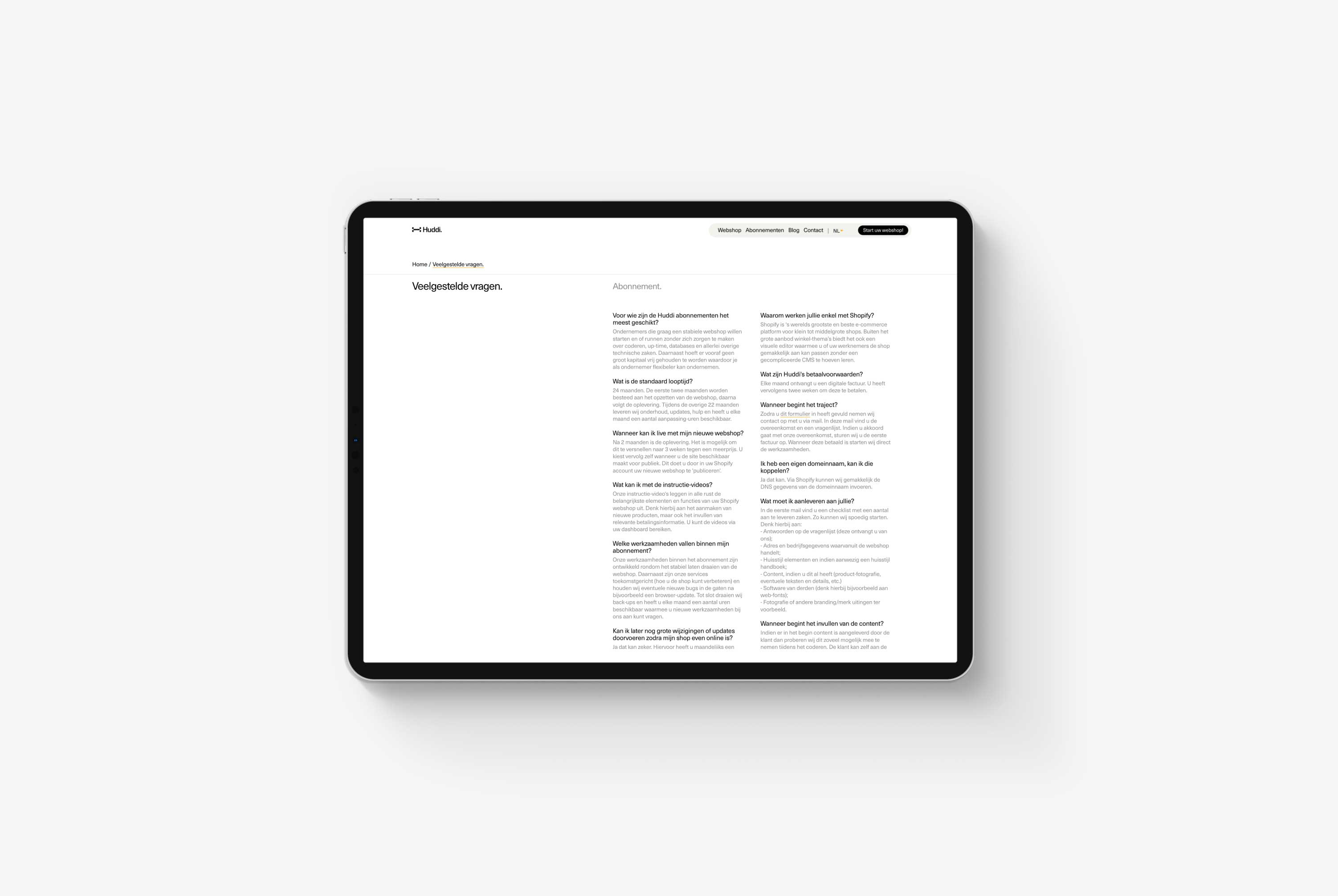
Because Huddi is a new brand without a previous online presence, it was essential to help generate traffic from search engines. As a result, I helped them set up an SEO strategy to help improve the status of the website amongst search engines. One of the first things I advised them to start doing was writing a blog and sharing all their knowledge while keeping a keen eye on keywords and phrases.
Important Sections.
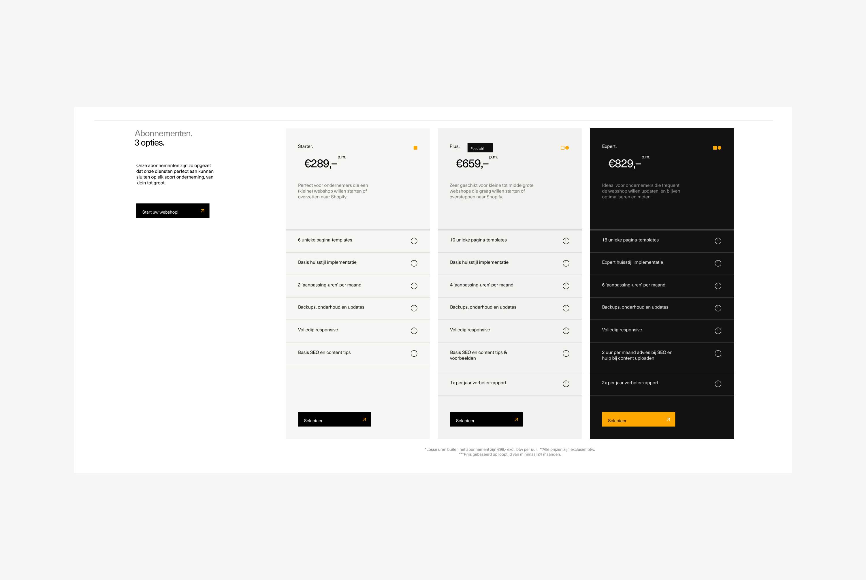
Not all pages are equal. Every website contains a few pages they rely on for their survival and performance. In Huddi's case, these pages are the pricing and sign-up page. Both play a crucial role in Huddi's sales funnel.
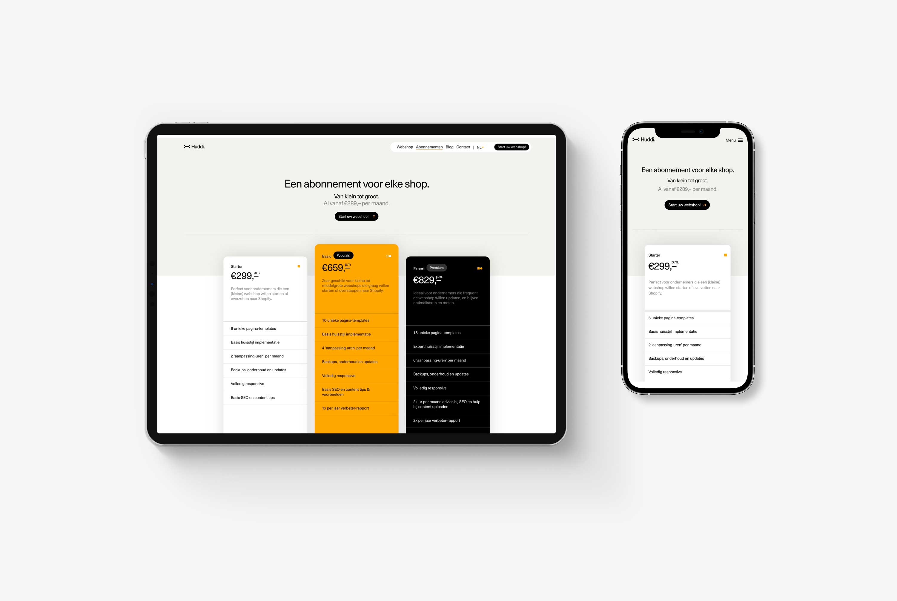
The pricing page aims to help customers choose which plan is right for them. Therefore, it was vital to help potential customers choose by highlighting different pricing tiers and potential benefits and, finally, to guide them to the sign-up page.
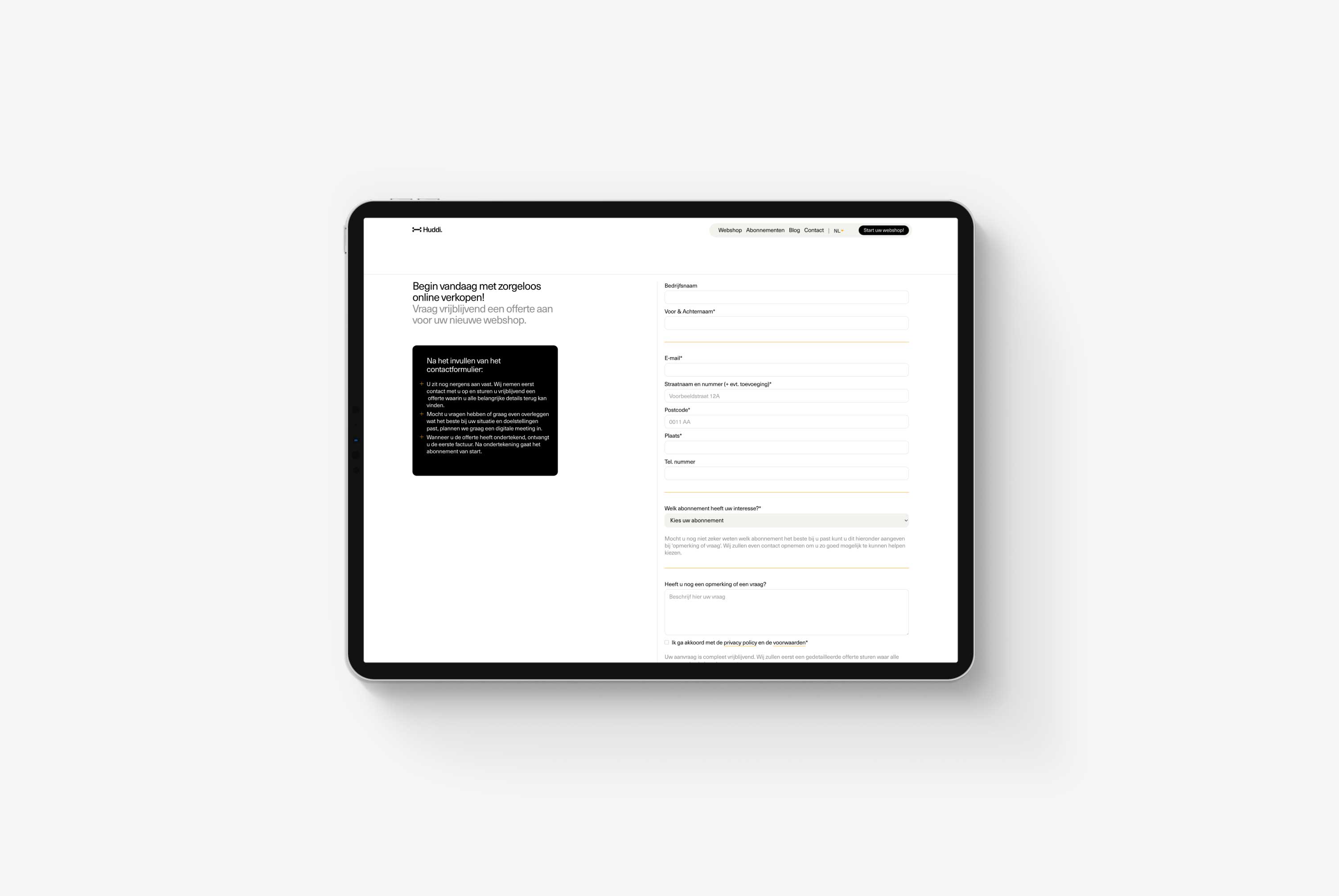
The sign-up page is simple and clean. The form is easy to understand, offers additional information where necessary, and follows general design patterns to ensure easy completion. On the back end, the form's data is integrated with a 3rd party API to forward protected personal information to Huddi's CRM for further action.
A Look Inside
Huddi is a brand-new company; they've only been around for a few months. For this reason, I decided to develop Huddi's new website in Webflow, as it provides flexibility, scalability, and easy editing.
Underneath, you will find a sneak peek into the Webflow Designer, where the pages are meticulously structured and neatly developed. In addition, all styling classes consist of BEM formatting, allowing an iterative workflow and future edits without requiring extensive research.


Information architecture
Prototyping
User journey mapping
Web design