Naam Agency '18. Mini Case
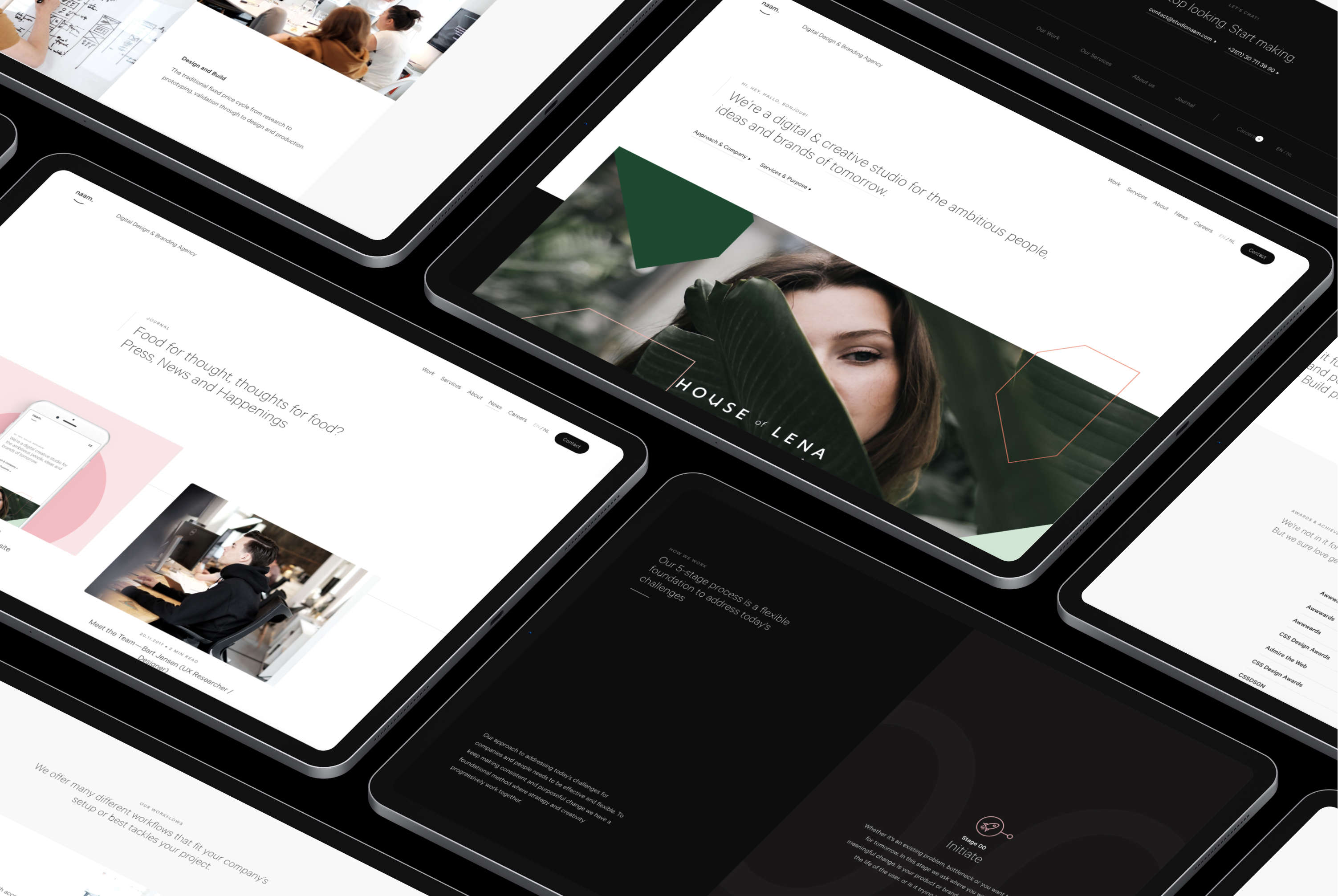
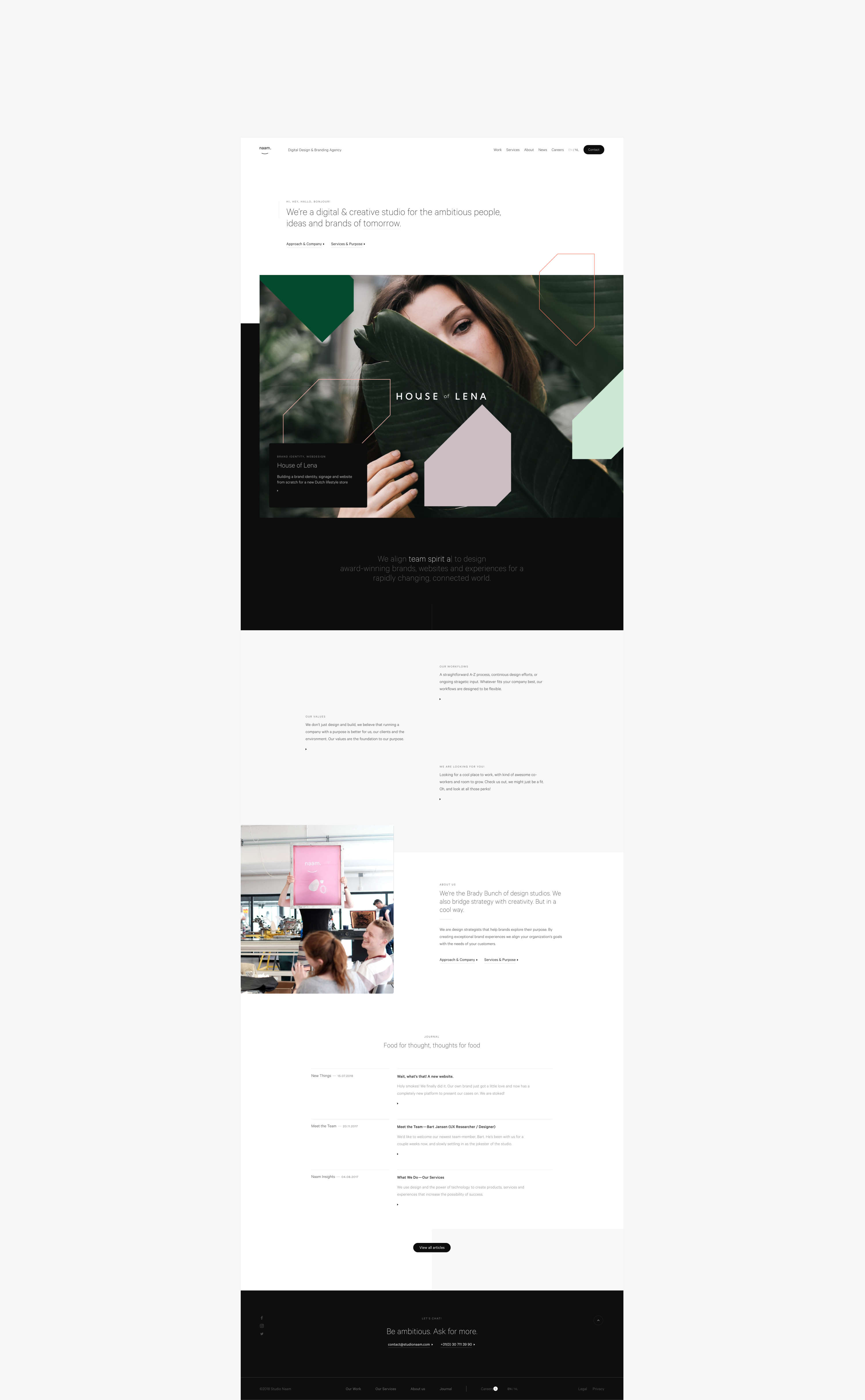
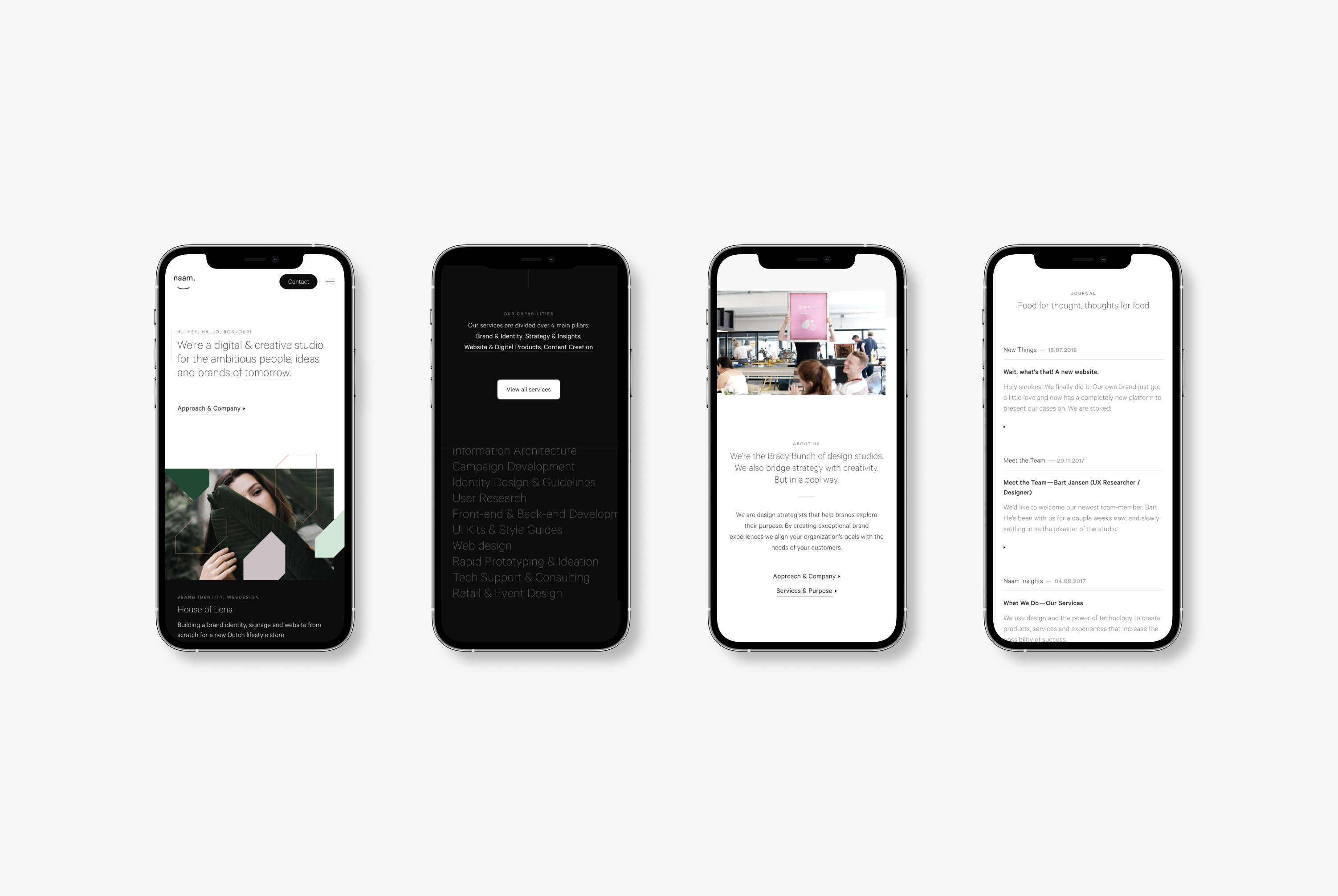
In 2018 we set out to redesign our website to show our audience that we are a creative agency focused mainly on providing digital design and development services.
Read more+
Before, our sites concentrated primarily on presenting beautifully designed solutions. However, most of the projects we realized focused mainly on user-centered digital products.
To ensure the new site captured our services perfectly, we completely overhauled it. Together with the team, we hosted multiple workshops to get everyone aligned and generate ideas for the website. I was responsible for the design, tone of voice, and site content.
Additionally, I developed the complete design in Webflow, and our development team then took my Webflow front-end code to connect it to a custom WordPress backend.The website allowed us to reach new clients, hire fantastic talent, and grow the company.
Even though I've designed a few updates for the Naam Agency website, we still have the original version of this design online at the time of writing.
Prototyping
Content Creation
Copywriting
Workshops
Tone of Voice
Creative Direction


About Time.
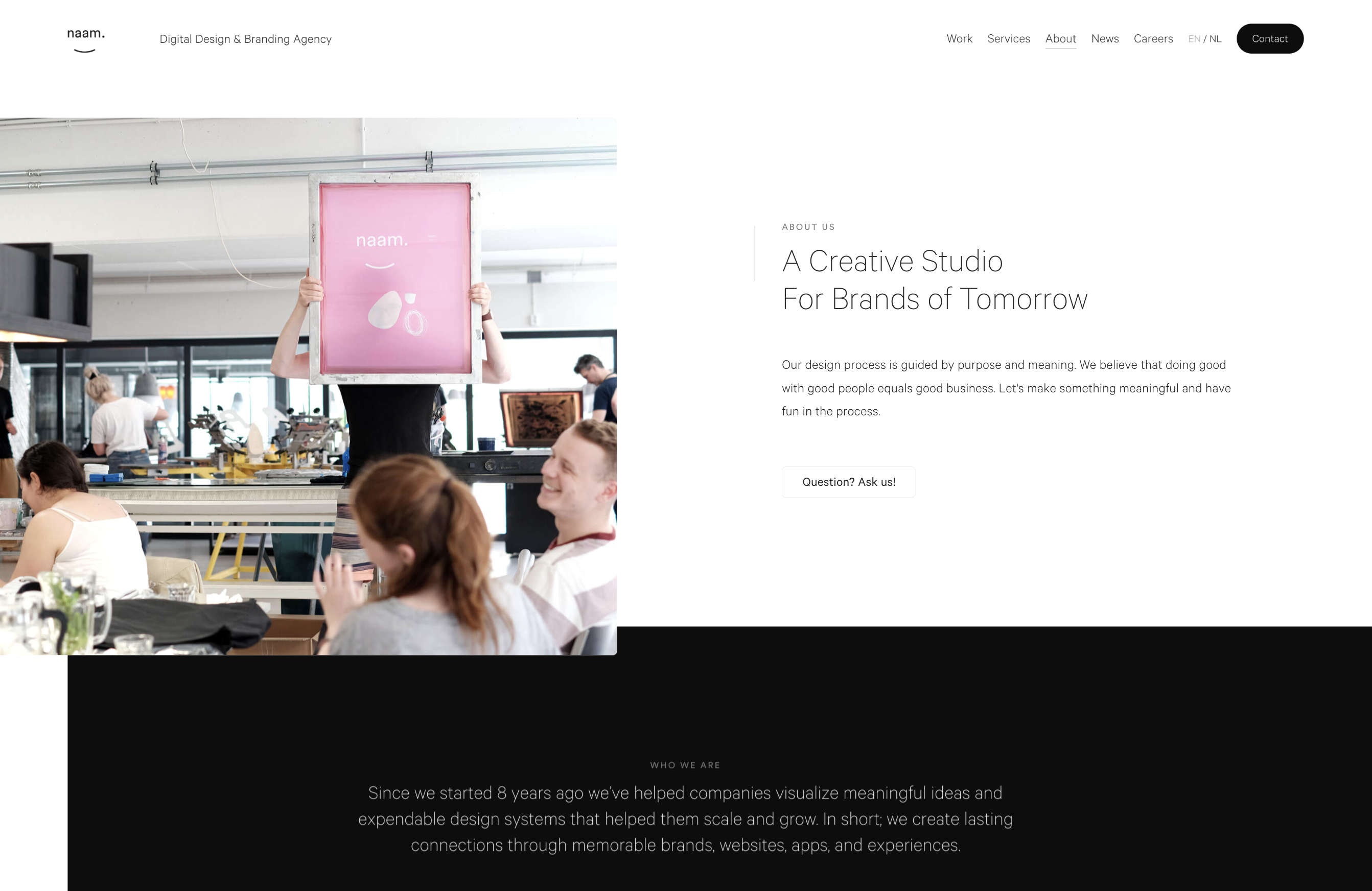
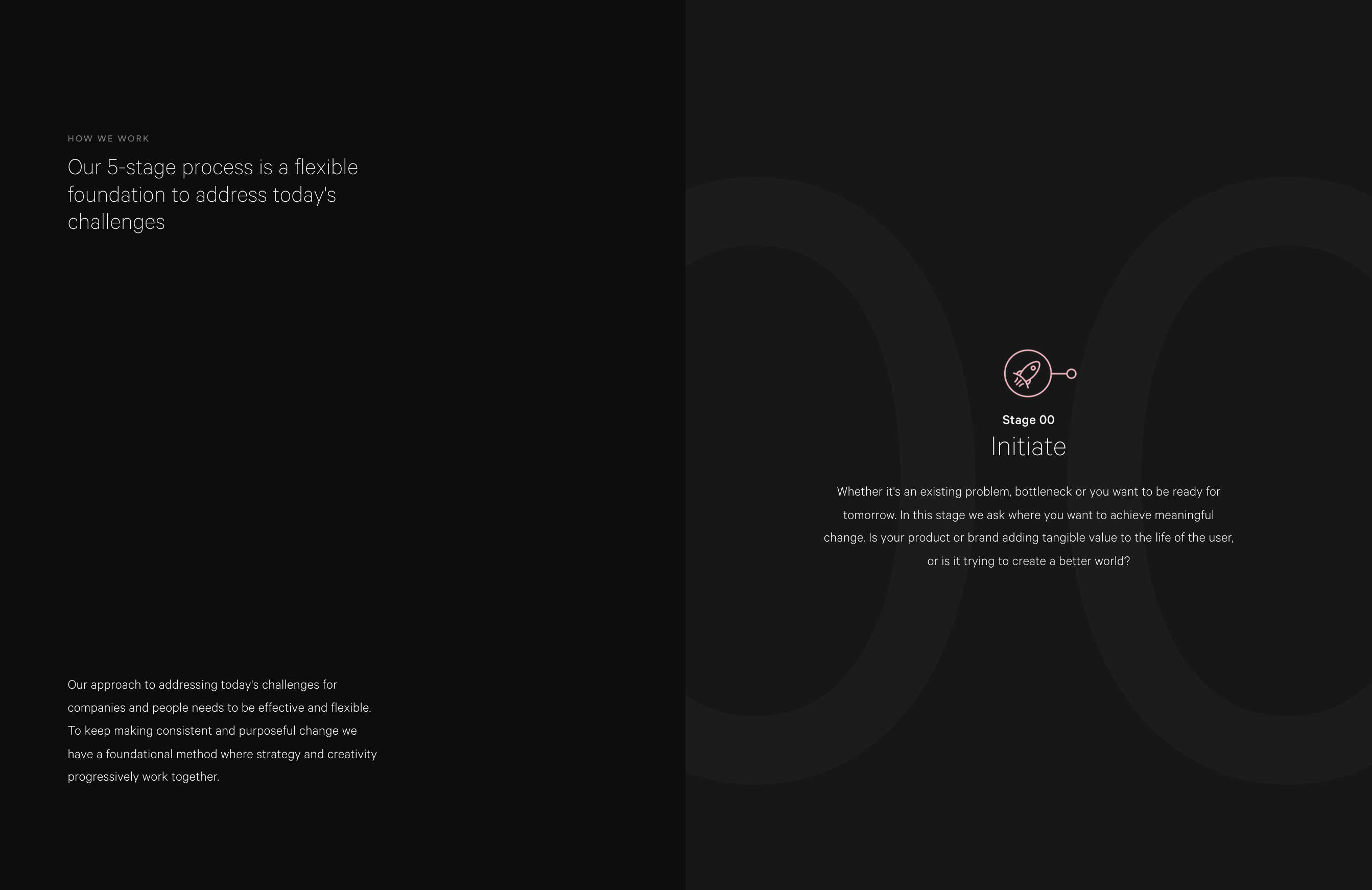
At Naam Agency, we care greatly about finding talent and potential clients that match our values and work methodology.
To give our visitors an idea of the kind of company we are, we designed an about page displaying who we are, how we work, and what we do best to make it all a little more personal.






Projects
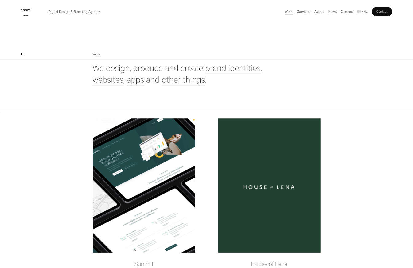
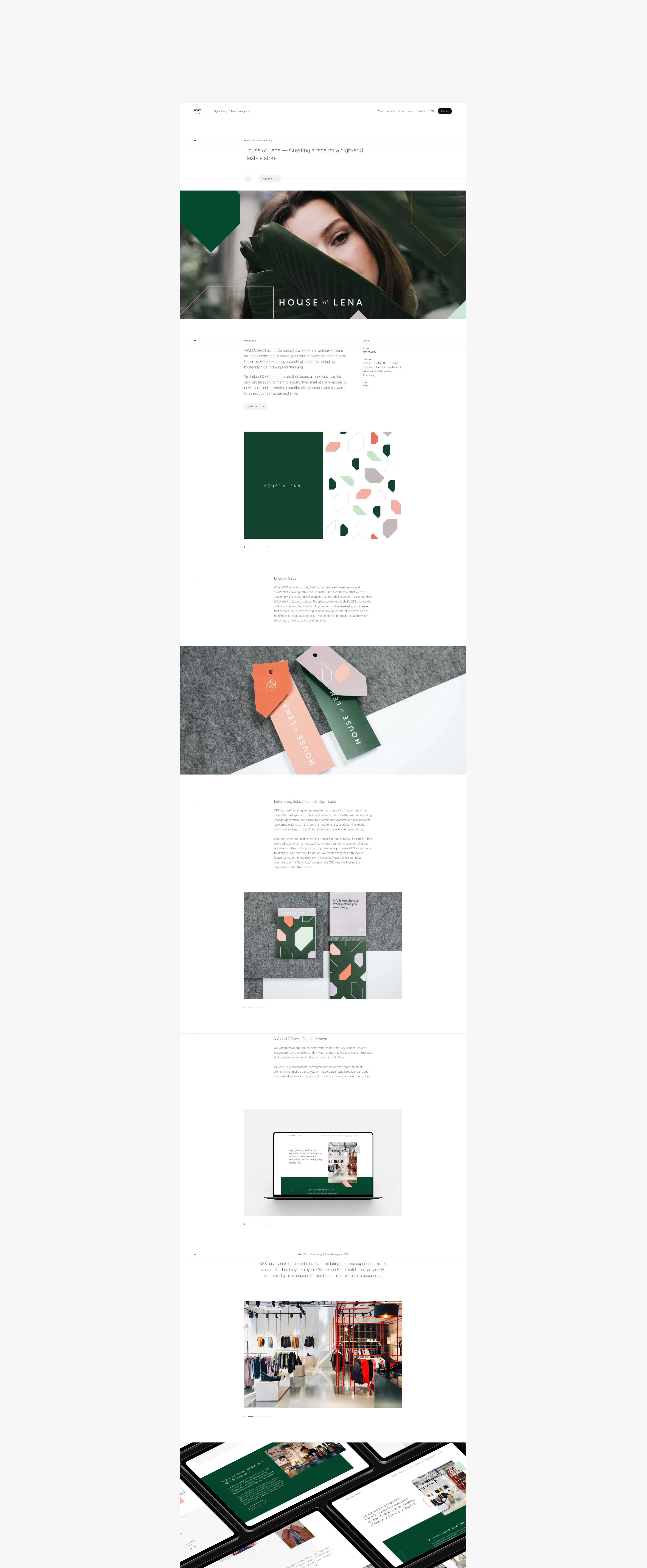
One of the most important aspects of our redesign was the new structure for the case studies. I knew it was essential to safeguard consistency when the team worked on creating materials for the case studies, so I took time to design the structural components, build a shared Figma library for the team, and write protocols on the tone of voice and how to compose the case studies.
Ultimately, we created a selection of essential case studies that go in-depth into the process and results for our clients. The outcome was successful, as many clients referred to our recent case studies when requesting a proposal.


Brand Assets
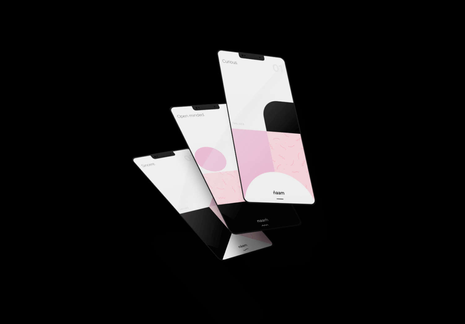
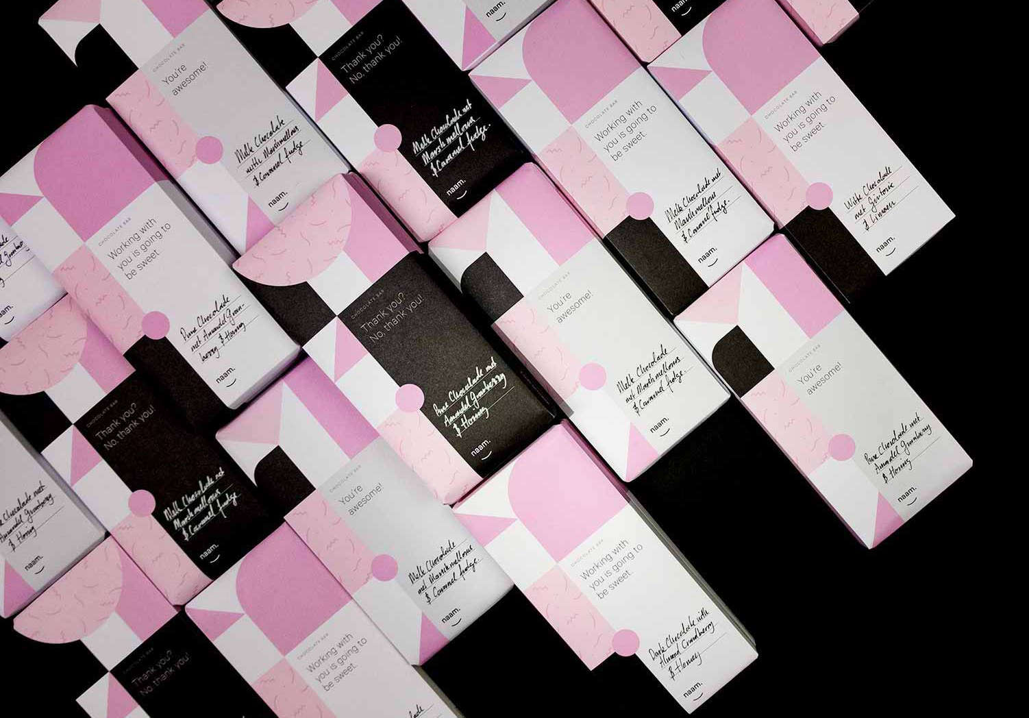
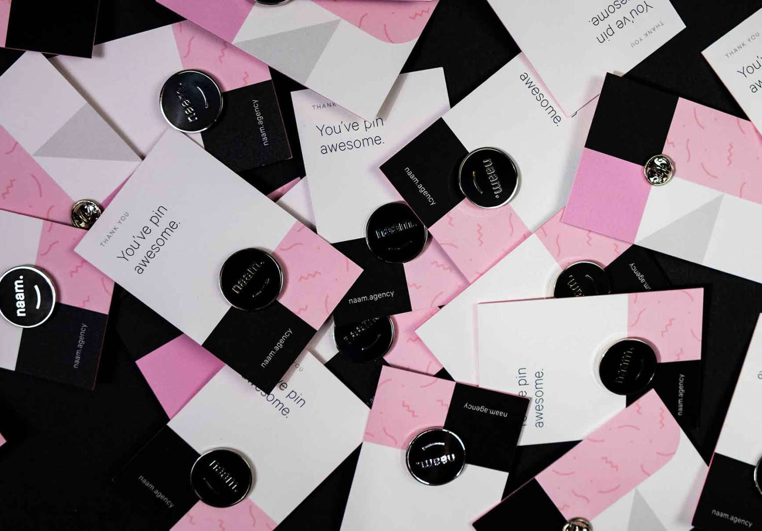
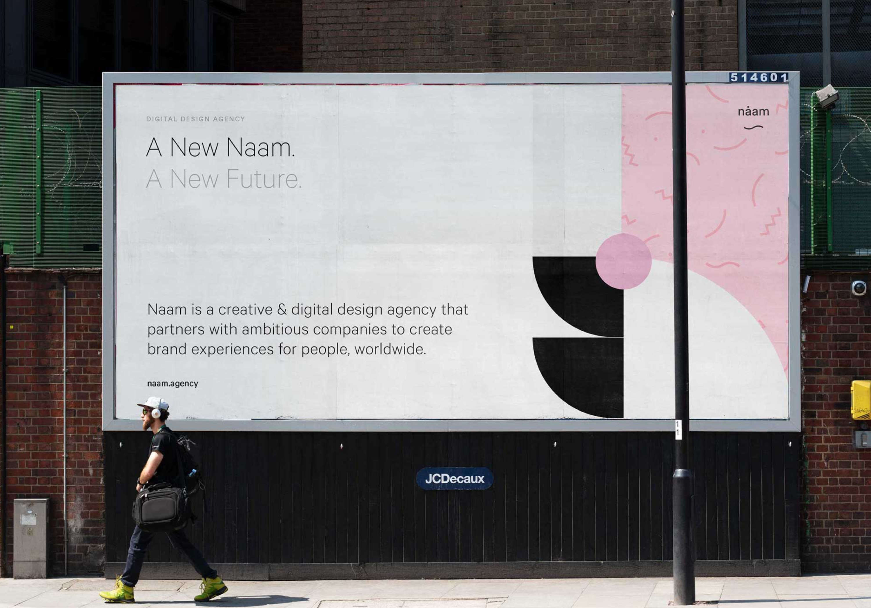
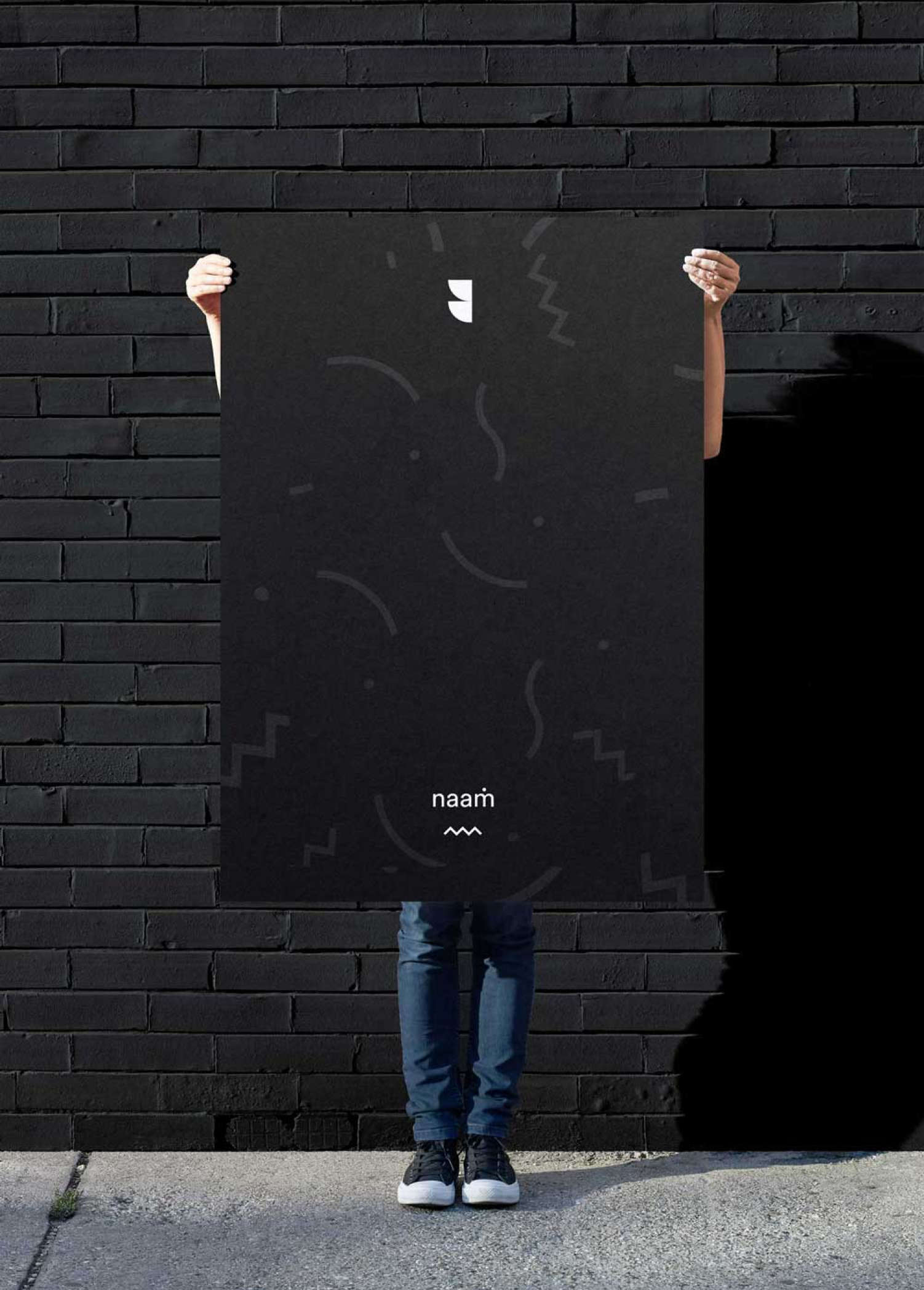
Besides the website, we also redesigned our visual identity with friendly colors and a brand-new logo. In addition, after searching for a more flexible digital font, I introduced the Calibre typeface.
This new look elevated our brand significantly, and in the following months, we created various print materials and holiday gifts for clients.
404
Sometimes a 404 page is the perfect page to show some of your development skills. For example, I love creating strange abstract interactions like the one here, and the 404 is the ideal page for a little experimentation and fun.
Because, after all, If I did a good job building this website, only a few people should ever end up there unless they're doing it on purpose to play with the interaction.


Prototyping
Workshops
Tone of Voice
Creative Direction
Content Creation
Copywriting
Lieneke Koenen (Back-end)
Joris Spiertz
Joris Spiertz