Qastor. By QPS
QPS Qastor is known worldwide as a market leader in precise maritime navigation software technology. To help them retain their market position, we completely redesigned the Qastor app, focusing on making it more user-friendly and accessible.
Read more+
We achieved this by designing new functionalities, prioritizing important information, and bringing essential details to the forefront. As a result, the Qastor app helps pilots get ships in and out of the harbor safely and without delays.
For the pilot, all critical information is a tap away. Real-time data allows for well-considered choices to be made quickly and effectively.
The app is available for maritime professionals in the Apple App Store and Google Play Store.
Information Architecture
Strategy
Creative Direction
User Journeys
Challenges.
During the process we created a few main questions to help us structure our information, and keep the user & business needs in mind.
Voyaging
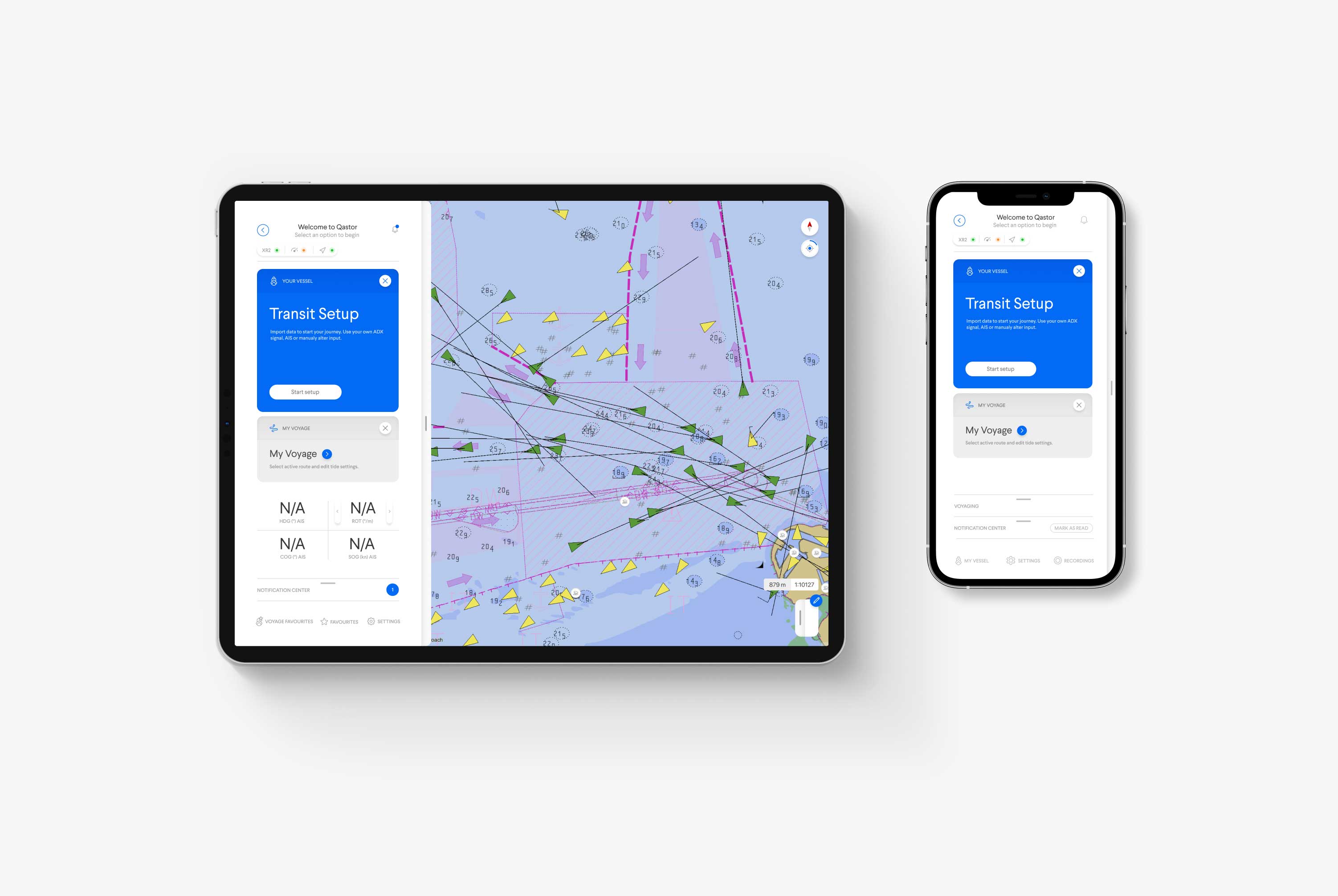
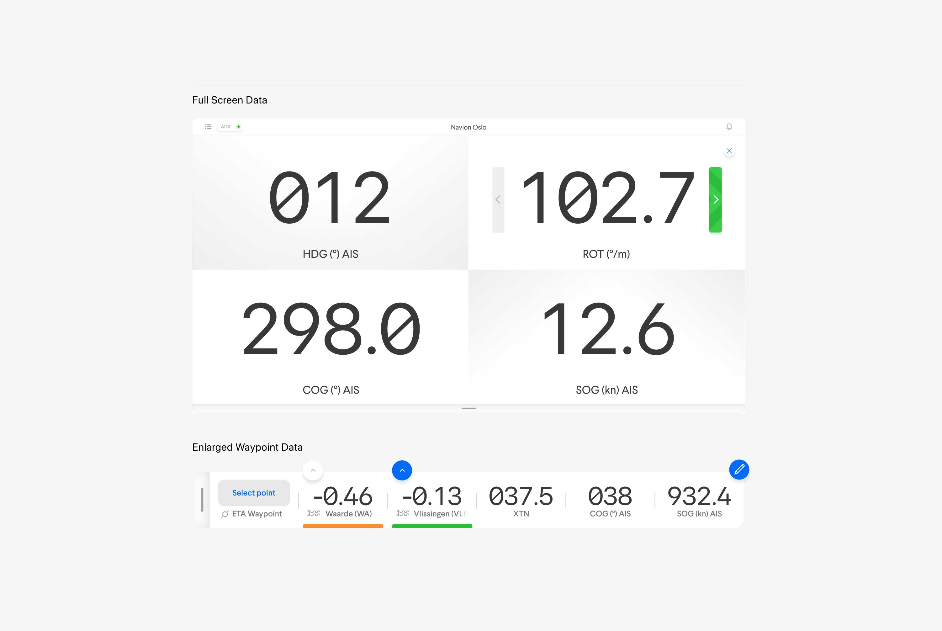
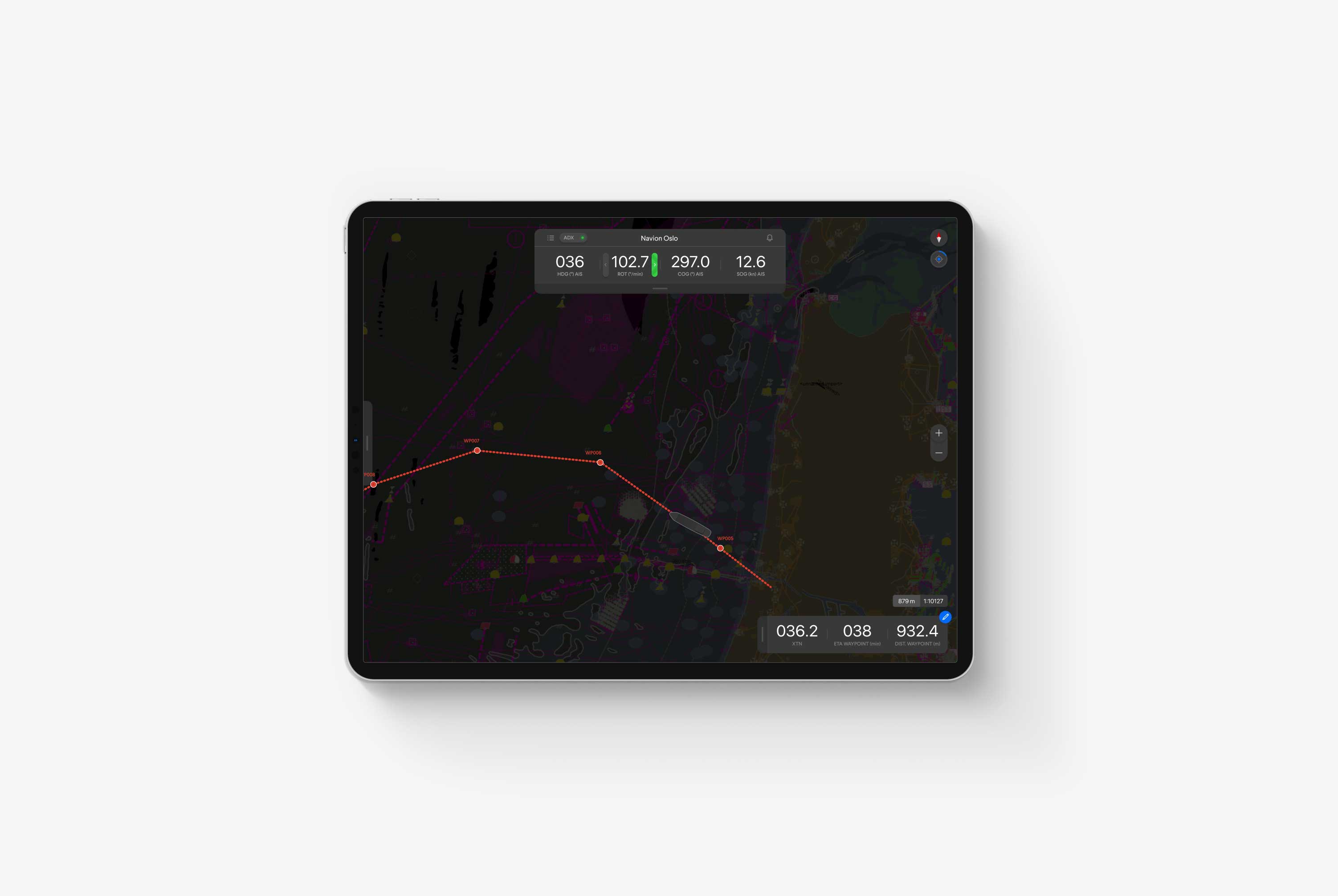
One of the essential functions of Qastor is to set a voyaging route consisting of multiple waypoints. The waypoints are vital in piloting, for example, they help a pilot navigate complex channels, canals, and open waters, which could hide treacherous rock formations.
As a result, the pilot relies heavily on real-time data, warning notifications, and various personal interface settings. Besides that, it's crucial that a pilot can record his waypoint voyage, dissect any issues that arise, and plot a secure course onwards.
Qastor's voyaging interface modules help the pilot control the app using a combination of general UX design patterns, extensive user research (and user inclusion in the design process), behavioral observations, and an onshore team with decades of offshore experience.
Notifications
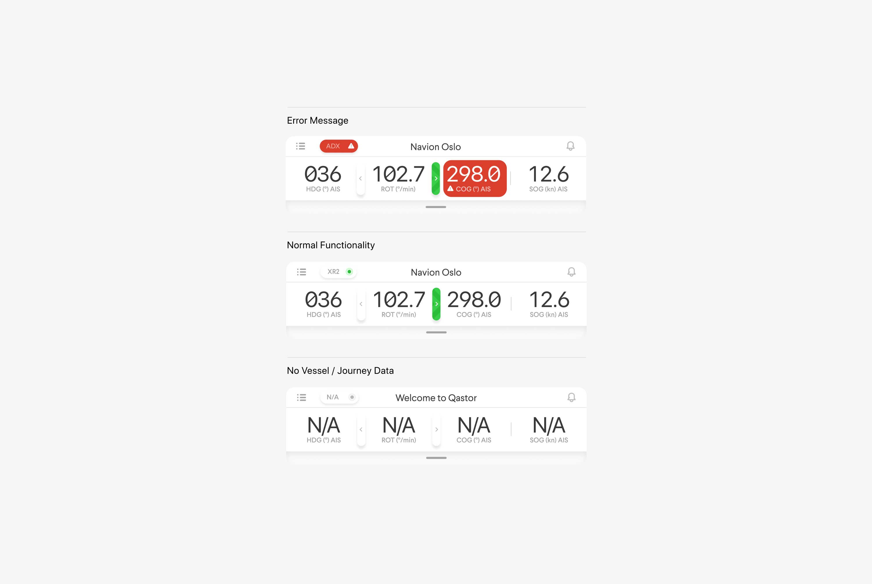
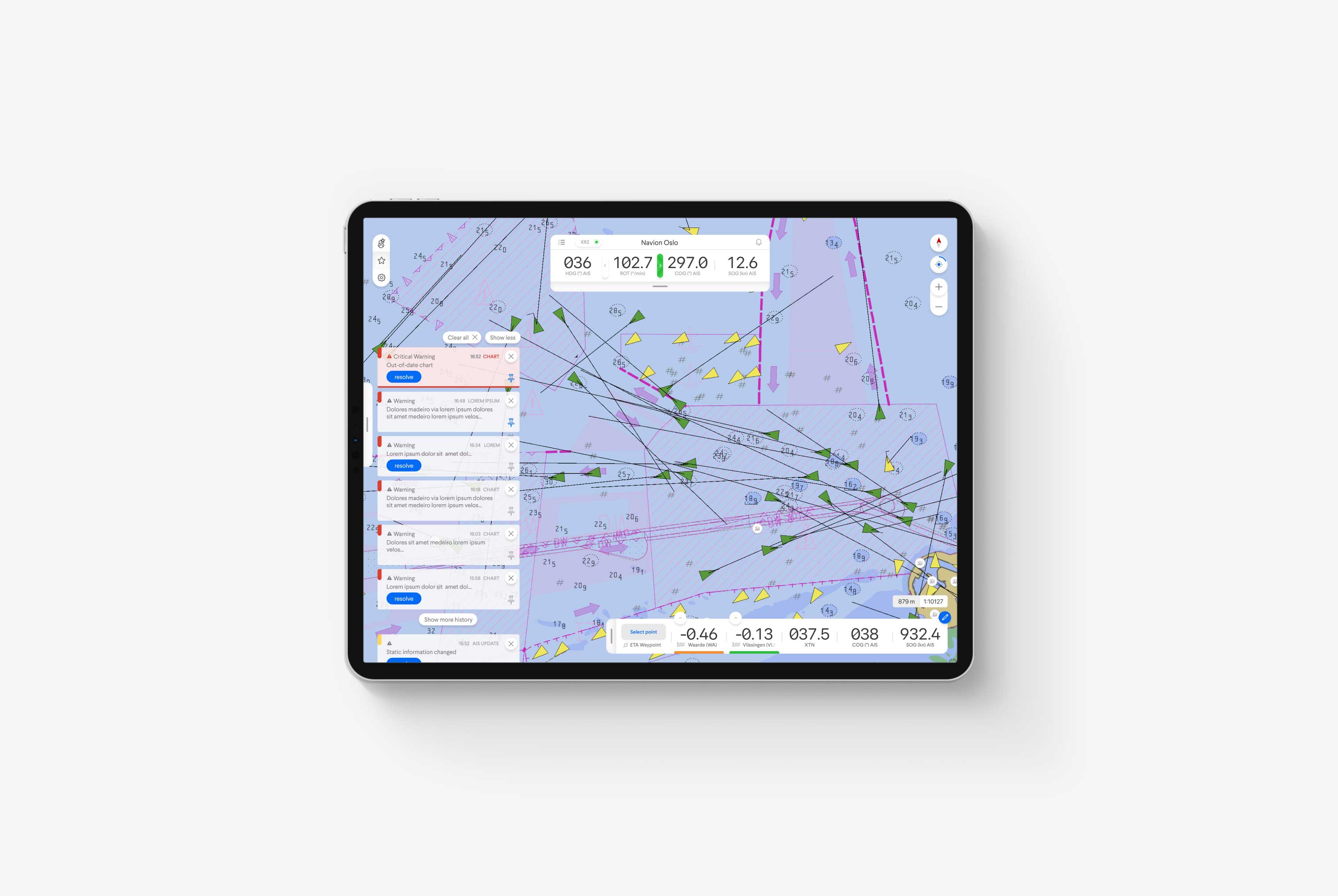
In Qastor, notifications come in many different forms, and they are all designed to keep the pilots updated on various happenings, some more important than others.
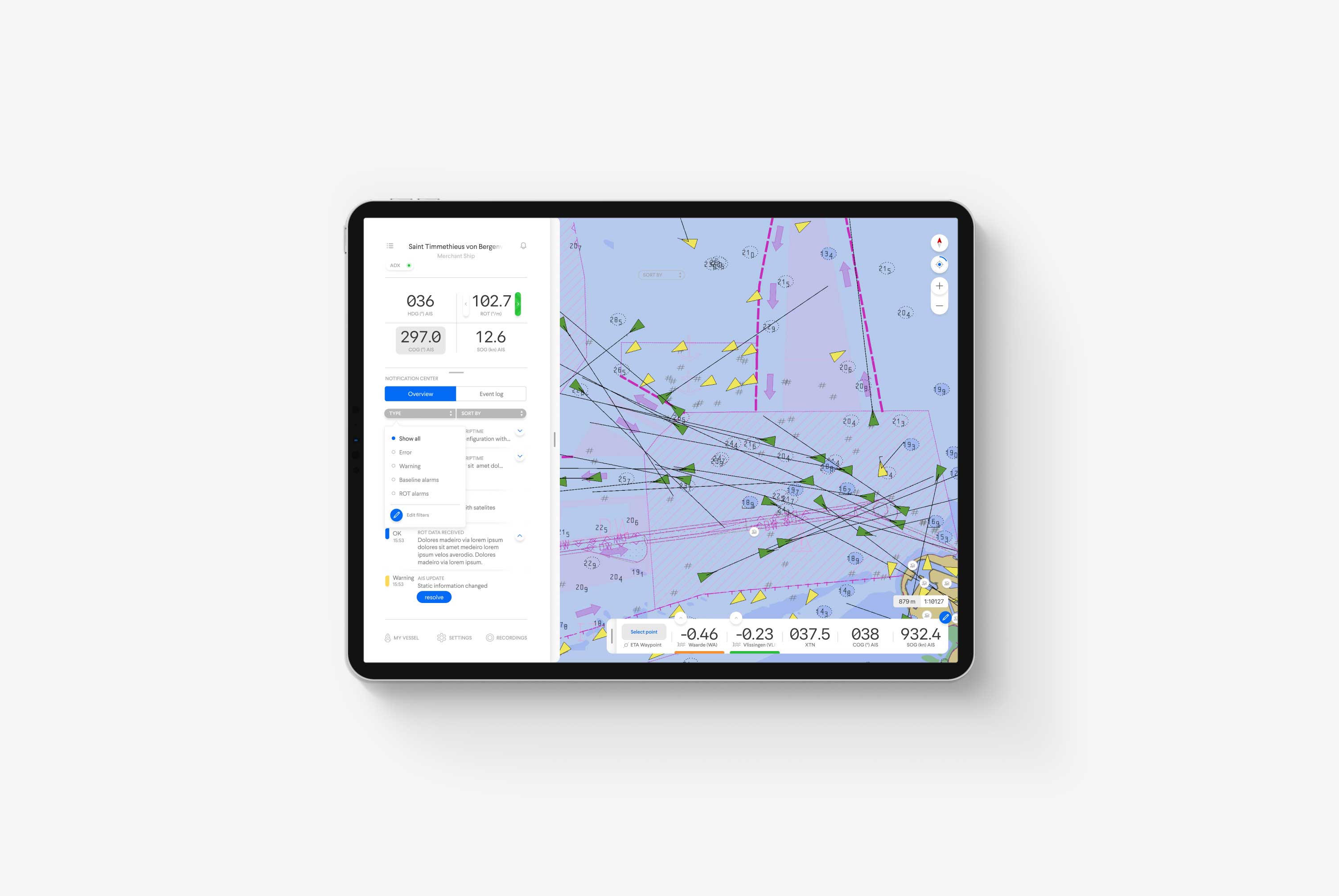
To accommodate this, we designed a notification center that visualized this variance in importance and time sequence, depending on which is vital at the time. Some notifications pop up over the screen, and others are called upon by sliding into the side panel.
Ultimately, a pilot must always attend to notifications and get informed when they arise, no matter what panel is open or closed. So in our design, we ensured that every vital piece of information comes front and center.
Docking
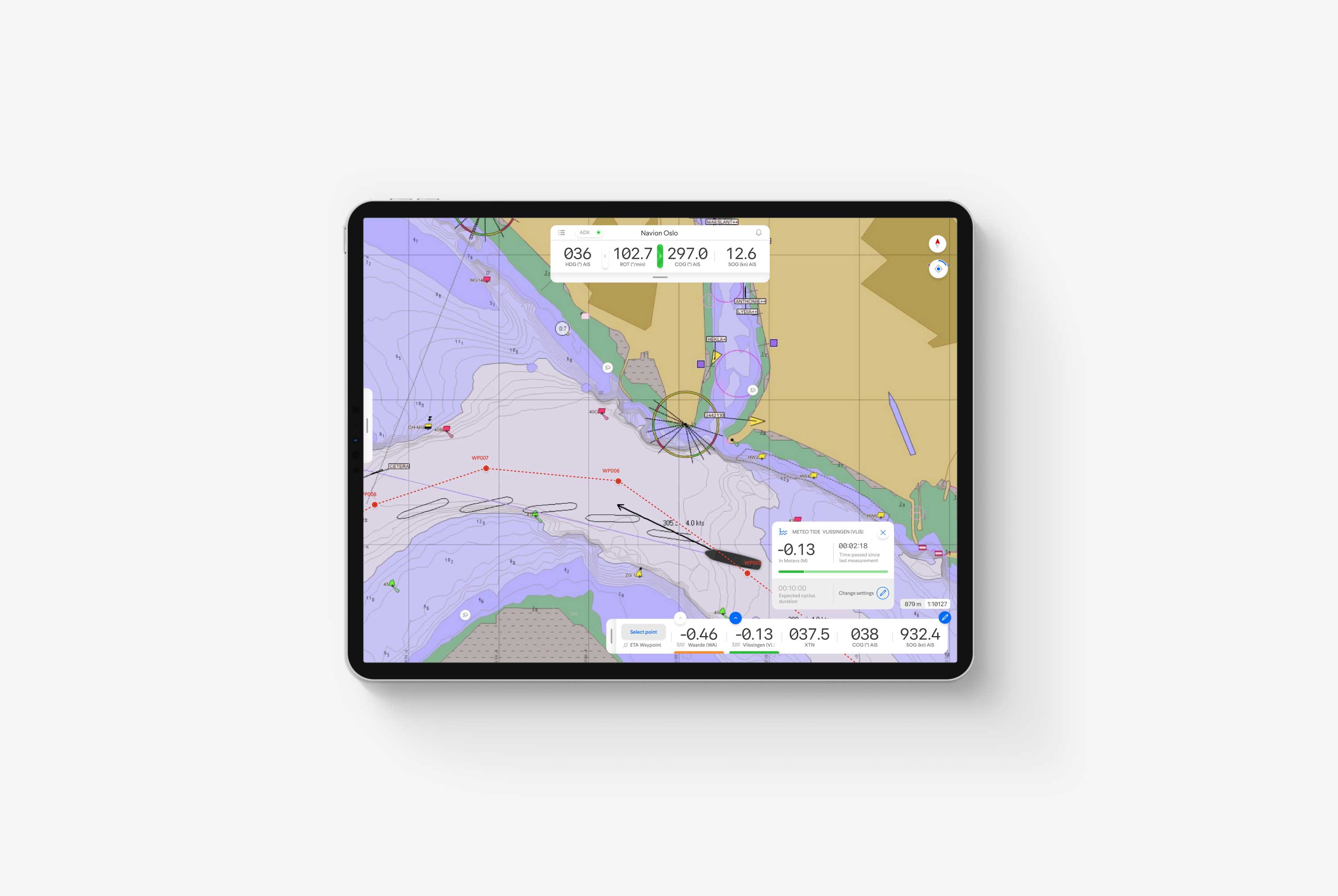
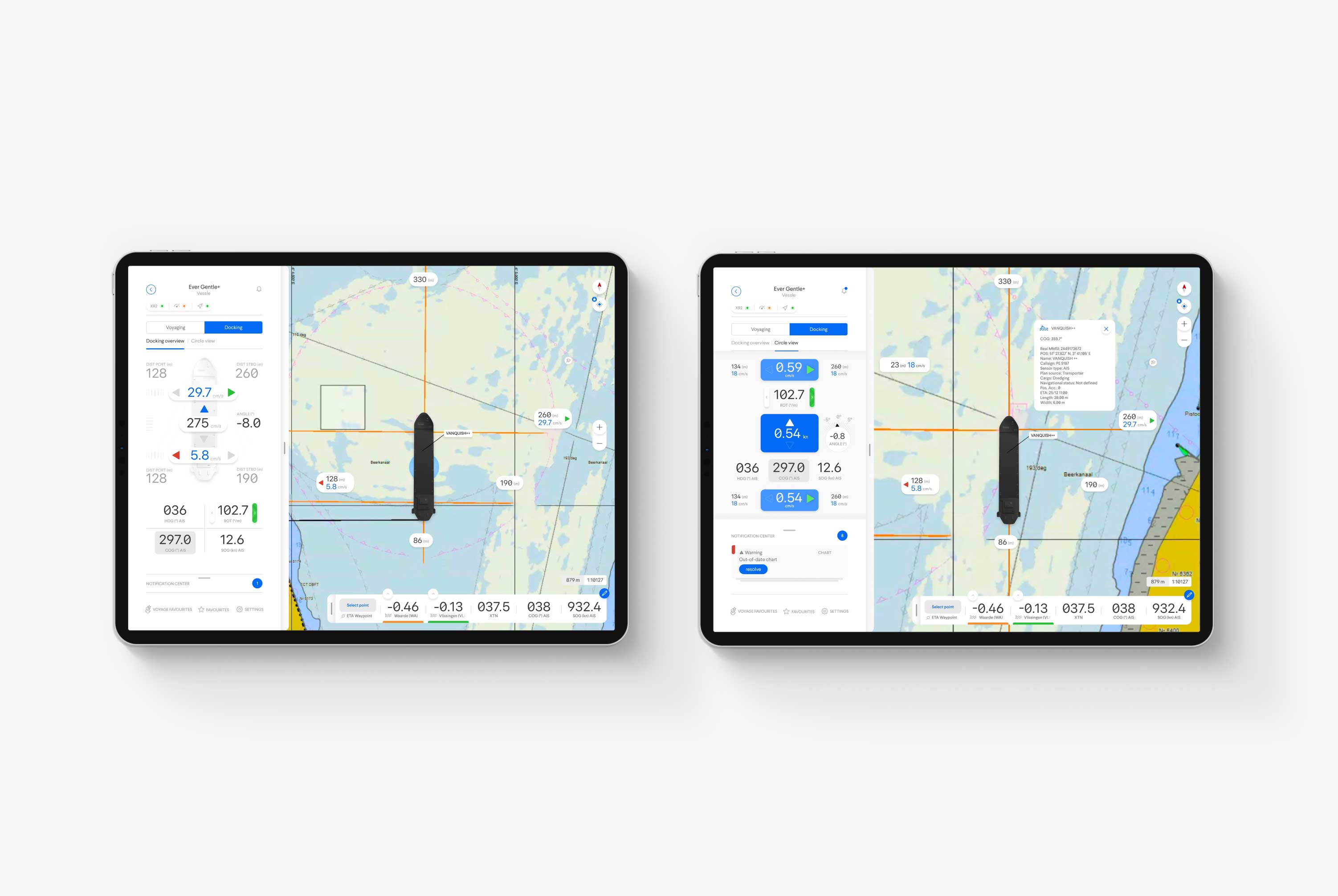
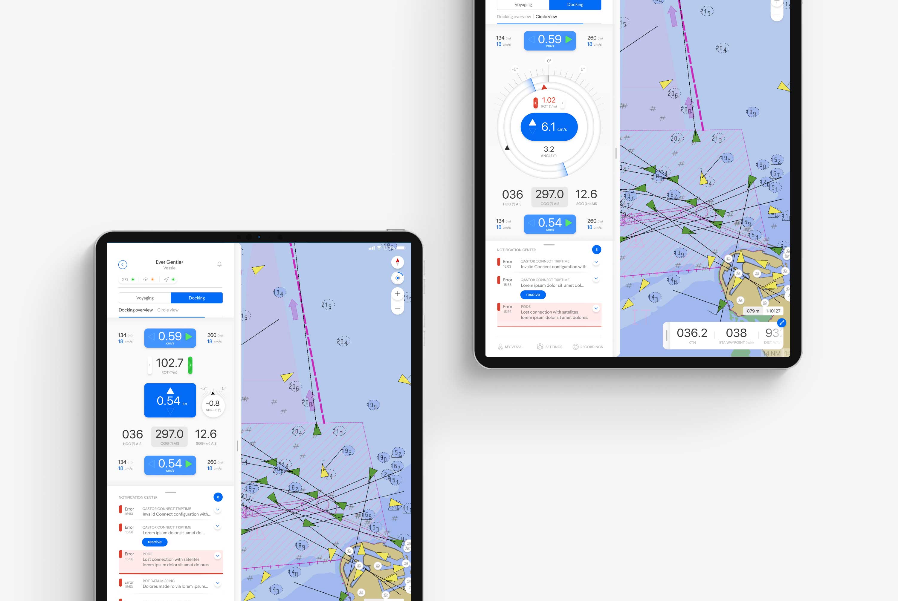
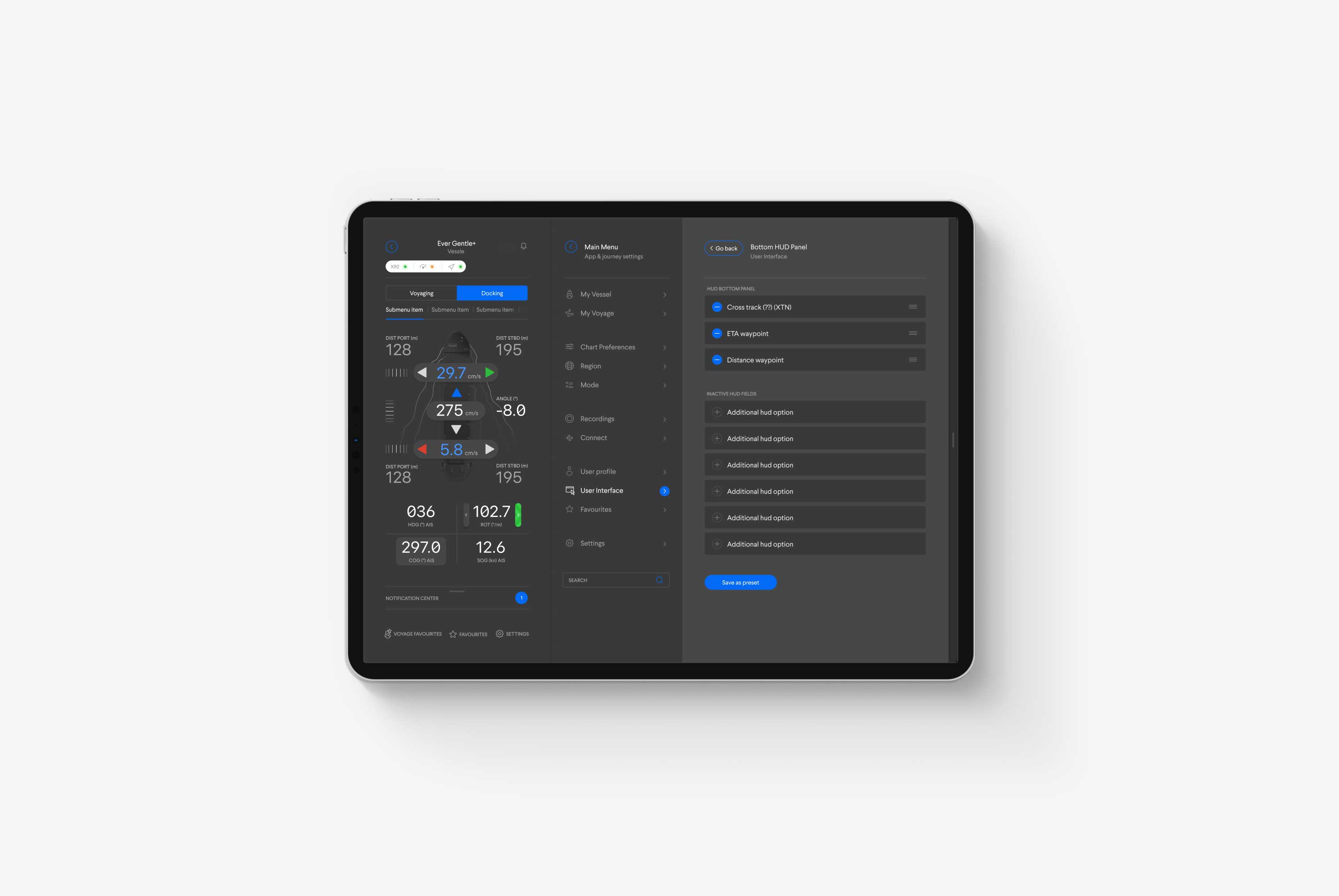
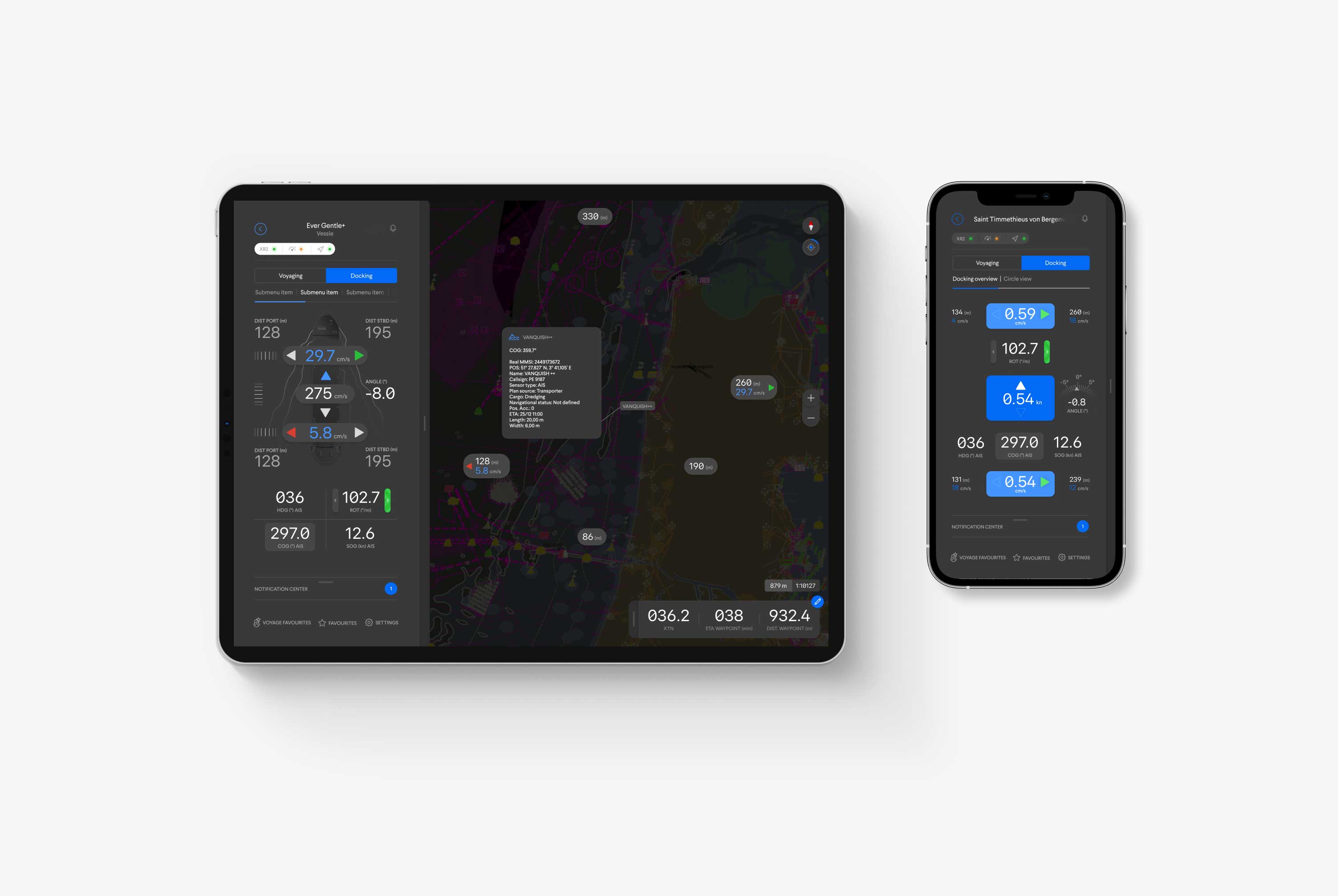
Docking is another primary function of Qastor. The pilot needs a range of sensor data and a real-time map to help ships get to the harbor safely and dock without incident. Even then, it takes years of experience and extensive knowledge of the waters in and around the port to do the job without incident.
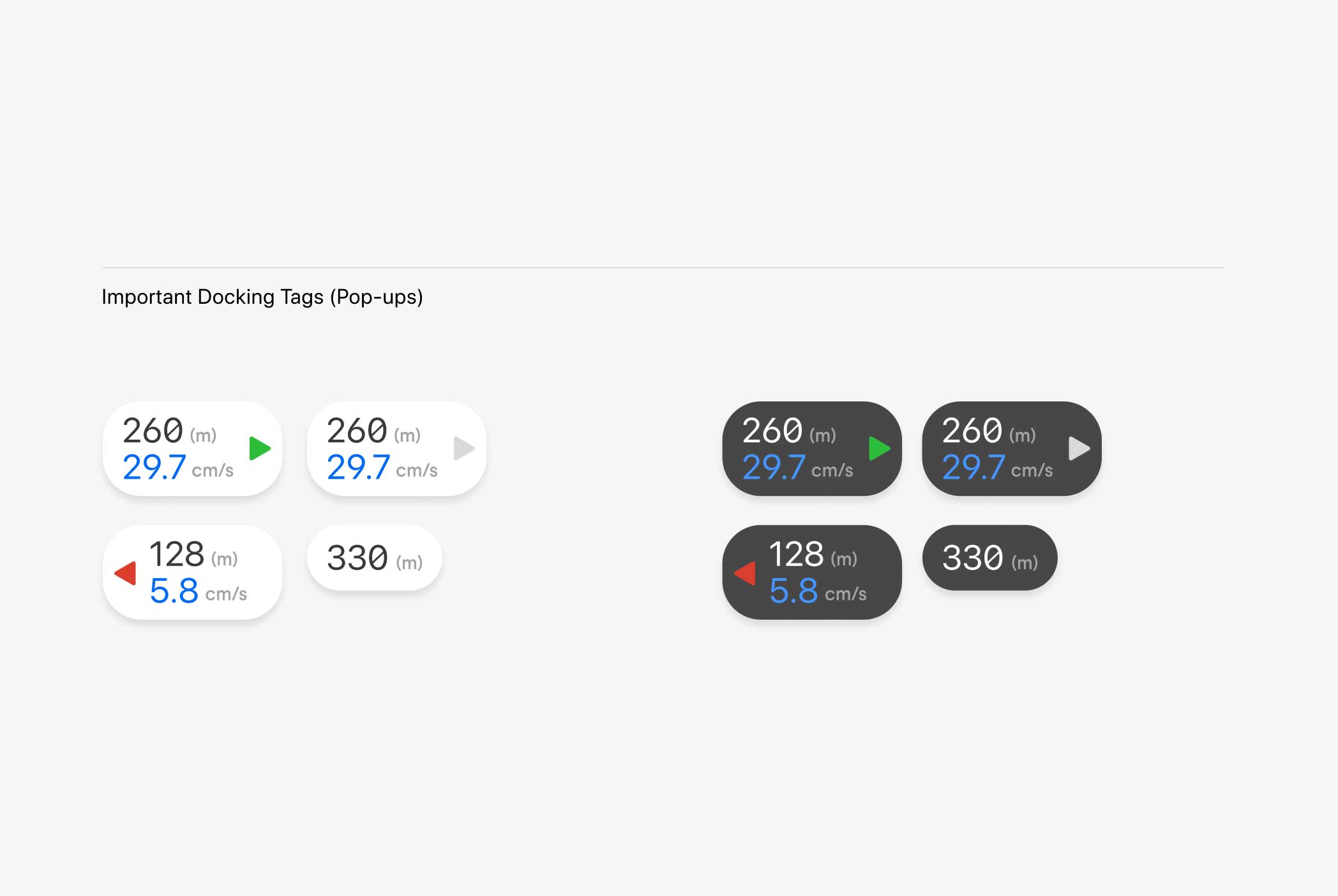
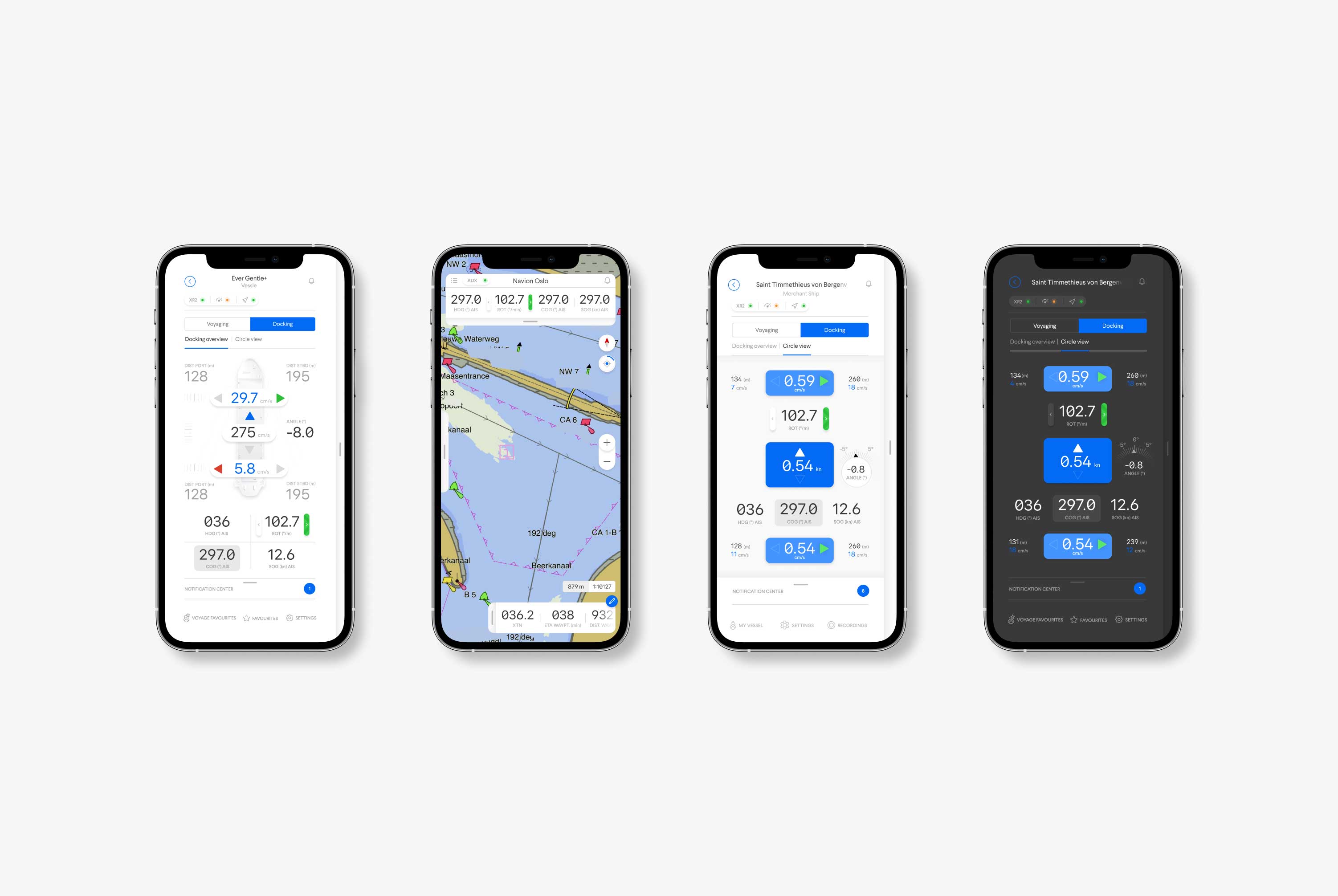
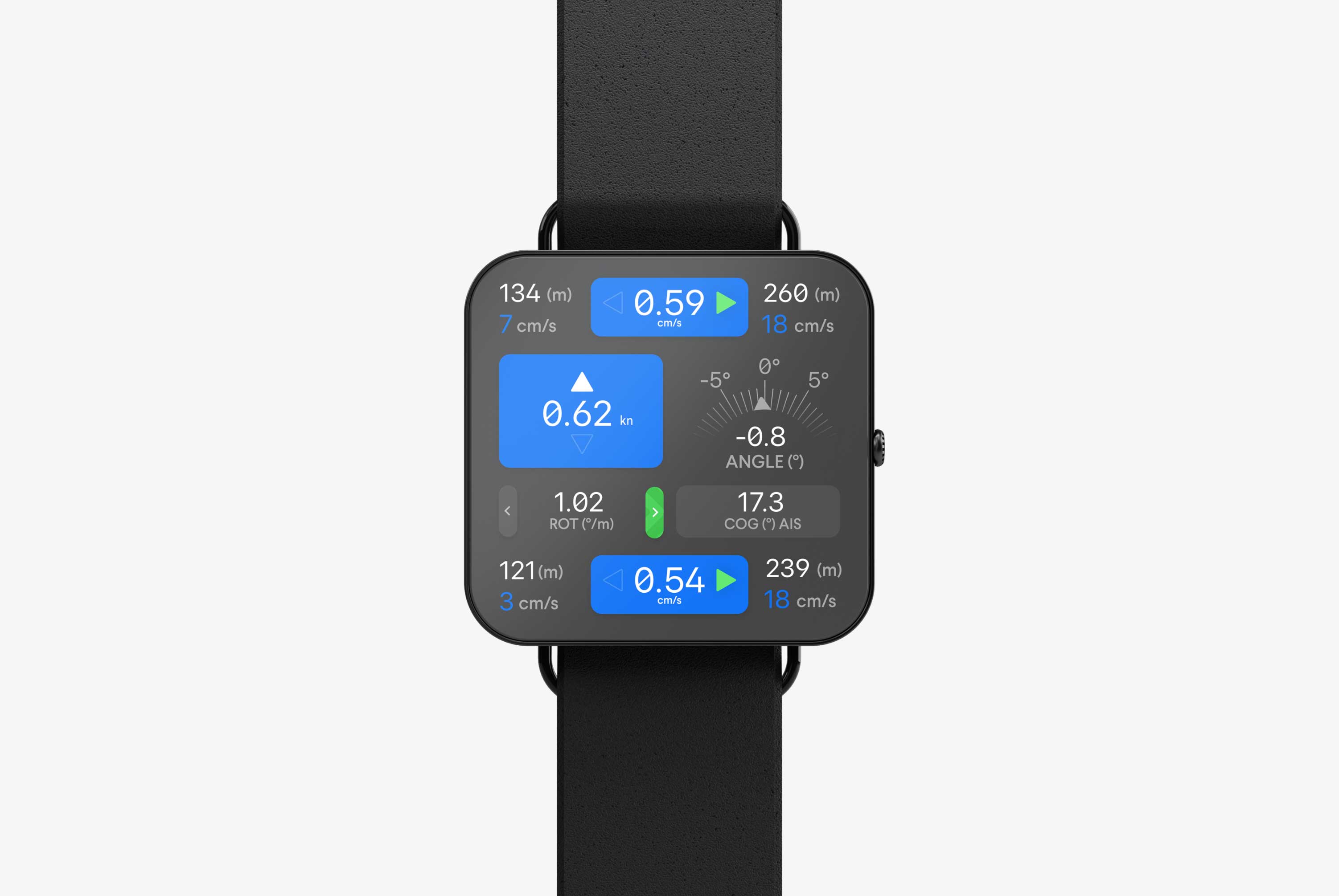
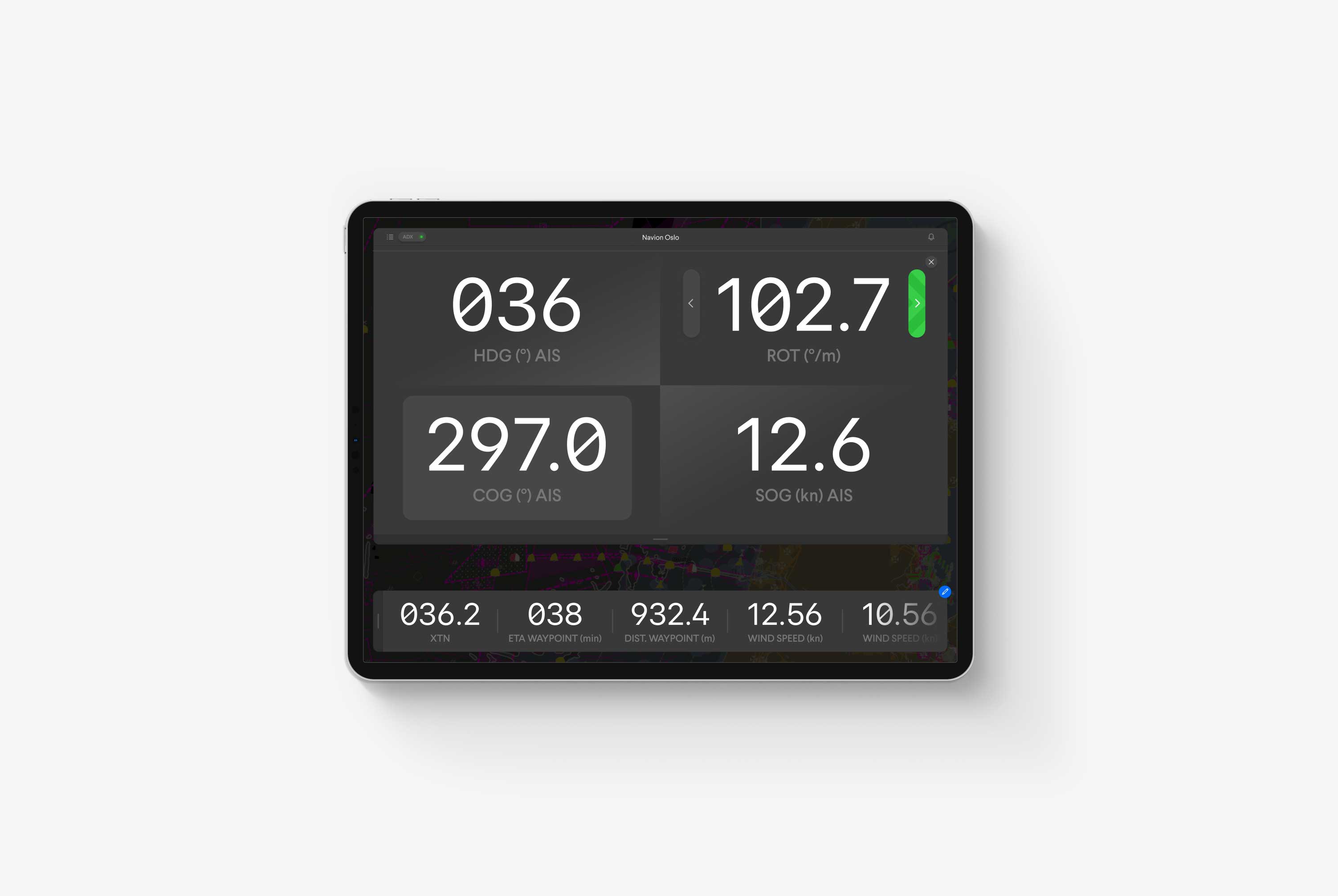
Every pilot has a preferred view, so we incorporated multiple options inside the app to visualize docking information. Additionally, a collection of pop-ups show essential details on the map. Finally, pilots can project the data values directly to their smartwatches to view as much of the map as possible on their tablets.
Menu Structure
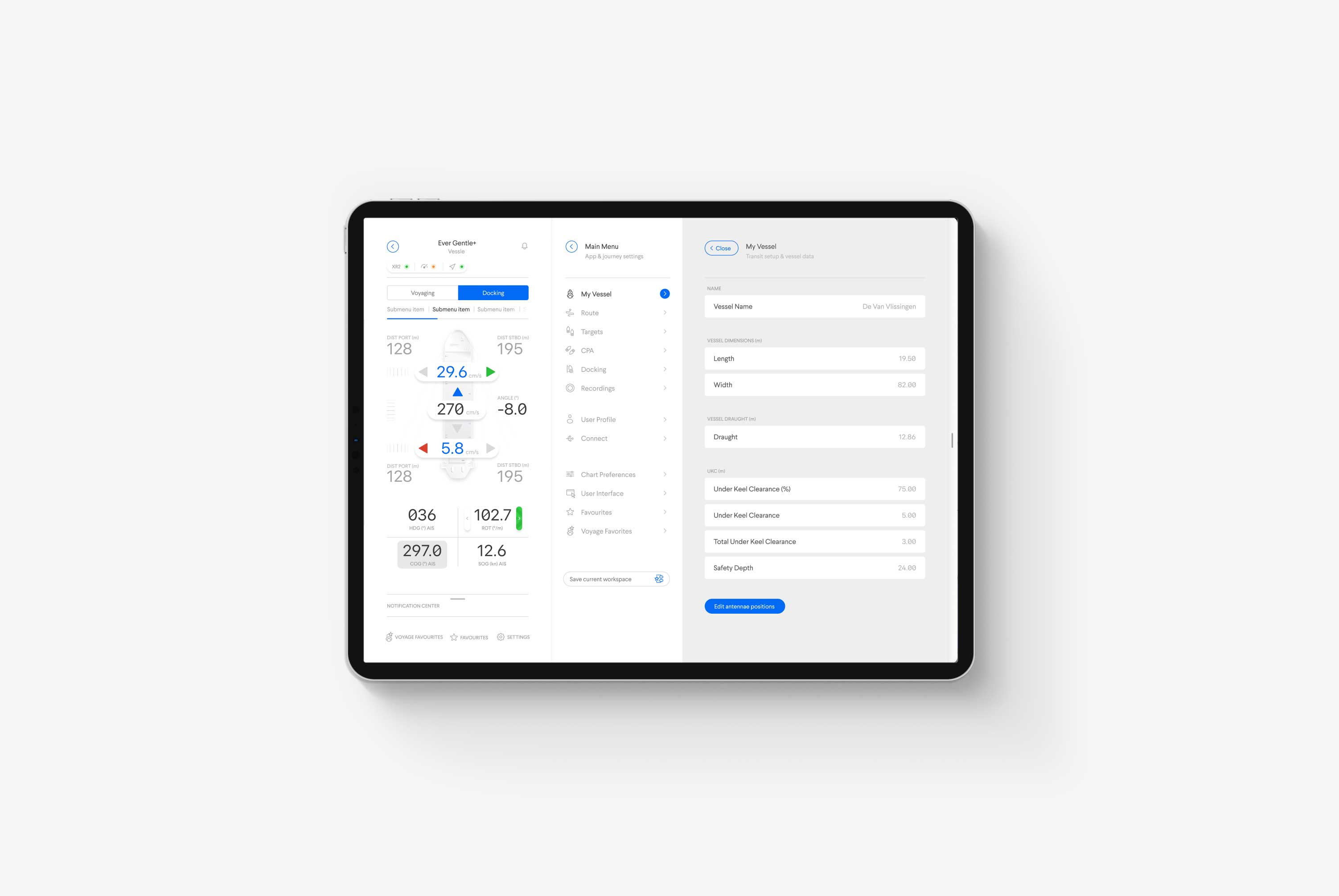
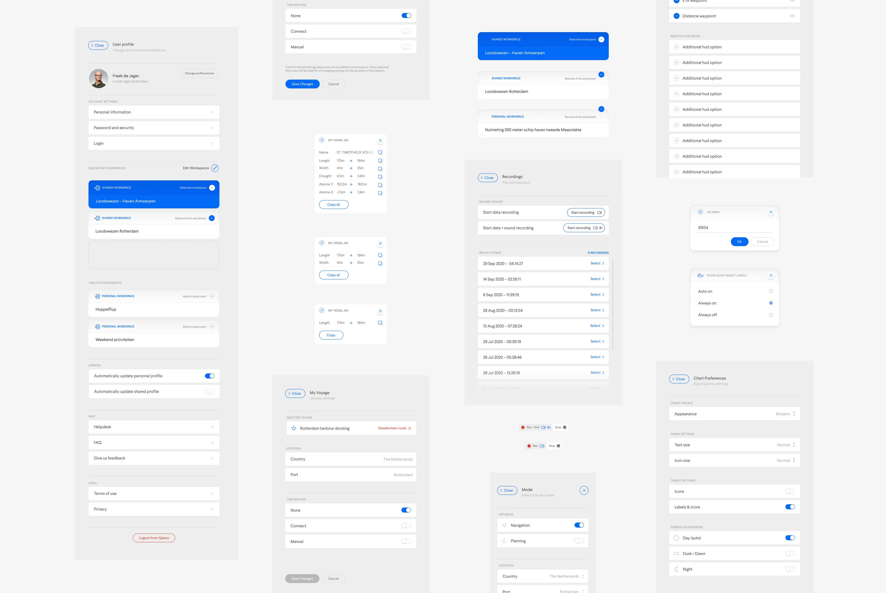
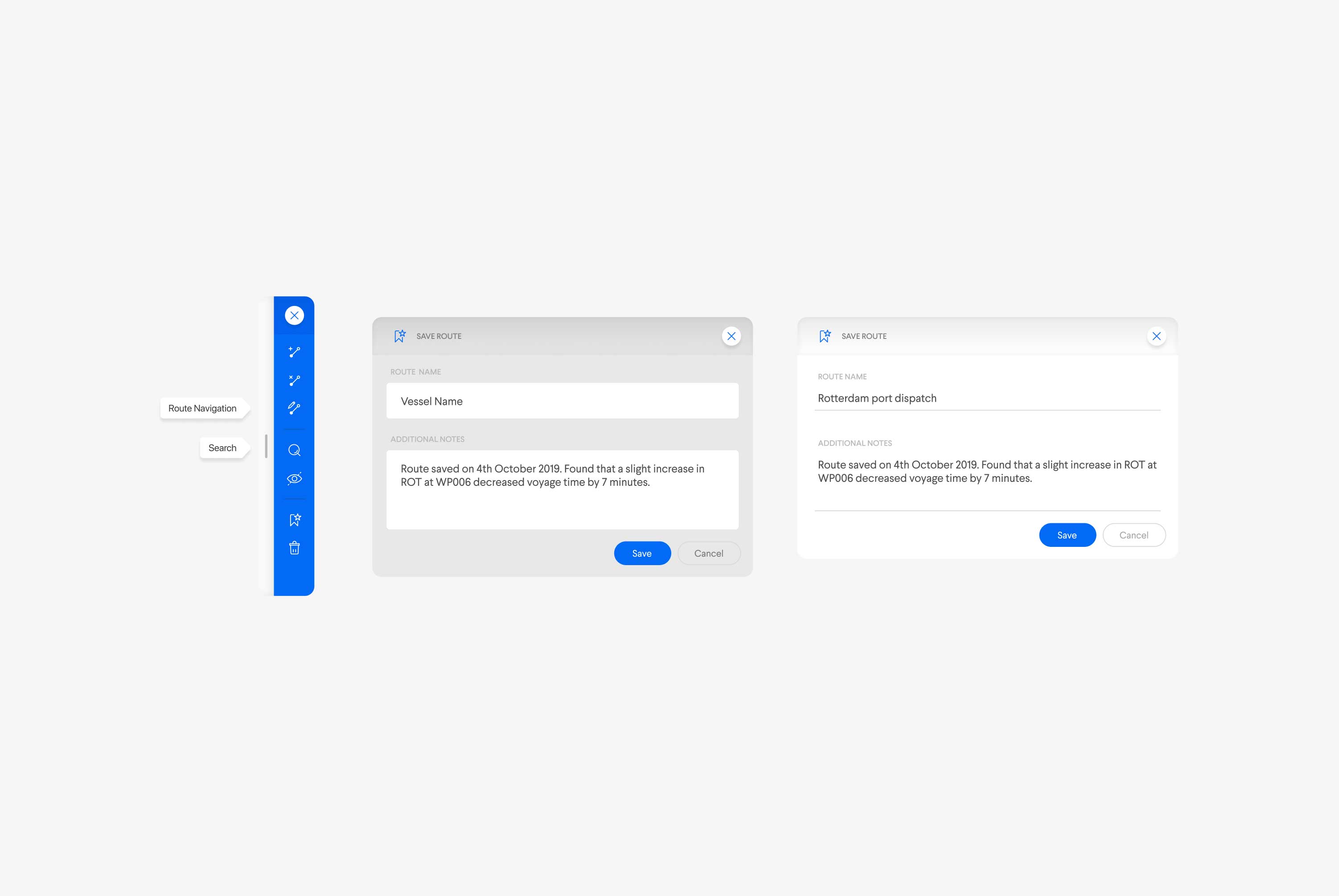
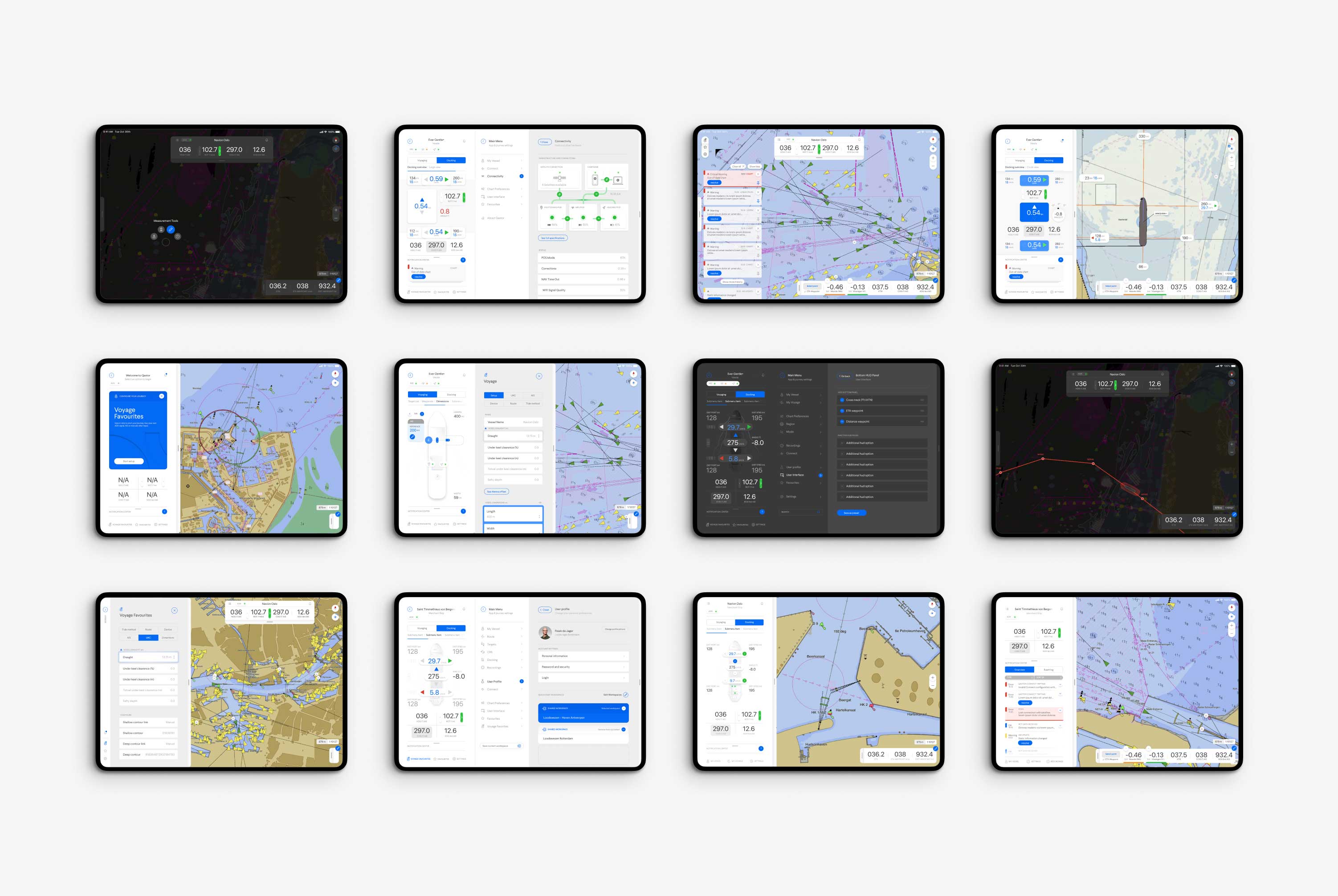
The new Qastor design has a completely redesigned menu structure to accommodate a range of new features. Overall, pilots' time to complete an operation is reduced, and elements are easier to find, even though the menu is expanded significantly.
Best of all, the pilot's profile remembers all menu preferences. This way, pilots can switch devices (in case something is malfunctioning) and immediately get their Qastor app the way they prefer, wasting hardly any crucial time in the process.
The Q-System
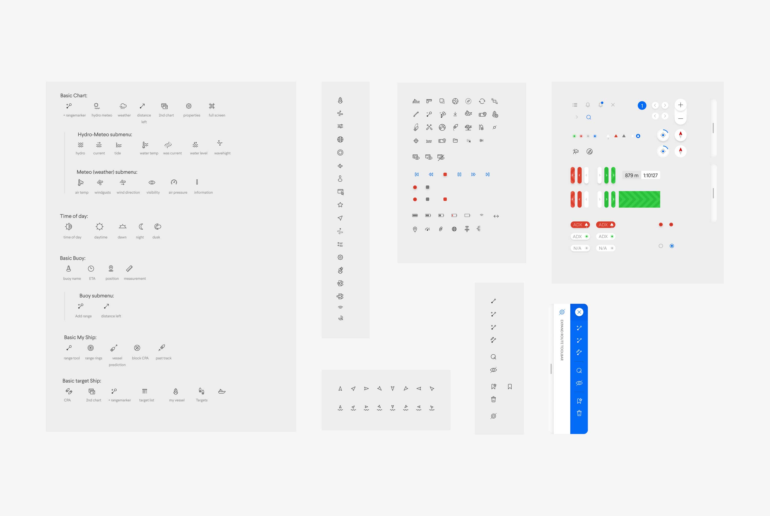
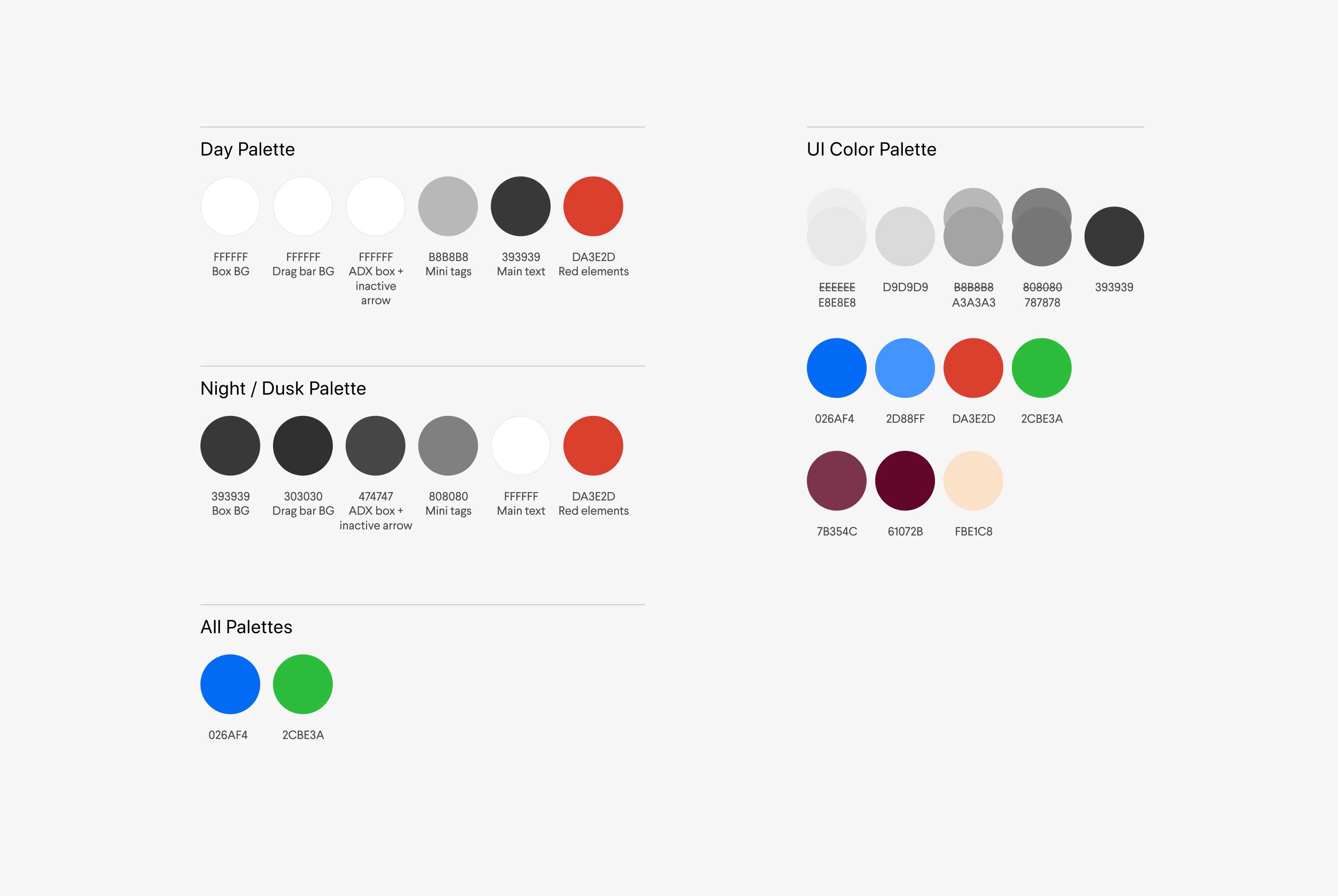
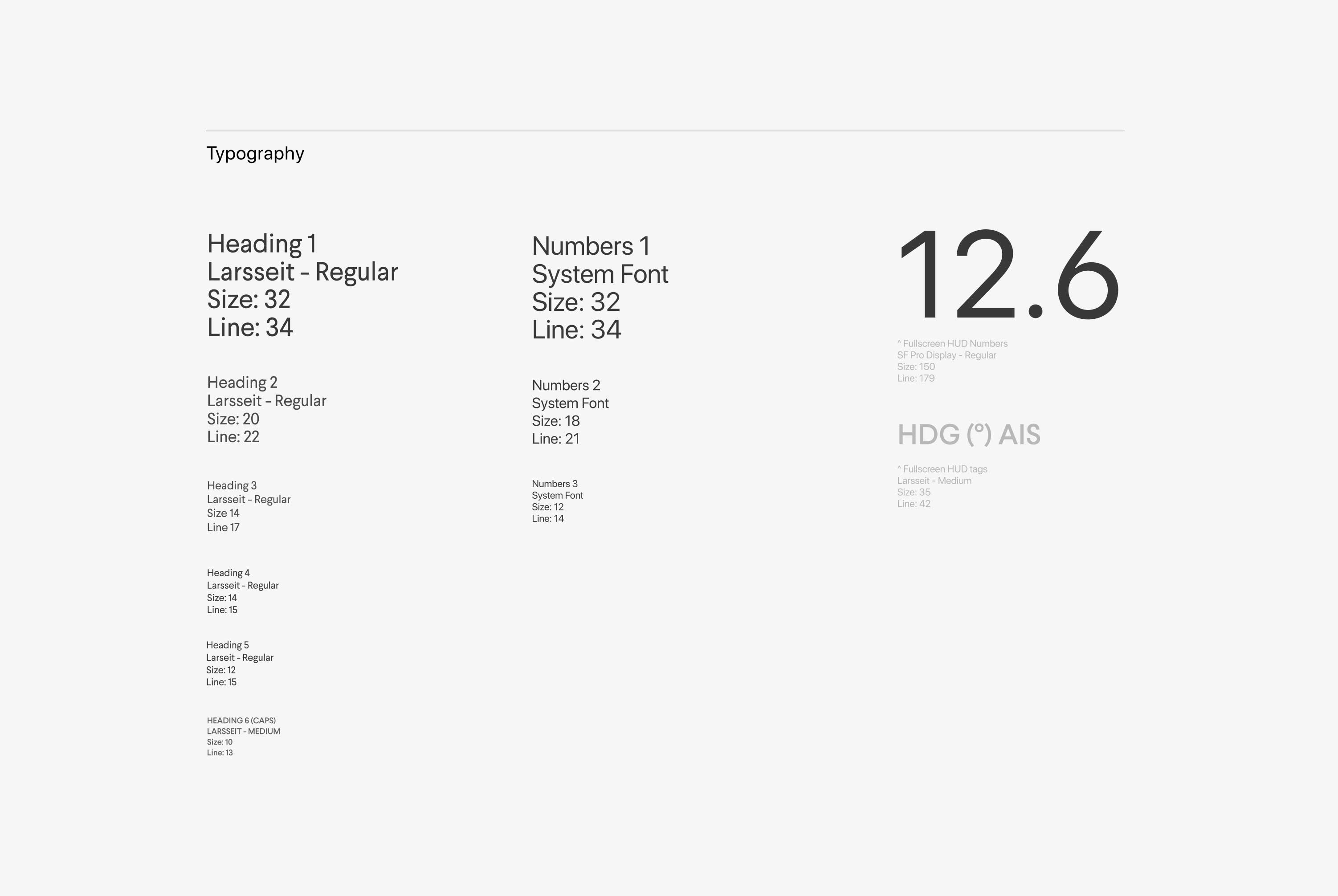
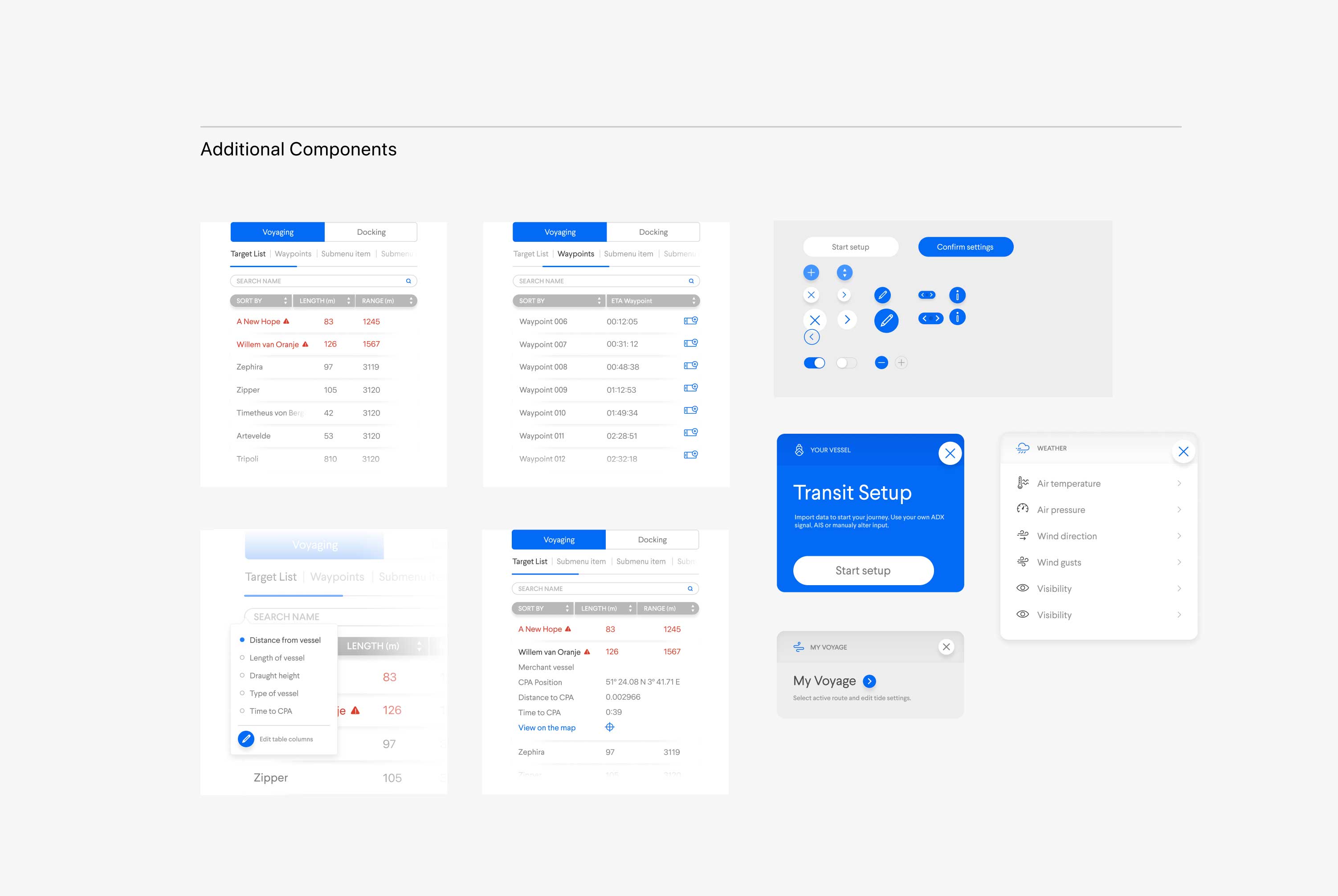
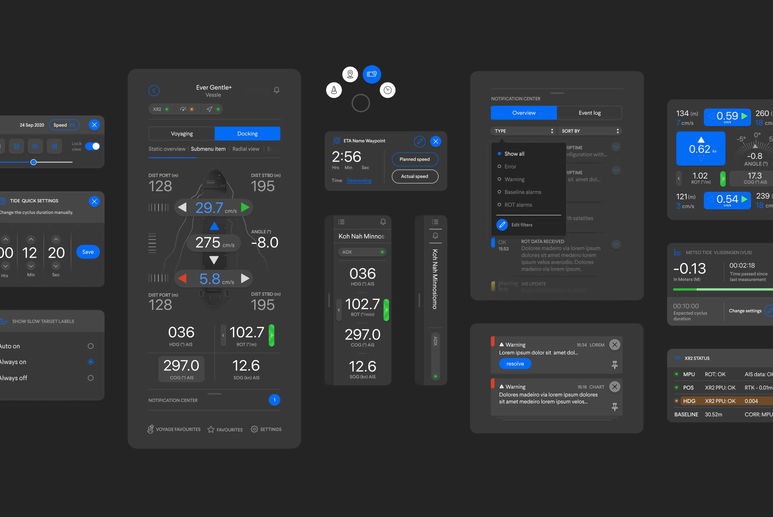
The Q-System hosts the design guidelines and assets for marketing and product design deliverables. It allows the QPS team to make design decisions without involving us in every small step. The system is extensive and utilizes Atomic Design to give a hierarchy to all individual elements.
Together with QPS, we have a shared Figma file that is always up to date. Additionally, many of the Atomic Design system's Atoms, Molecules, and Organisms are turned into Figma components, ensuring that we can scale quickly and easily without risking breaking the system.
Vessel Setup
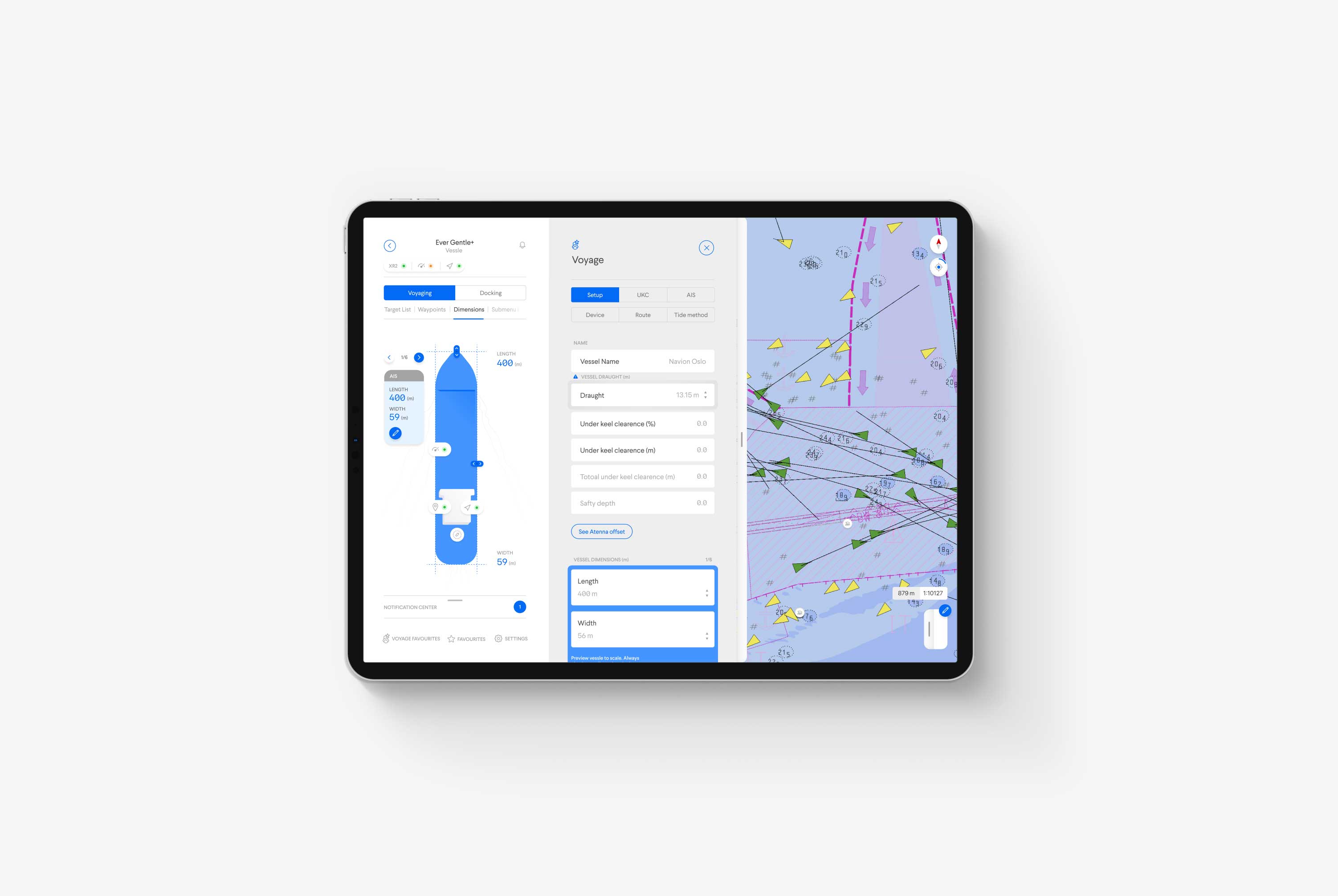
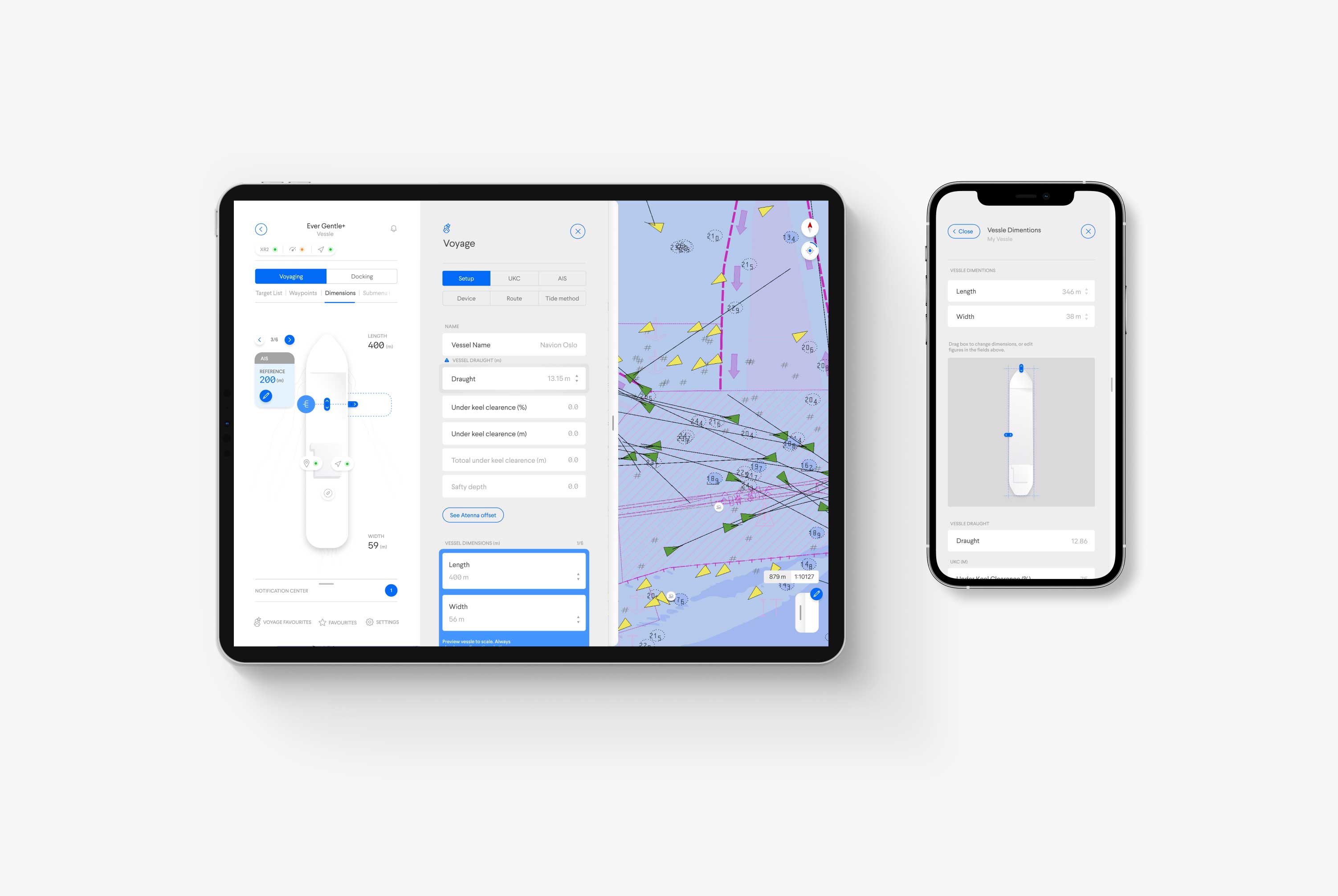
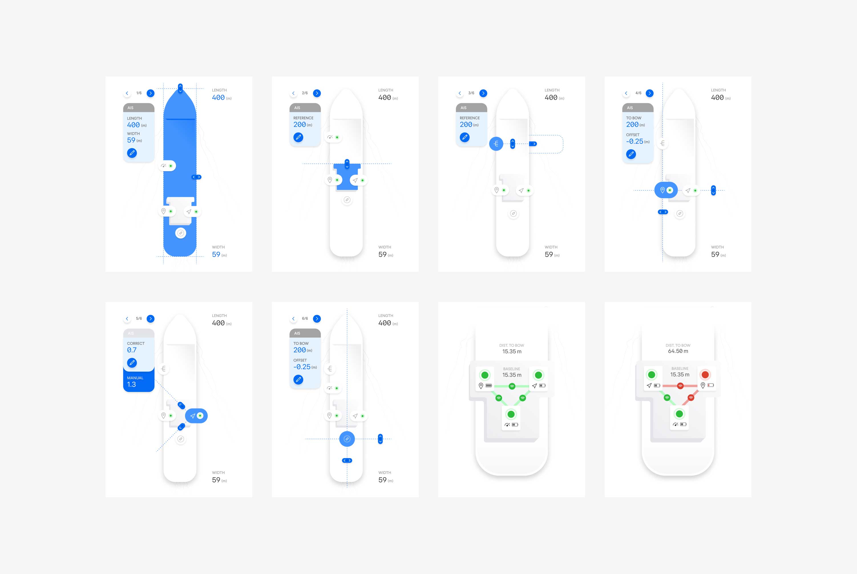
Vessel Setup was one of the most requested features by pilots, as it allows them to save all vessel data, sensor information, and ship dimensions. Pilots often pilot the same ship multiple times per month, so being able to save this information would reduce setup time tremendously.
In addition, setting up a vessel is very detailed, and all information must be exactly right. So from now on, when, for example, a pilot is working from another device, they can log in to their Qastor profile, select the ship they're on in their preset list and find all their vessel data and preferred settings waiting for them.
Connectivity
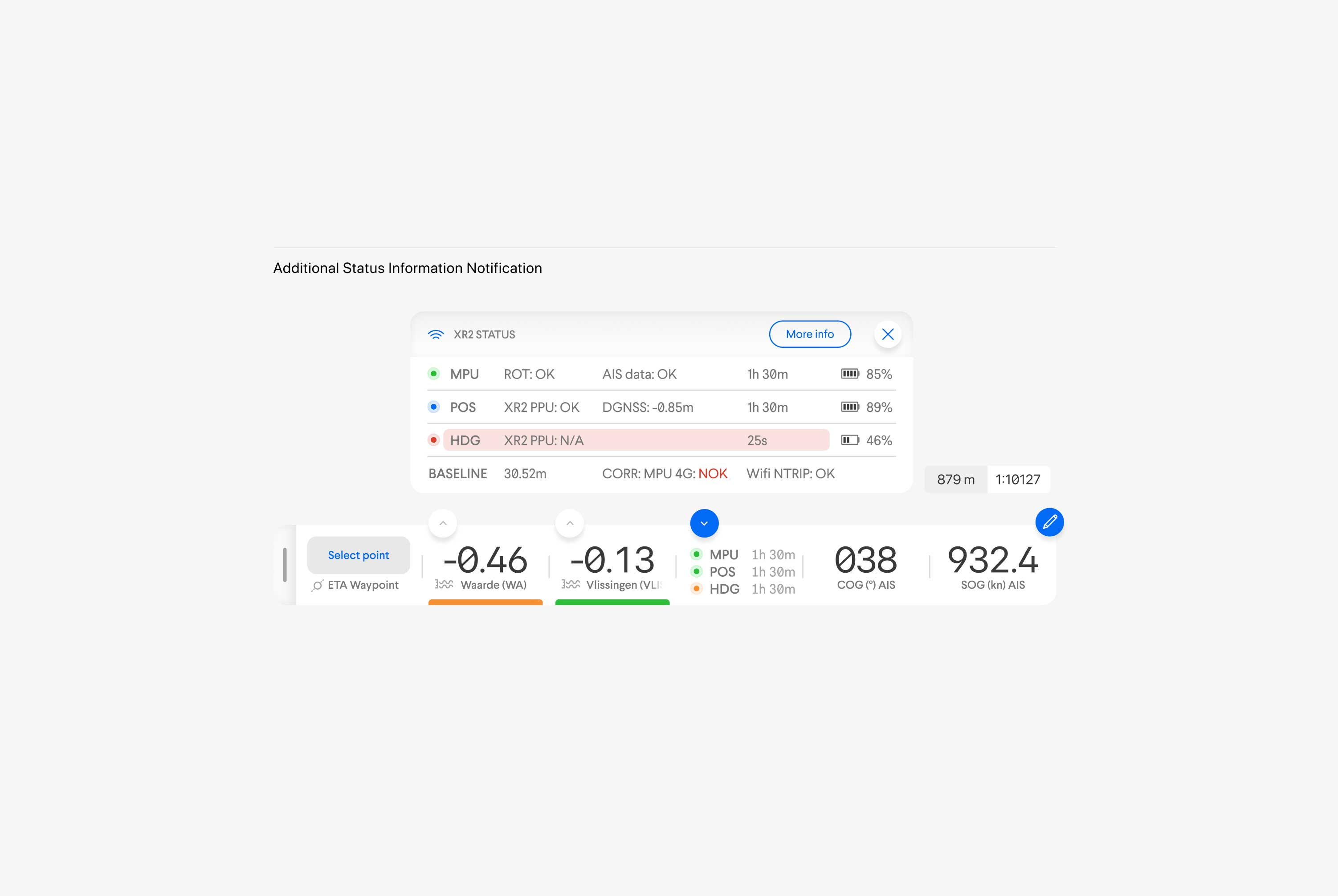
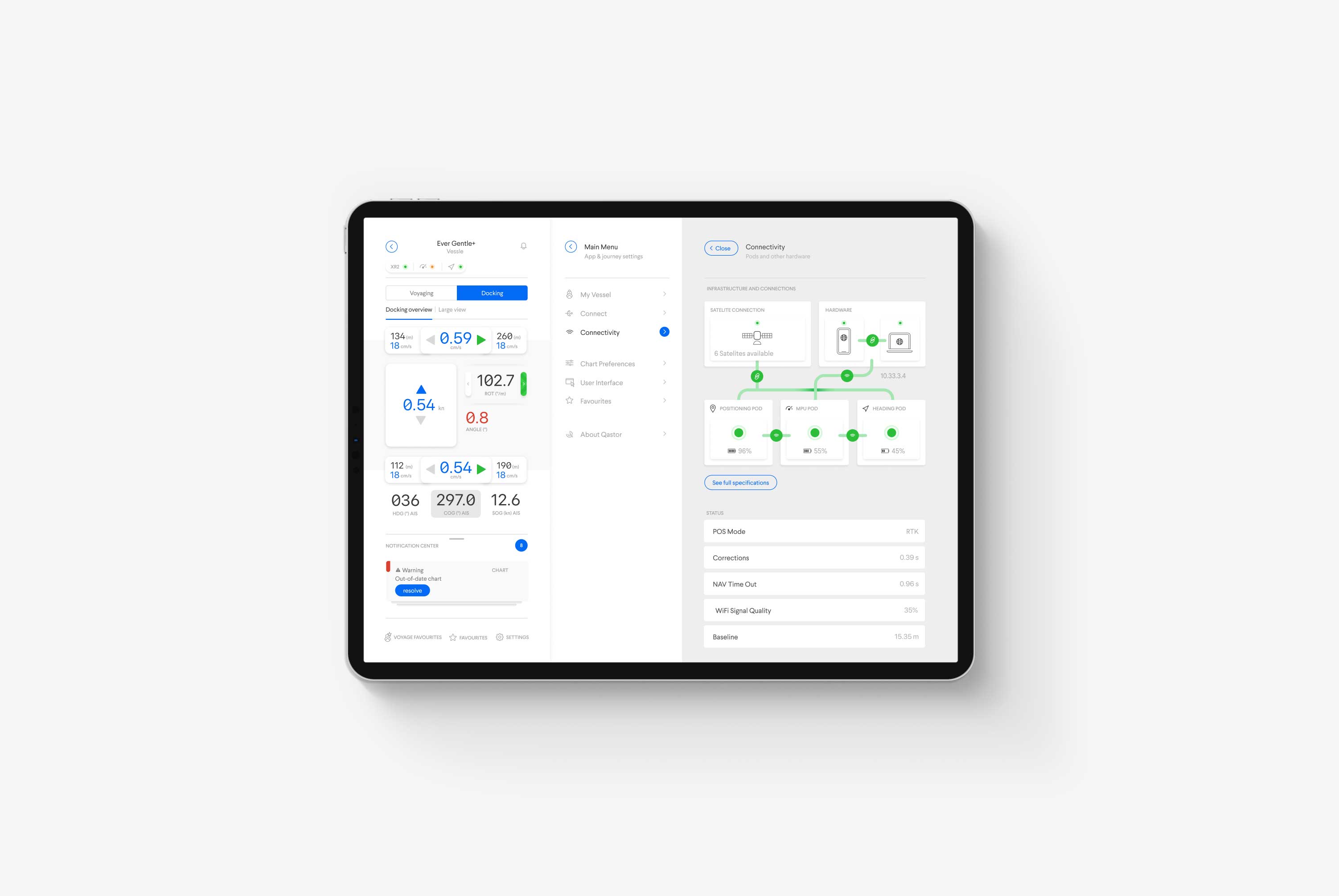
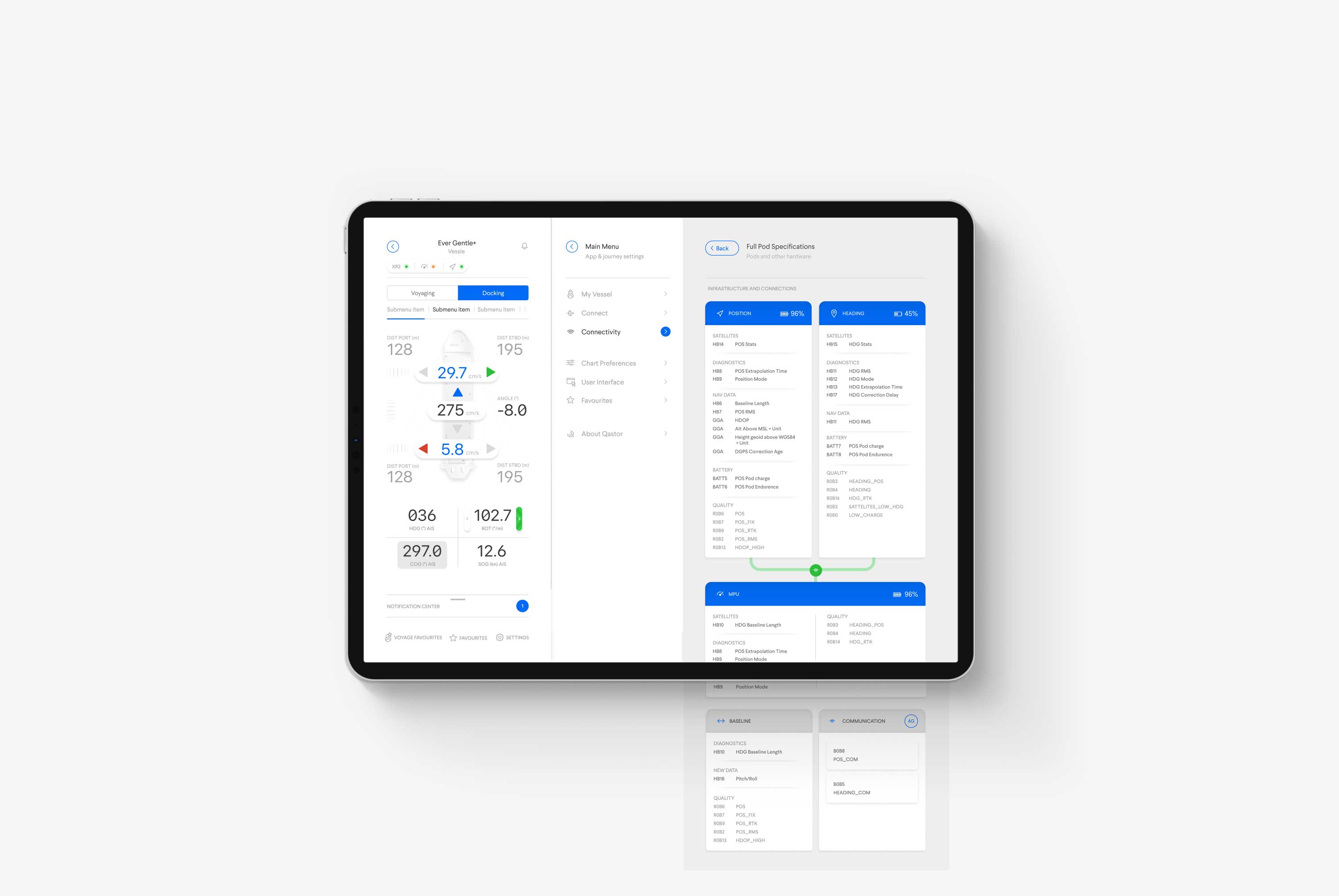
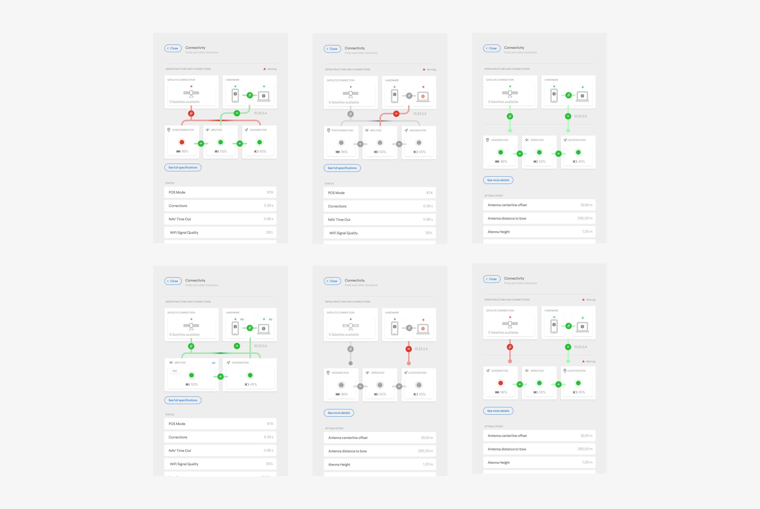
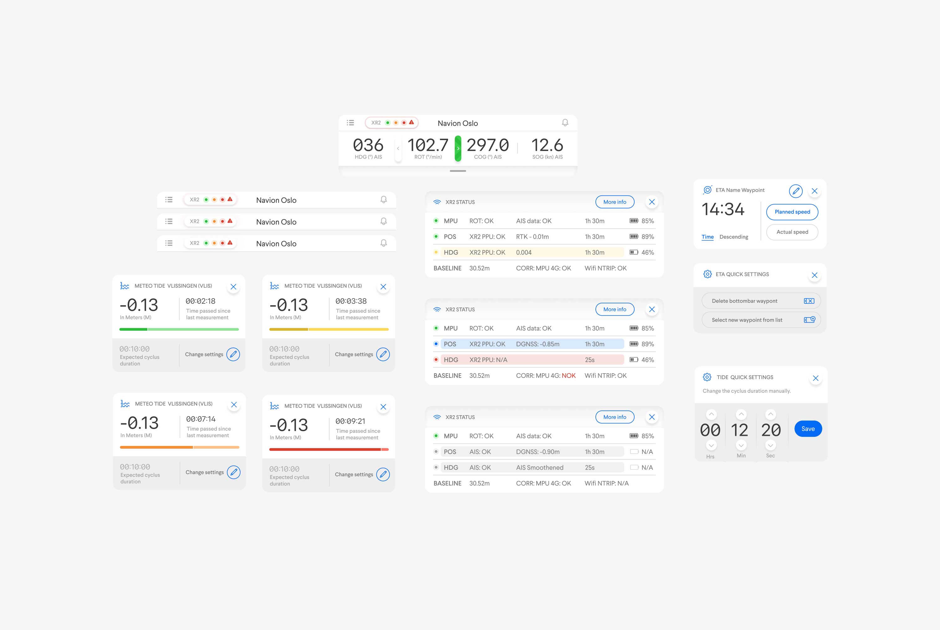
The connectivity menu allows a pilot to check the connection to the ship's sensors, various PODs, the Qastor app, QPS servers, and the satellites. It's important there are no or a very limited amount of delays in these data transfers, so a pilot must always check if all connections are stable. The pilot can do this in the new Connectivity Center.
In case of an error, a pilot can see where this error is occurring in the connection. Sometimes, more information is needed, and inside the Connectivity Center, one extra click is enough to view all specifications and raw data. This is especially helpful when tracking down a delay interfering with safe operations, for instance.
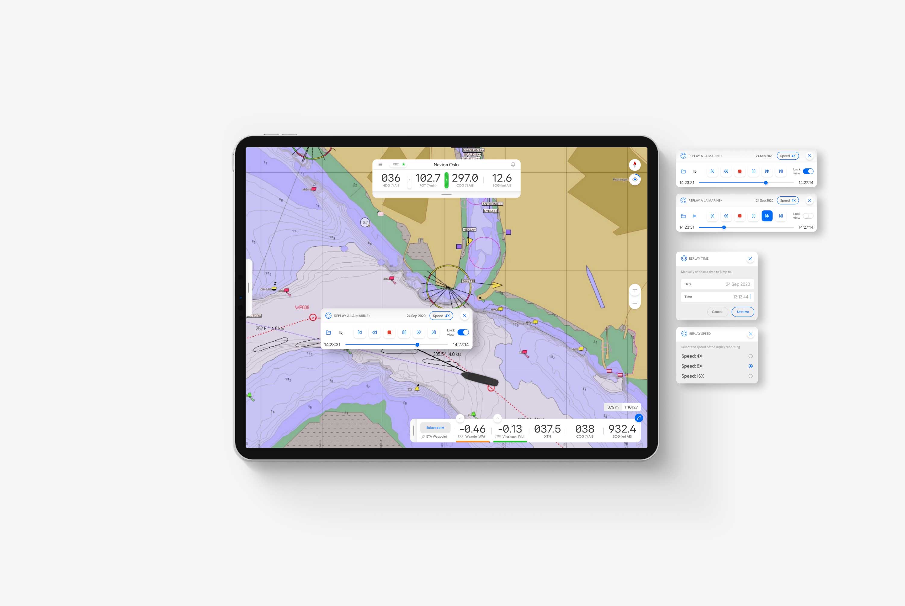
Pop-up Panels
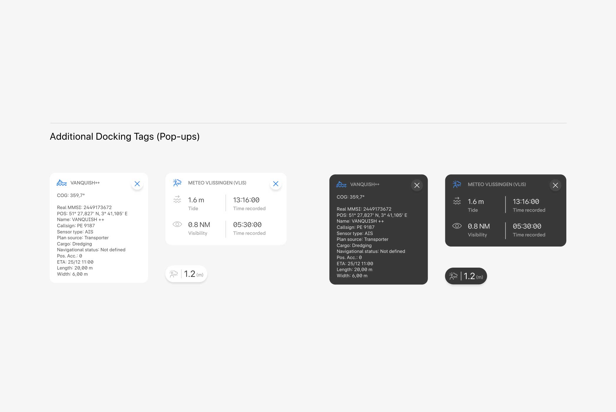
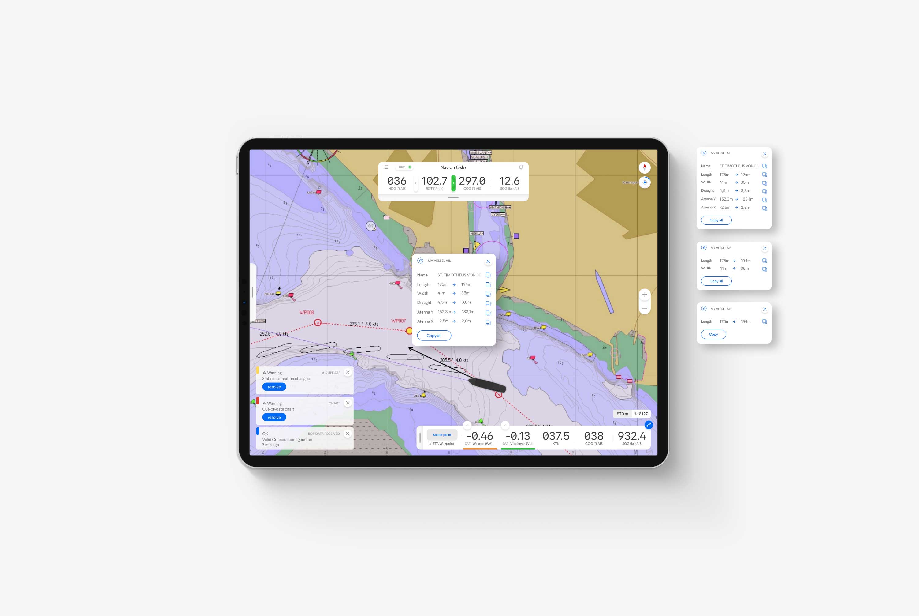
Pop-up panels allow us to add another layer of information to the design. Pilots require such a wide variety of information from one moment to another that if we showed it all, the screen would be flooded (pun intended) with information.
Hidden inside the pop-up panels is a carefully selected library of information containing elements that show up only when you need them or call on them. This reduces the cognitive load as much as possible.
The pilot may call on some of the pop-ups to complete a specific task, such as recording a voyage or retrieving waypoint information. These pop-up panels are a beneficial tool to add another layer of complex data to the design.
Ultimately, pop-ups are used all across the app design. Sometimes we find them within a menu or even on the docking panel. But one rule is applied; they're only available to be called upon when additional information is necessary.
Asset Overview
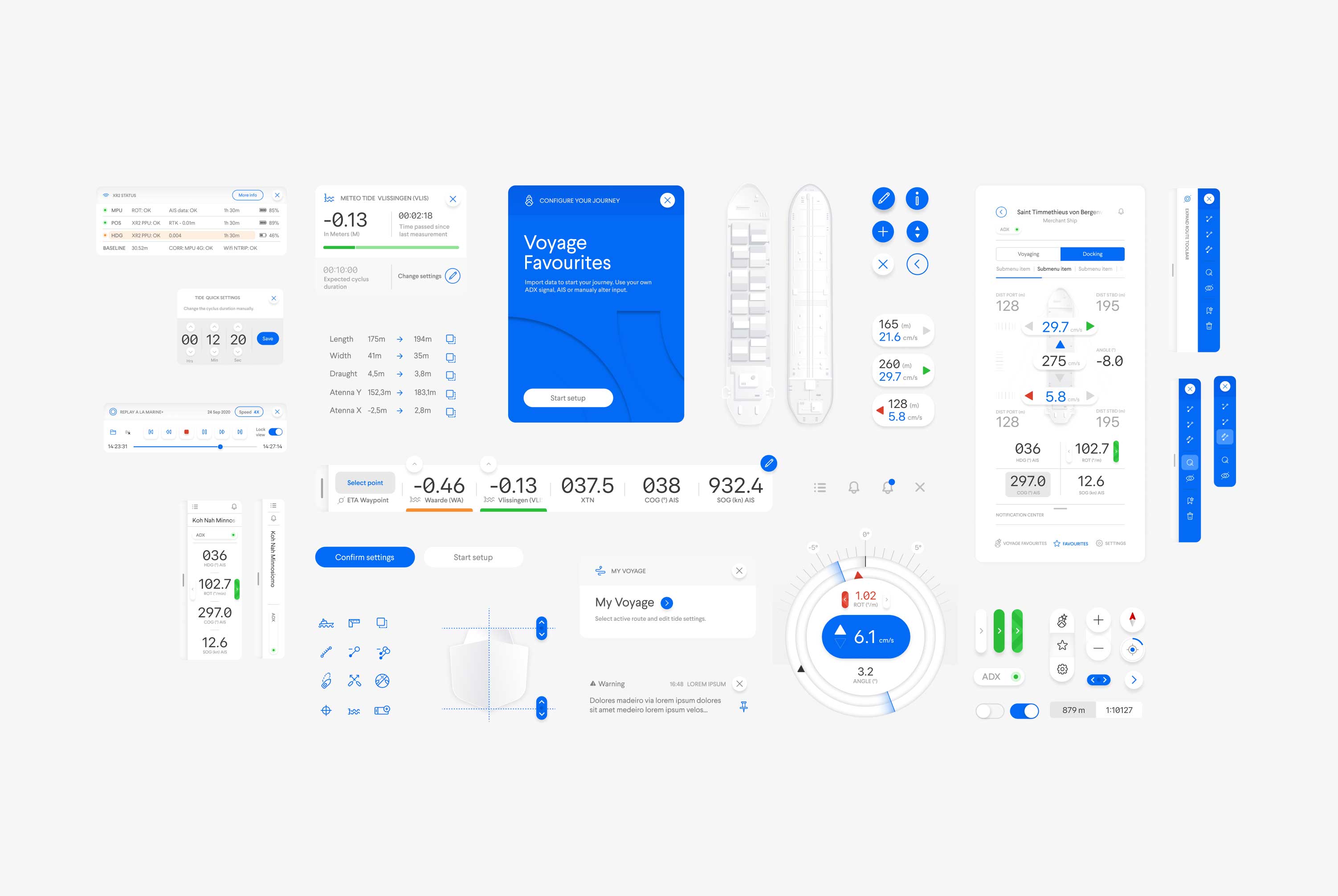
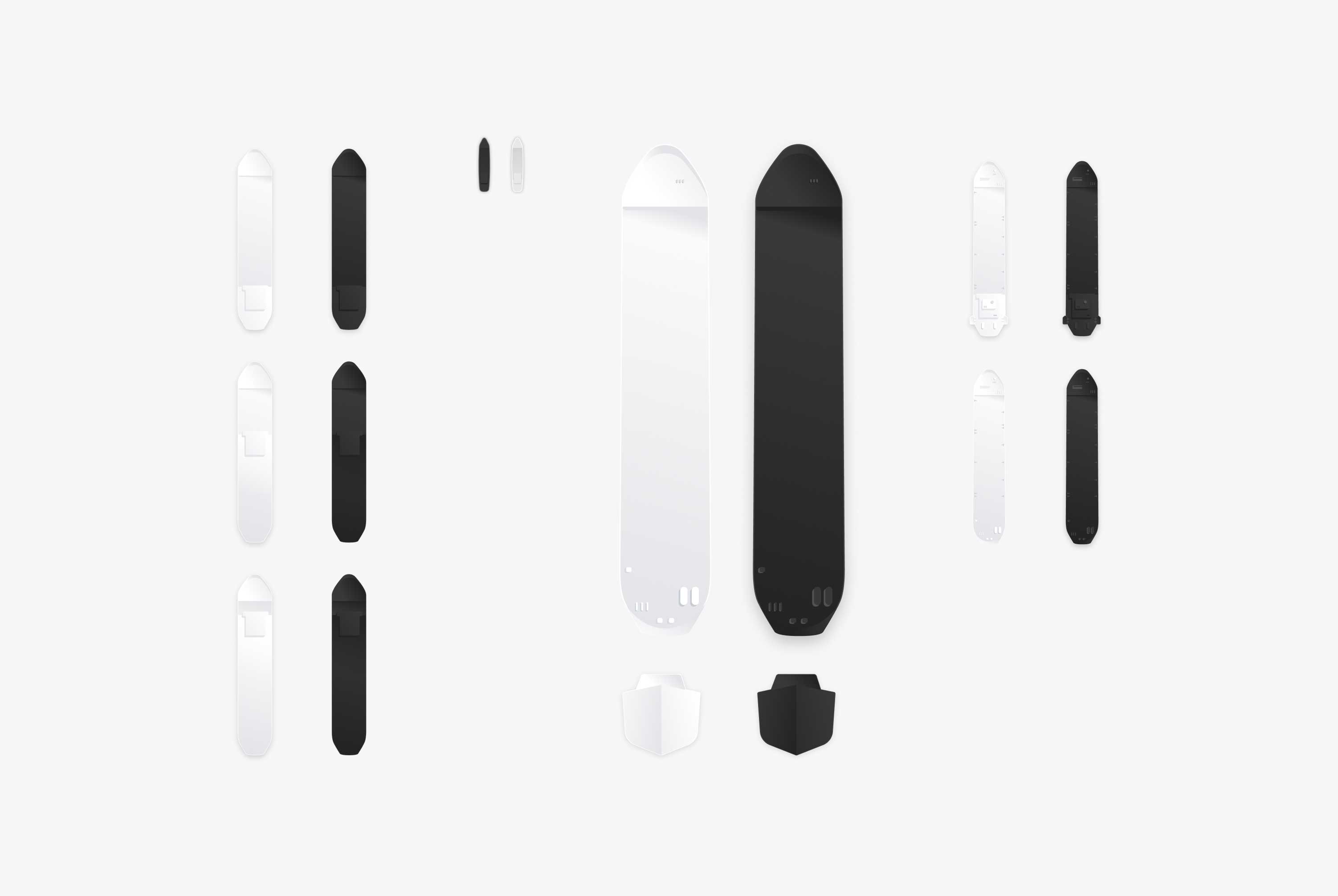
As part of the Q-System, we've created many different assets. Inside Atomic Design, these are also referred to as molecules. The molecules are a helpful tool in optimizing the design process.
Many design elements are thoroughly thought through, often based on previous feedback, and additionally, they are almost always subjected to many rounds of iterations. Therefore, when finally approved, we must ensure that these elements are not altered or misused within the Design System workflow. Consistency is one of the most challenging things to maintain within such a large design.
In my opinion, a large portion of the success of Qastor 3 comes down to the new design system and workflow. To quote Duko van der Schaaf, Qastor Product Owner:
"Naam Agency has, to our full satisfaction, translated the wishes of our users into a design that gives our product, Qastor, a user-friendly and professional appearance. The positive interaction with our development team has resulted in valuable time savings. Qastor is used by our global user base to perform complex maritime navigation tasks in an intuitive way."
Night Mode
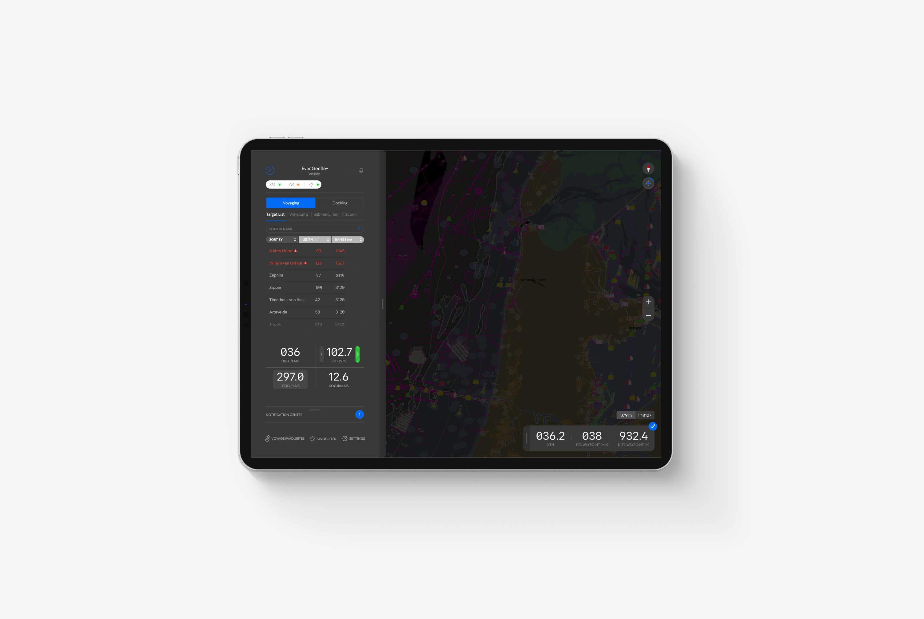
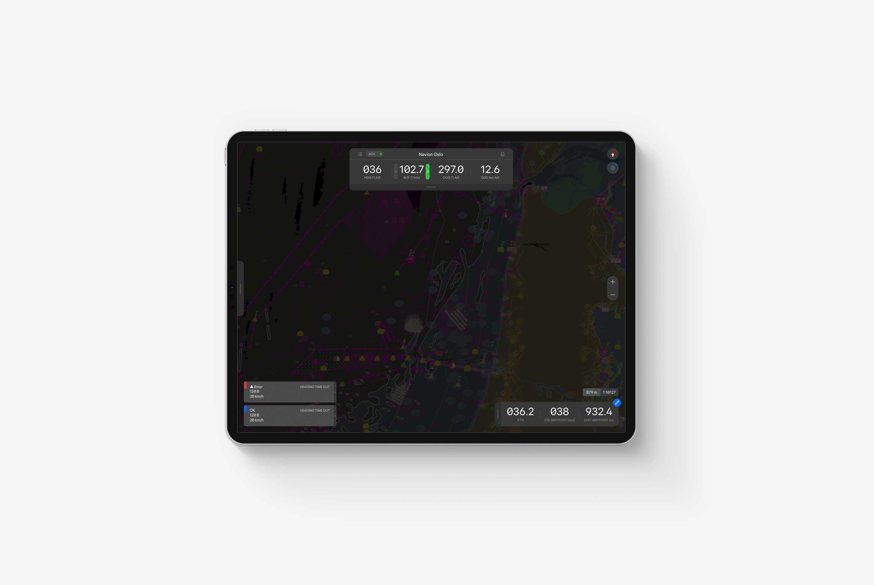
A pilot's job goes beyond 9 to 5. In fact, pilots often work in the pitch black of dark. Therefore, a night mode that was easier on the eyes was essential.
We redesigned the complete interface in a pleasant dark grey. The grey we chose still allowed different contrast schemes by using a darker or lighter grey for specific functionality and maintained the visibility of all navigational colors without contrast issues.
In Qastor, these navigational colors are crucial; for example, red and green mean something different than bad and good or stop and go when piloting a boat. Therefore, these colors needed to remain intact in the night and day modes.
Summary
It's safe to say that the Qastor app is never done. Even though it's live and available in the App Store and Google Play Store, Naam still joins monthly improvement sprints to update or create new features and functionality. It's such an essential tool for such a dangerous activity that all user requests are considered and taken seriously. I'm excited to see the app grow to its full potential.
As digital creative director and head of user experience design, it was my responsibility to ensure that not only the new QPS brand was visible in the design and new features were correctly implemented but that the design was also contemporary, accessible, and user-focused. More importantly, I needed to ensure that the design style and system were both scalable and deployable without losing the ability to have the QPS development team implement them correctly in such a demanding app. And plainly, I think we achieved our goal and then some.
Qastor truly needed this redesign, as the old version was on the verge of becoming redundant due to the outdated interface and lacking features. However, with the new user needs we implemented, the easy-to-use interface we composed, and the delightful user experience we designed, I'm happy to say that we've seen the tide turn (again, pun intended) in Qastor's favor. Last I checked, they are back on top as the go-to precision maritime application worldwide. Which is the biggest compliment we could get.
Information architecture
Prototyping
User journey mapping
Web design
User Journeys
Joris Spiertz
Joris Spiertz
Joris Spiertz