QPS. A SAAB Company
QPS is one of the world's largest Maritime Software Developers, with a suite of applications that offers one of the most complete geomatics software solutions in the industry.
With offices in the US, Canada, and the Netherlands, we helped QPS find a shared North Star.
Read more+
When we started working with QPS, they voiced the need for a singular brand vision that could stand the test of time and trends.
Additionally, with a recent significant integration of another maritime software developer, the new, now bigger QPS needed a common, shared vision across all teams. For six months, we hosted many branding and design workshops among employees and management.
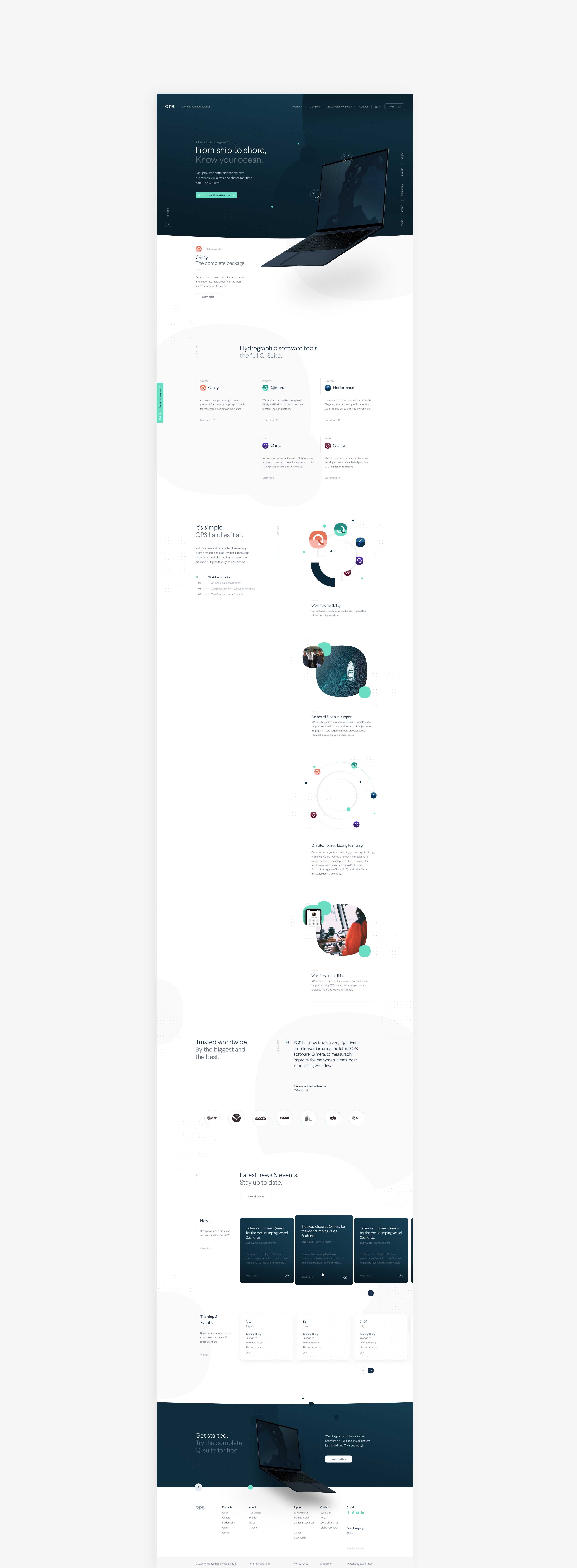
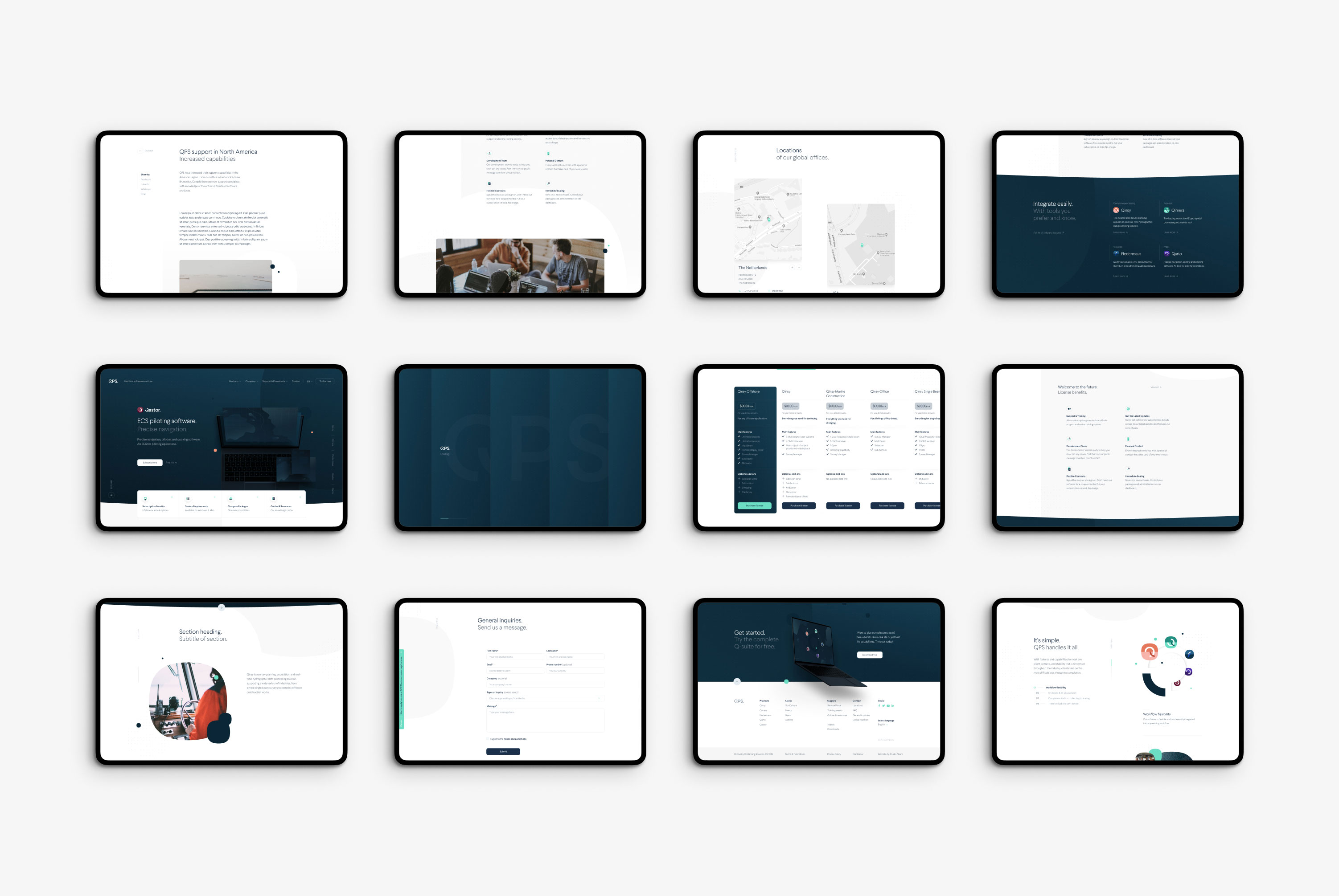
The results speak for themselves. With a uniform focus across all offices and teams, we were able to help create a new brand, build a design system called Q-System (in which we also included guidelines for the future design of QPS's products), unify the Q-Suite (including the new name), and as presented here, developed the complete marketing site that now also includes the support center.
Prototyping
Creative Direction
Branding
Challenges.
During the process we created a few main questions to help us structure our information, and keep the user & business needs in mind.


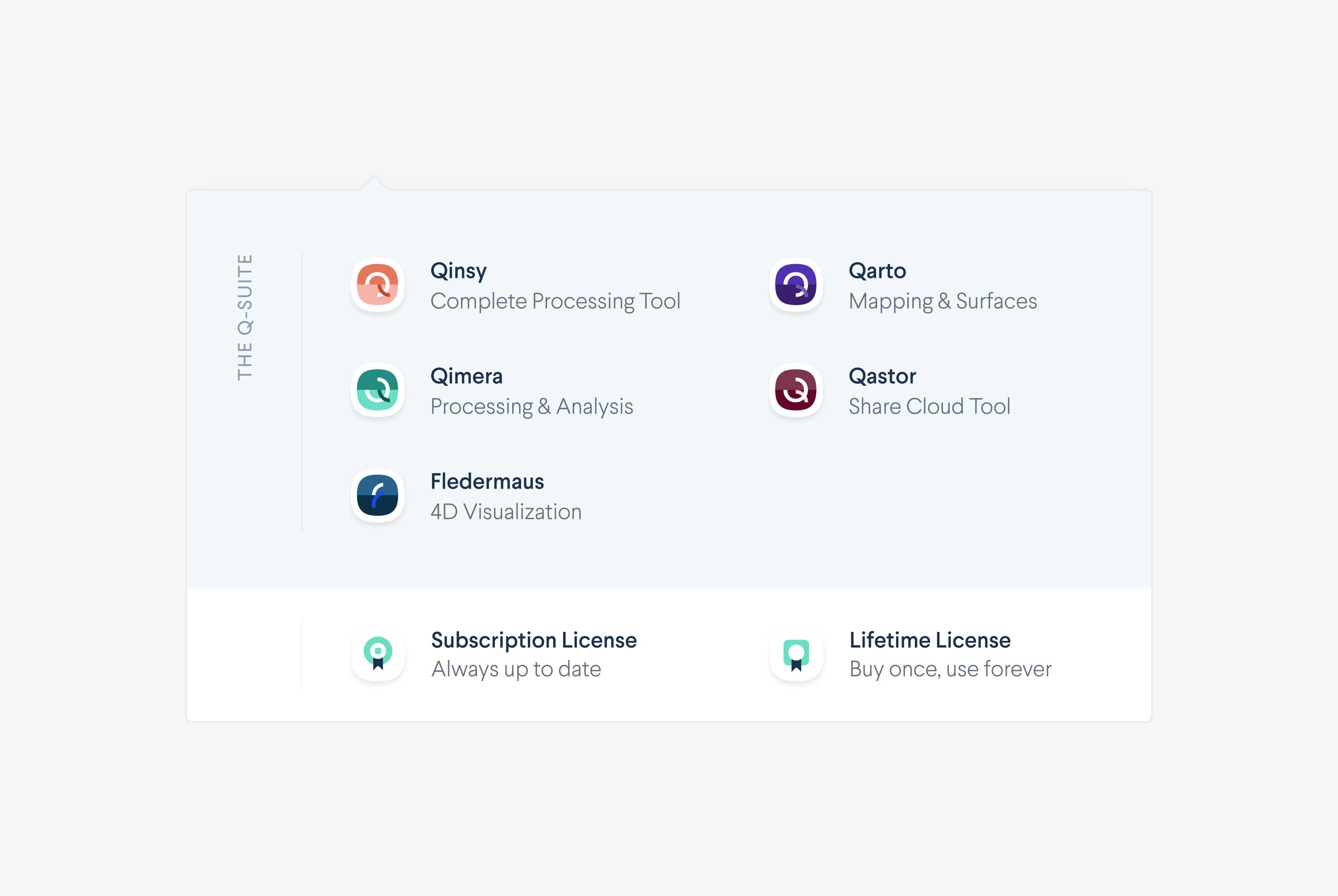
Introducing the Q-Suite
One of the main reasons QPS contacted Naam was to improve cohesion between the applications and to help find a shared 'North Star' to enhance decision-making across their intercontinental teams.
Through multiple strategic sessions, design thinking methods, workshops, and marketing meetings, it became clear that QPS didn't just offer a set of different products. It was a full suite that could do everything maritime companies need, from guiding and setting routes to visualizing the sea floor with complicated 3d texturing (the results of this we can often see on Discovery Channel).
In short, they offer a one-stop solution for maritime companies to get to know, understand and visualize any body of water. Our main focus during this project was to bring all their solutions back together into one cohesive suite, one language, and one brand that solidifies QPS’s position as leader. The Q-Suite was born.
Product Pages
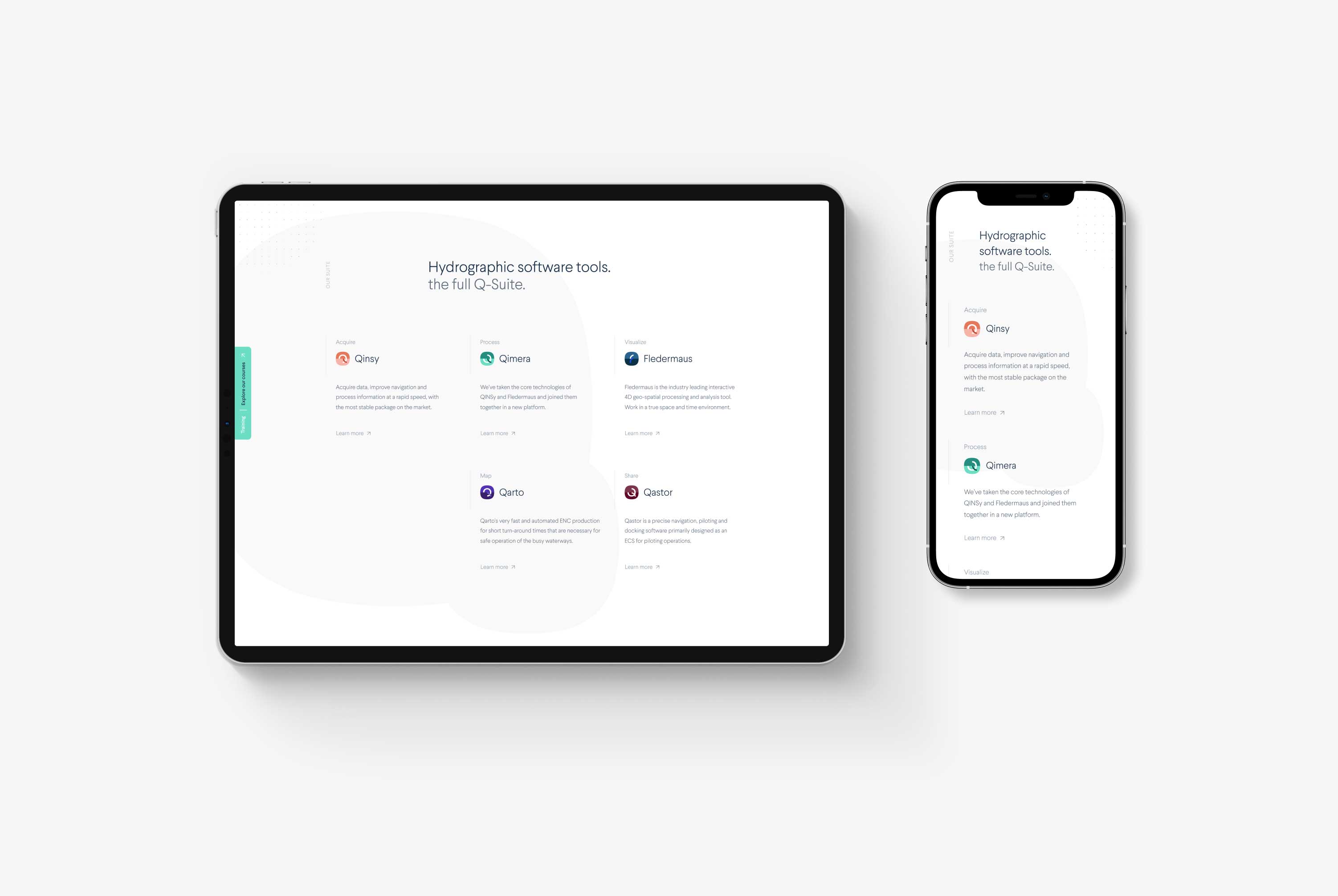
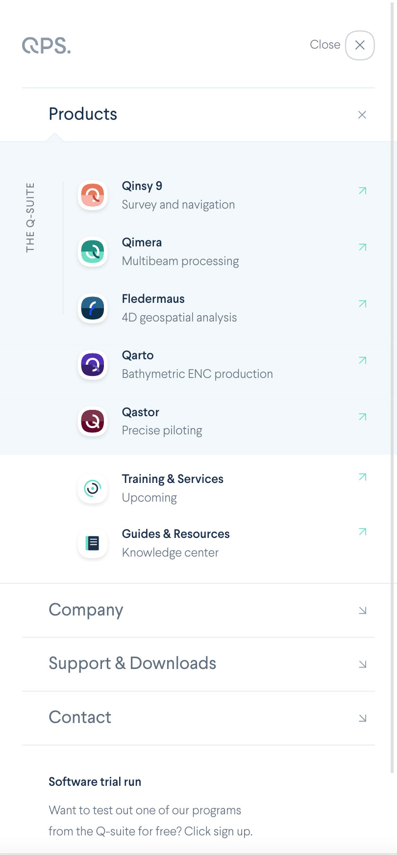
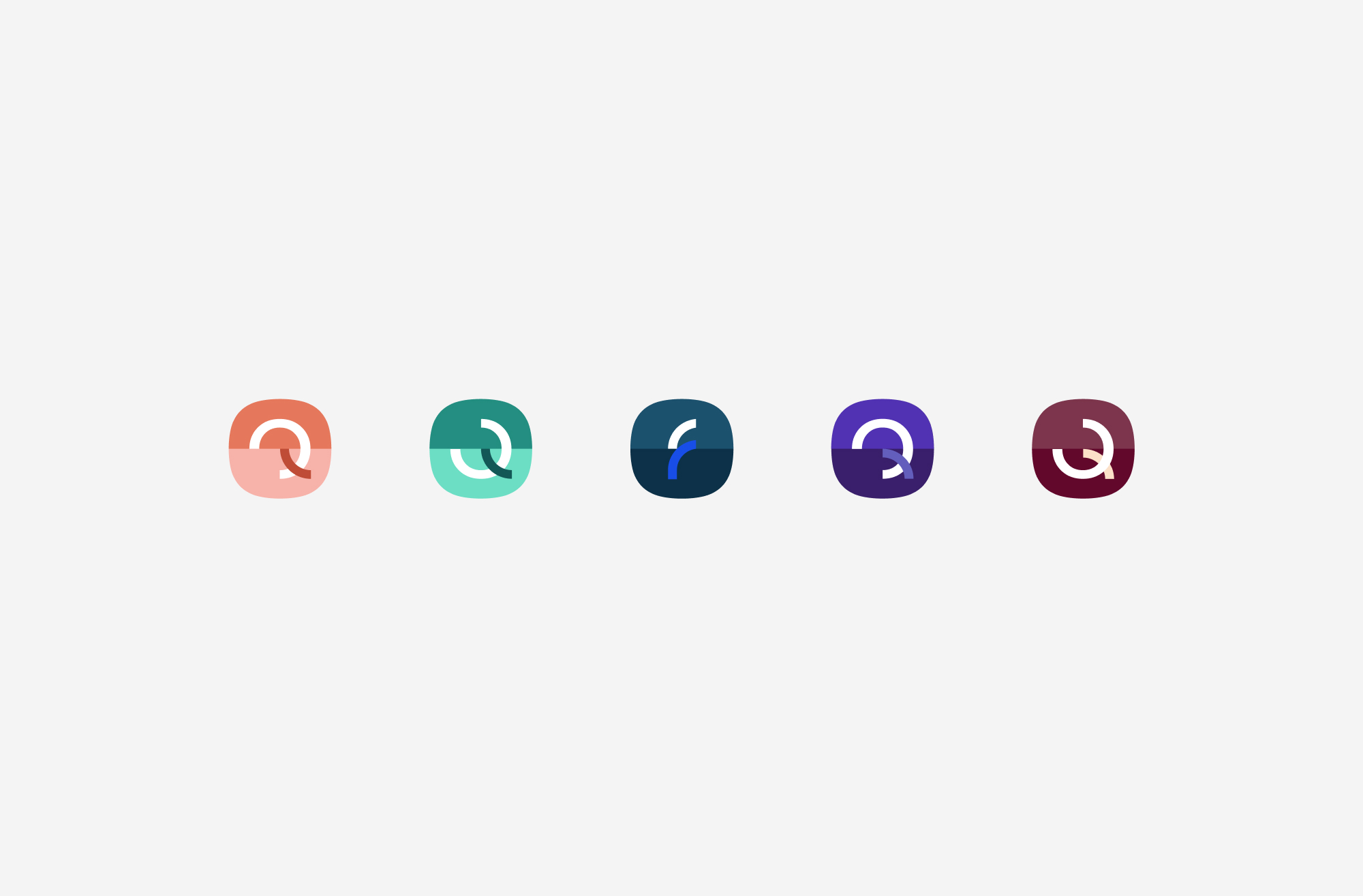
By introducing the Q-Suite name, we brought all applications together under one umbrella. However, on a UX and visual level, it will take time to update all respective product interfaces according to the new design system. So in the meantimeproduct icons were one of the first things we needed to redesign to make it feel like the products belonged to one suite.
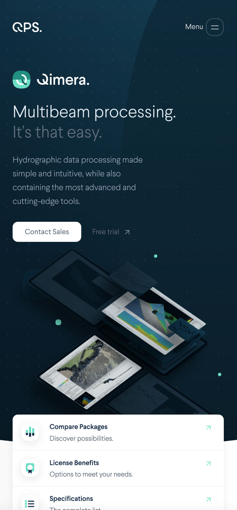
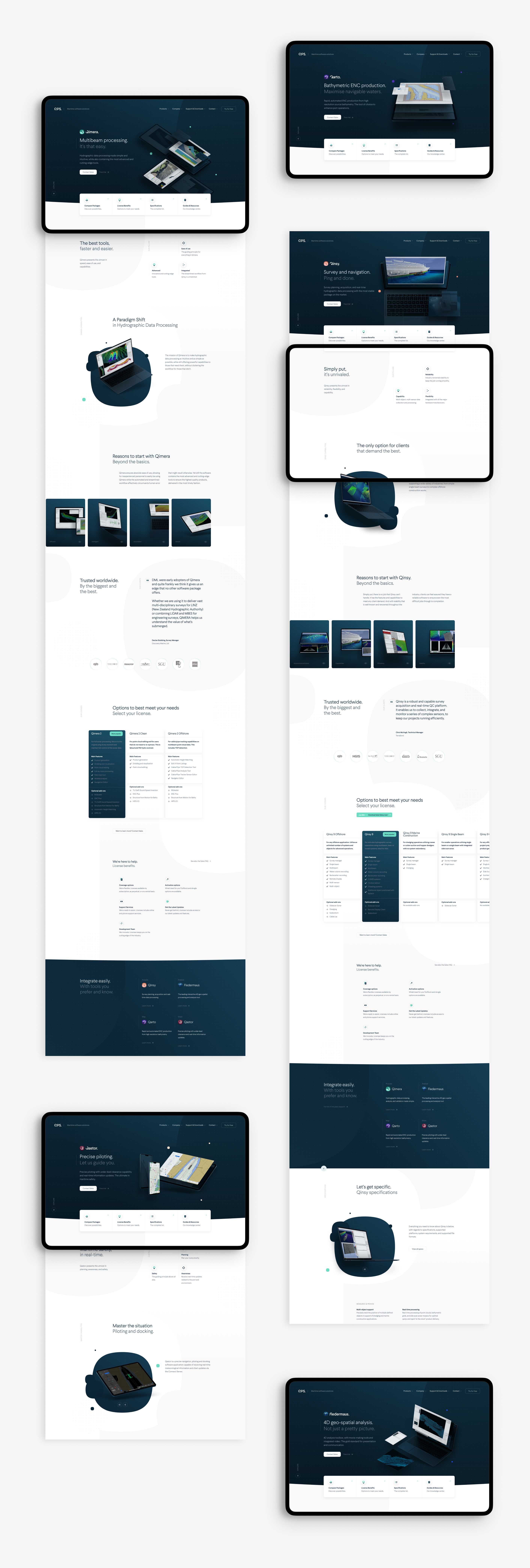
Additionally, we decided to build a library of QPS-styled devices that could present the various product interfaces similarly and make the different apps feel cohesive without having to redesign all the interfaces. As a result, the QPS-styled devices solved many marketing challenges and gave a coherent look to all the applications in the suite.
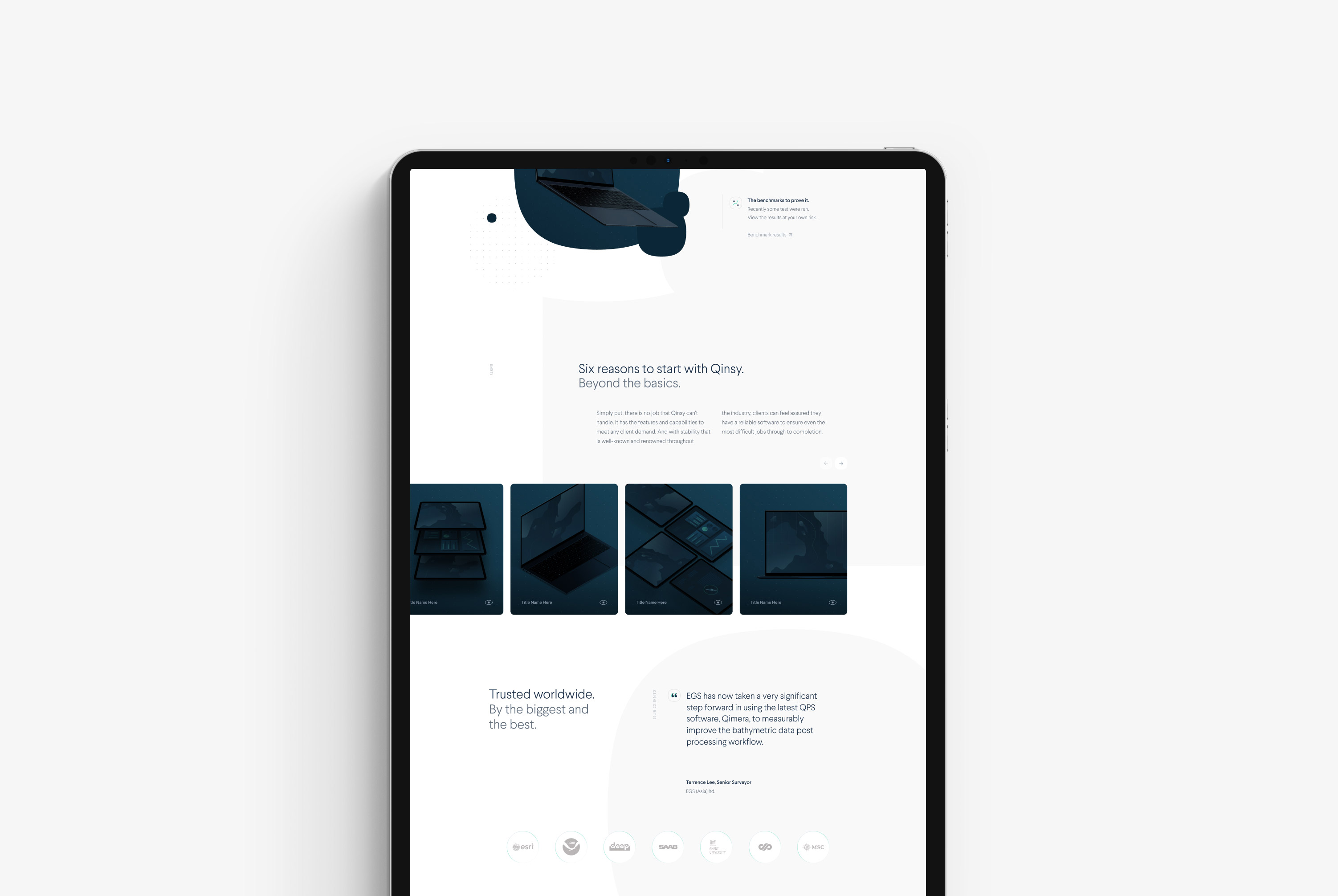
On QPS's previous website, none of its products were highlighted or presented. As a result, a lot of visitors were confused about QPS's services. So we made sure the new website gives every software package the room to present its features, main benefits, supported workshops, and news.
The Q-System
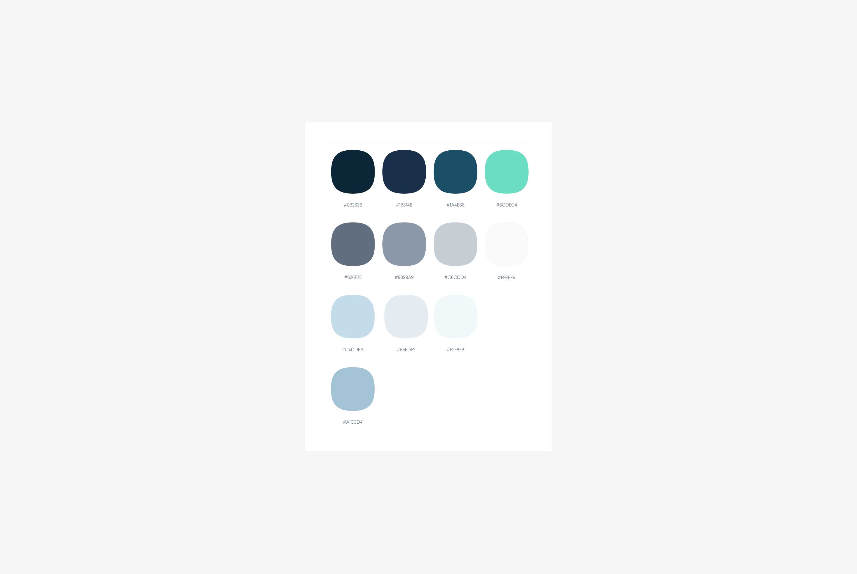
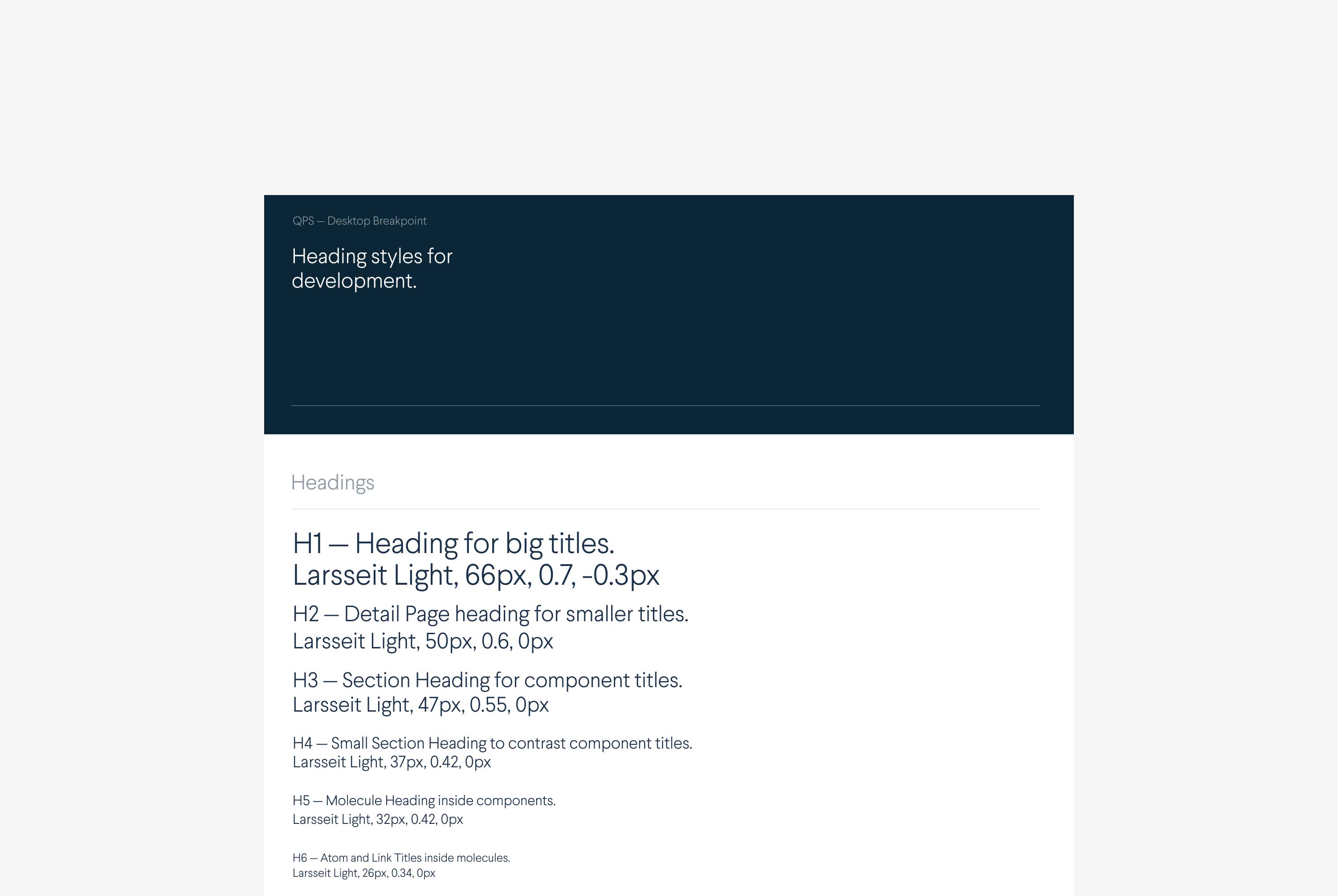
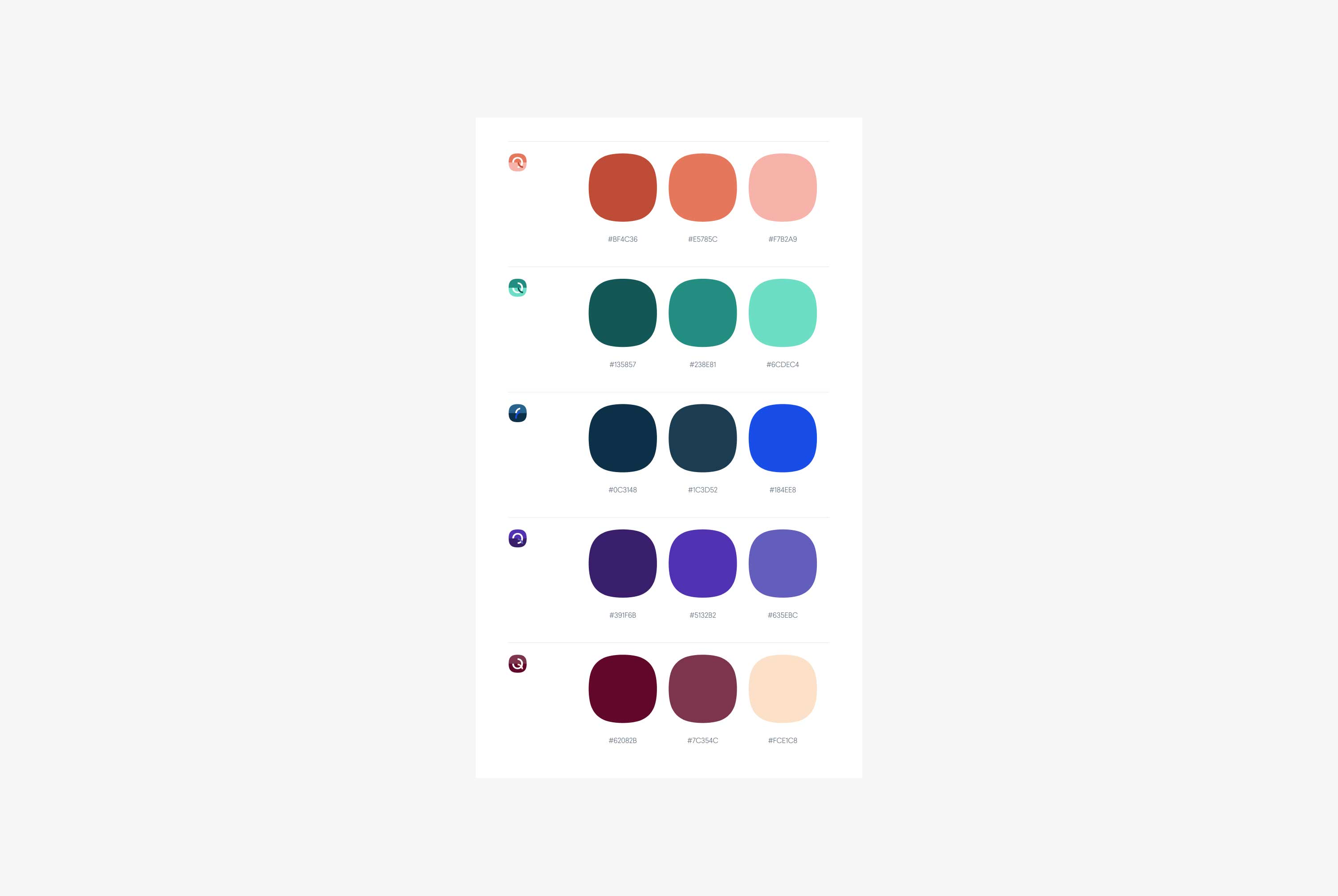
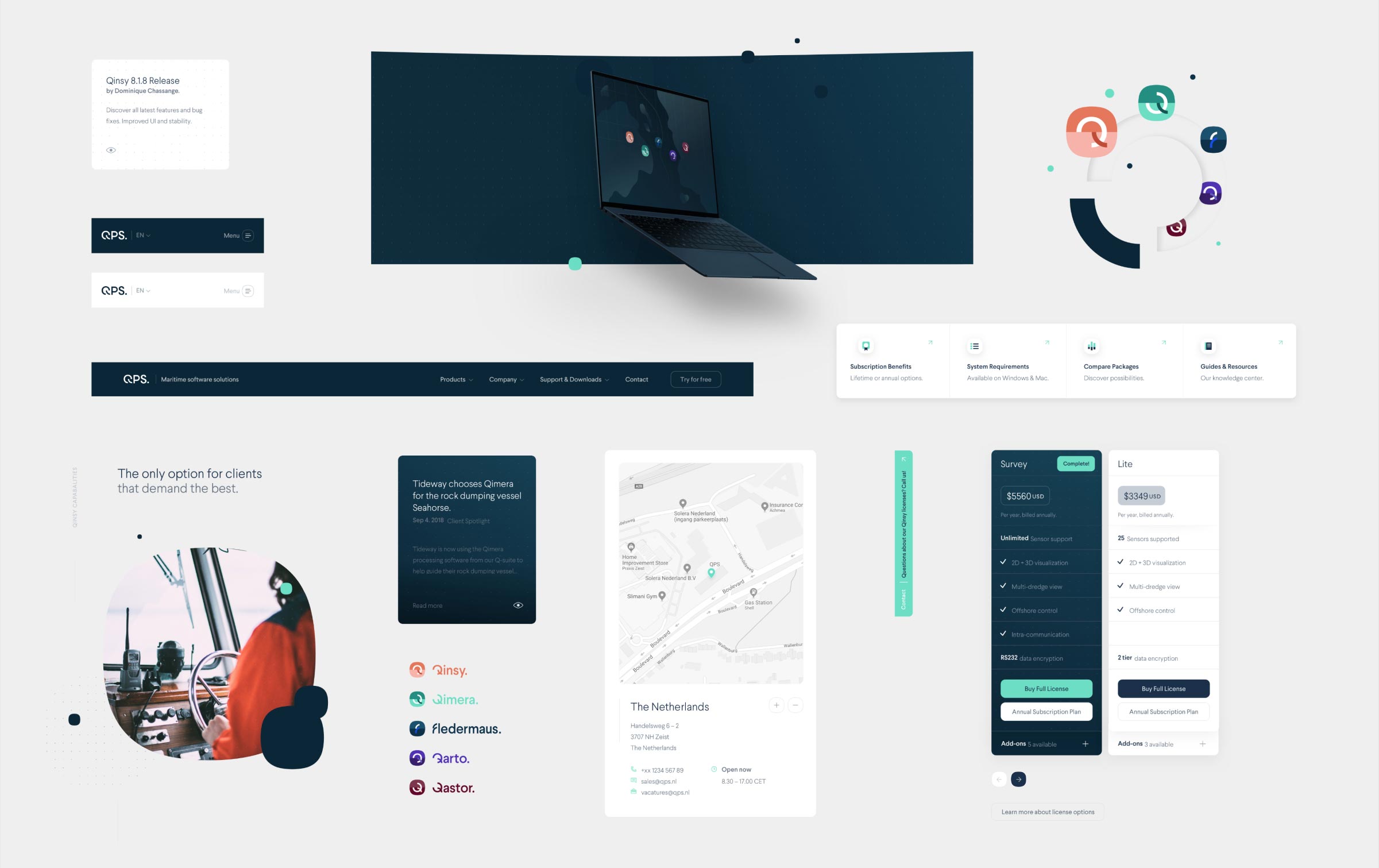
The Q-System is QPS's brand-new design system. It includes colors and typography, guidelines, the philosophy behind the design decisions, app interface elements, design patterns, and much more. The ultimate goal is to integrate the Q-System across the entire Q-Suite, and all QPS's marketing efforts and apps.
Even though the design system focuses on marketing and product design, which are inherently two different applications, they each have their respective guidelines within this one system. Marketing design elements generally have a more friendly aesthetic, with more lenient procedures for more accessible applications and room for experimentation. In contrast, the product design guidelines are more rigid, user-focused, and tailored for professional use in a maritime setting.
Since its launch, the Q-System has proven its dynamic qualities with the new website (marketing) and Qastor app (product) design. The latter's digital design grew the system significantly with new native components specifically for portable devices. For more information on Qastor, feel free to view the new case study.
The young and hungry
QPS's old website and brand needed to be updated to appeal to the 'younger' manager. This type of manager is just settling down onshore after being offshore (at sea) for over 10 years. They've used various software during their time at sea and will vocalize their preferences to their purchasing managers, and, more importantly, their opinions are well-valued and highly weighed.
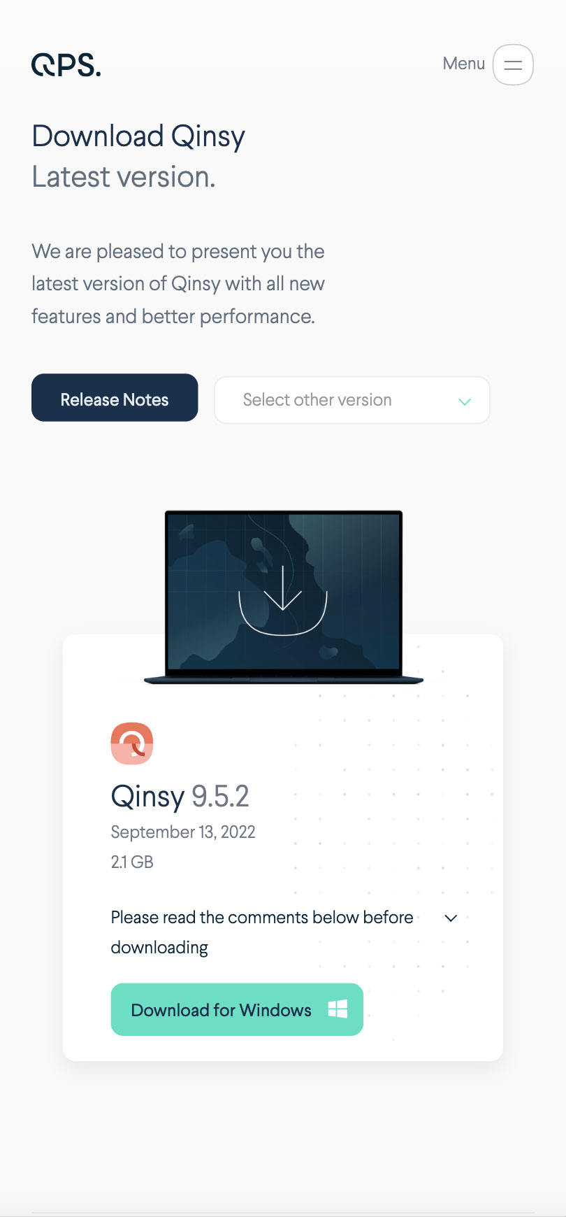
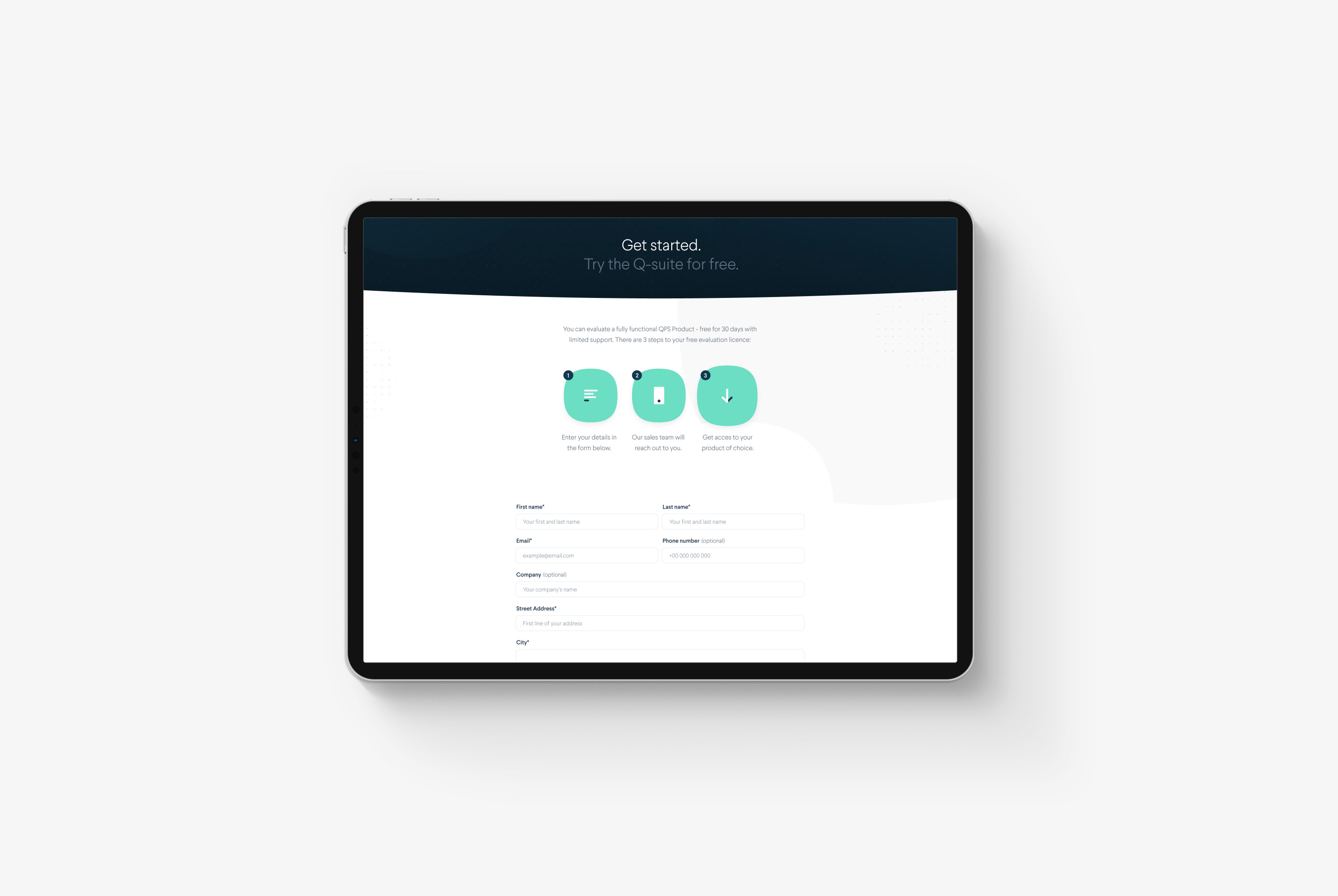
We decided to make some crucial changes to speak to this new, younger manager. First, we presented a trial download on the website, which is usually not an option in this industry. As a result, they allowed younger managers to explore the entire Q-Suite, where they usually had only previously worked with Qinsy or another brand software.
Secondly, QPS introduced a new pricing model based on subscriptions, giving the younger manager more tools to 'sell' or try QPS's software to their purchasing manager. Many of our design efforts focused on this target audience, and the first results are promising.
Thirdly, we redesigned the complete look and feel of the brand to fit this target audience.
All-in-one Support
One of the challenges that we discovered during the workshops was the support system. Support had been running on different platforms, and most of the training and specs documentation for the Q-Suite was hard to find or unavailable to non-users.
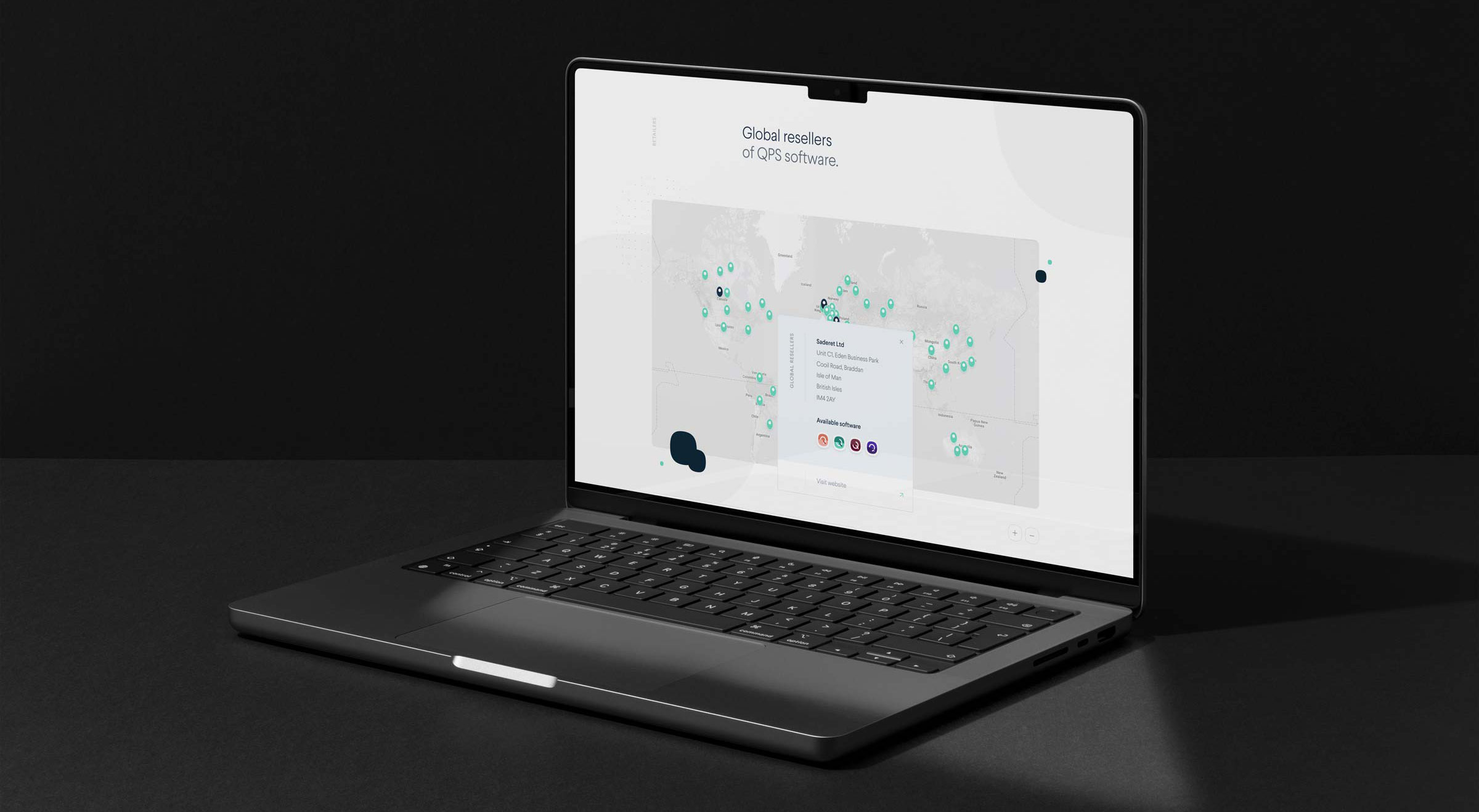
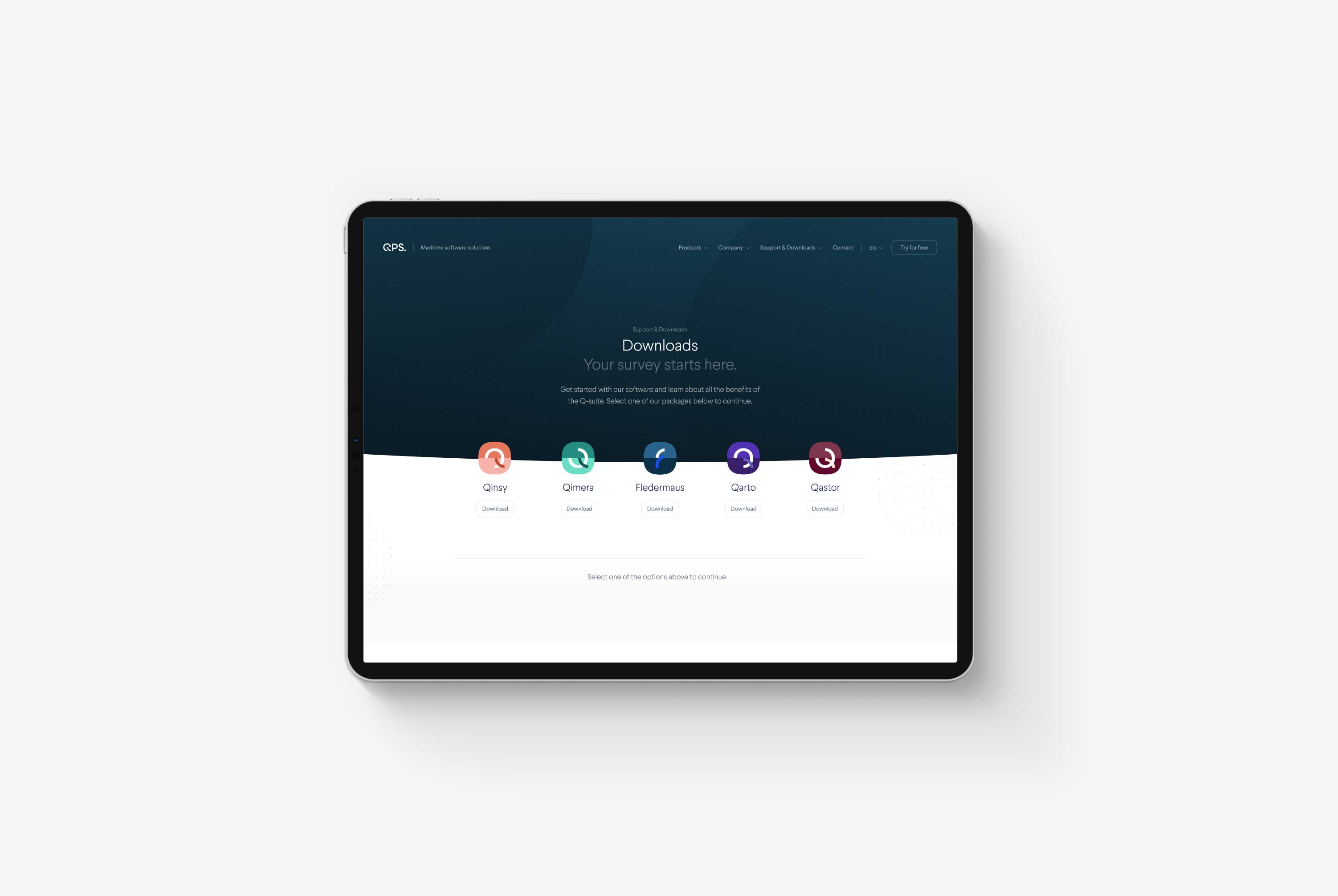
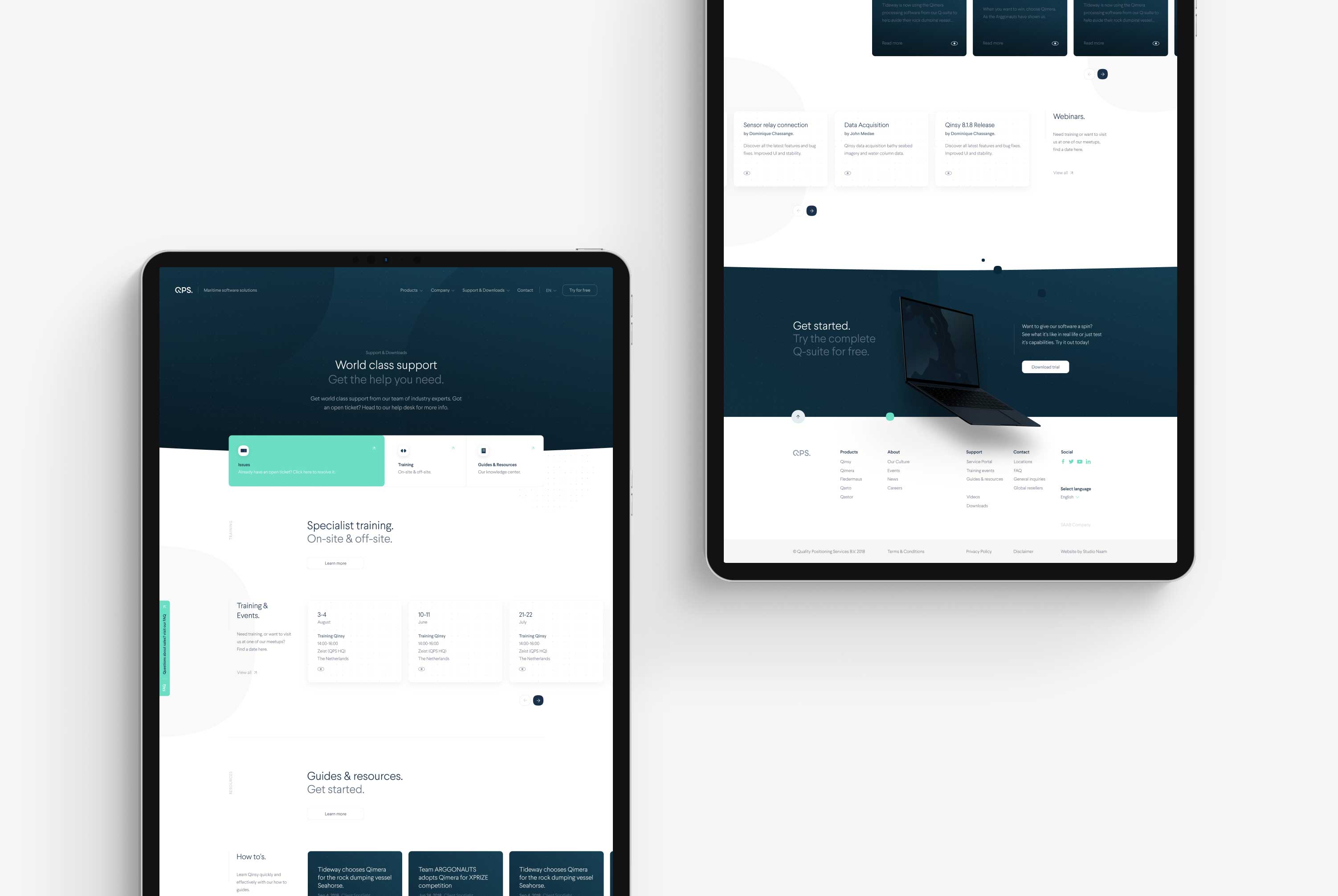
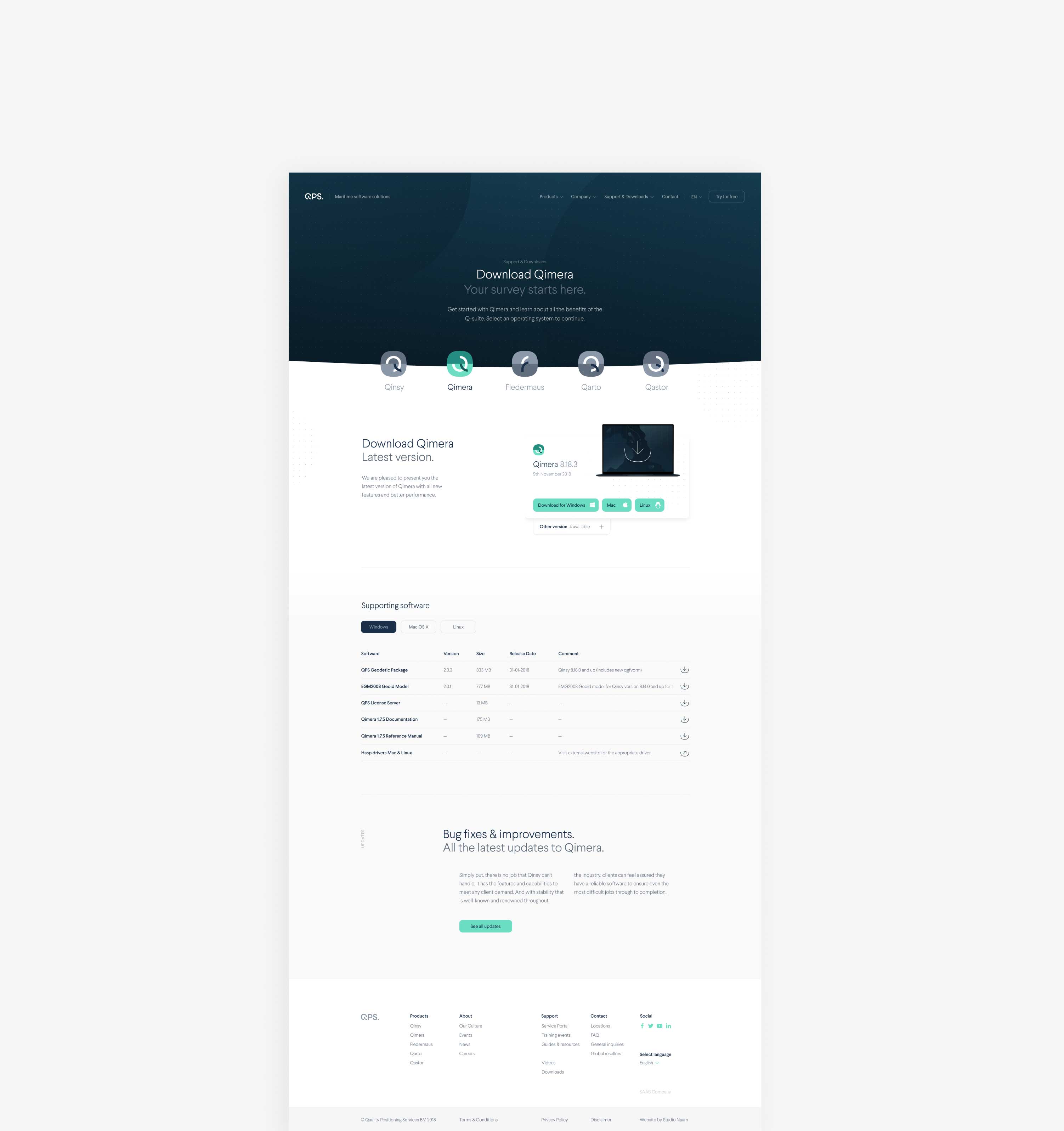
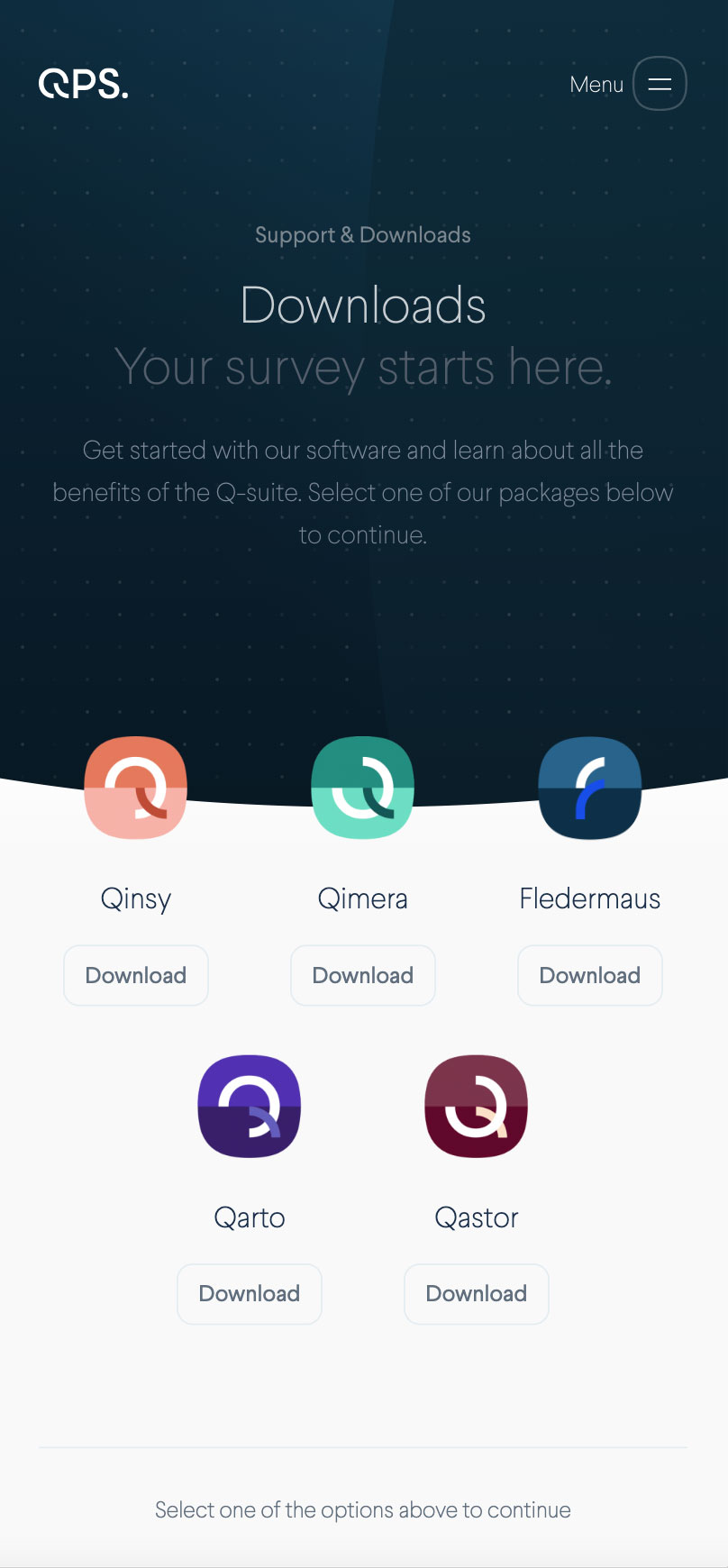
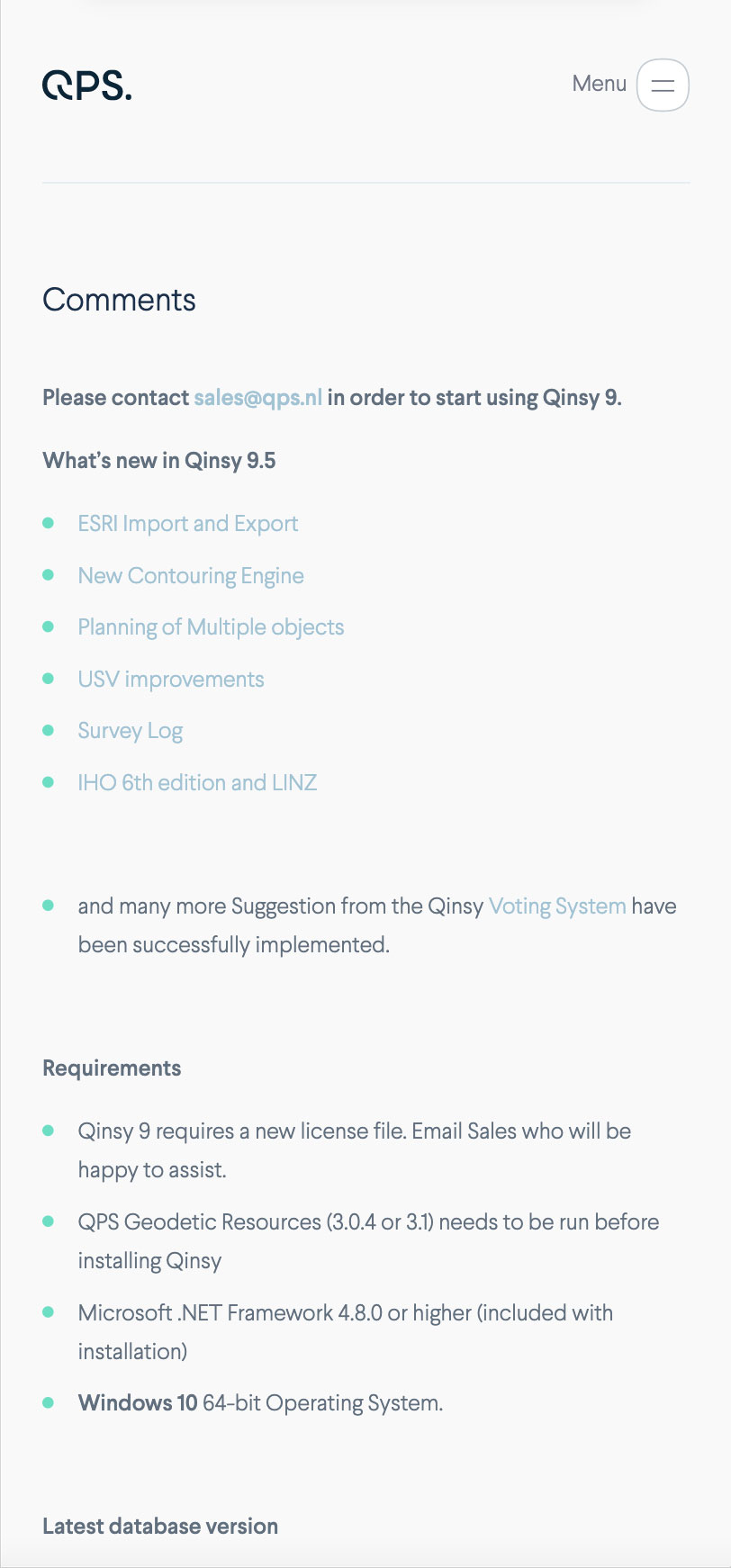
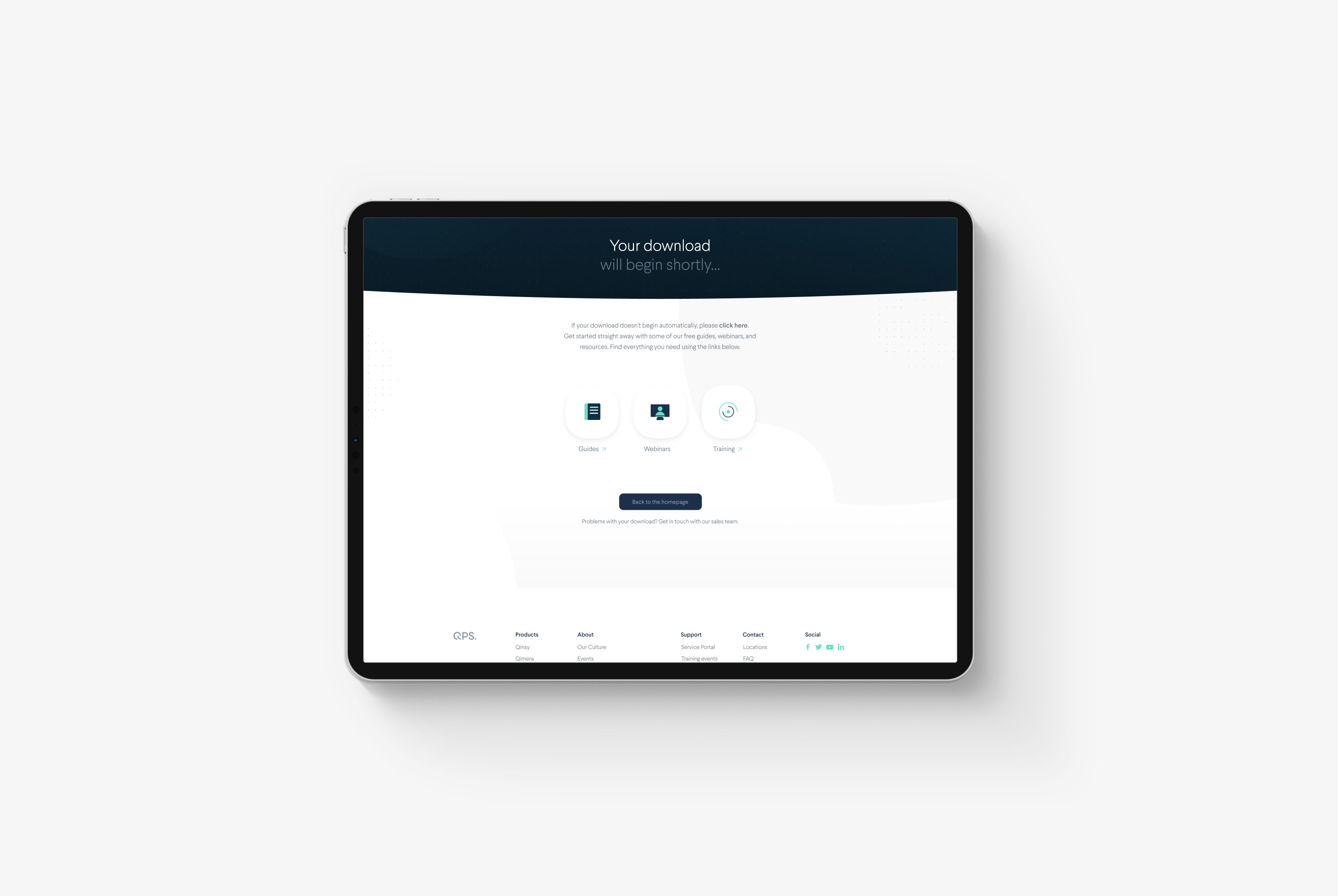
We decided to design a new Support collection where all service-related requests and documentation would be transparent, accessible, and come together. This new collection now offers a place for tutorials, training sessions, software patches, downloads (complete applications, trials, or patches and updates), and full documentation for the software.
Having all this content in one easy-to-find spot gives QPS's support team a directory that, whether or not you have a QPS login account, gives visitors the right content for them and helps the team to solve support issues more efficiently.






Cards
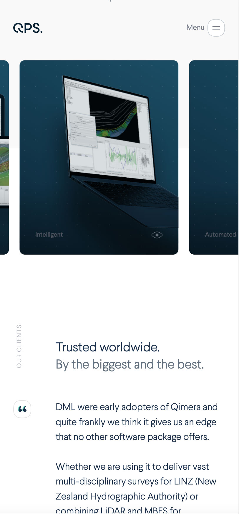
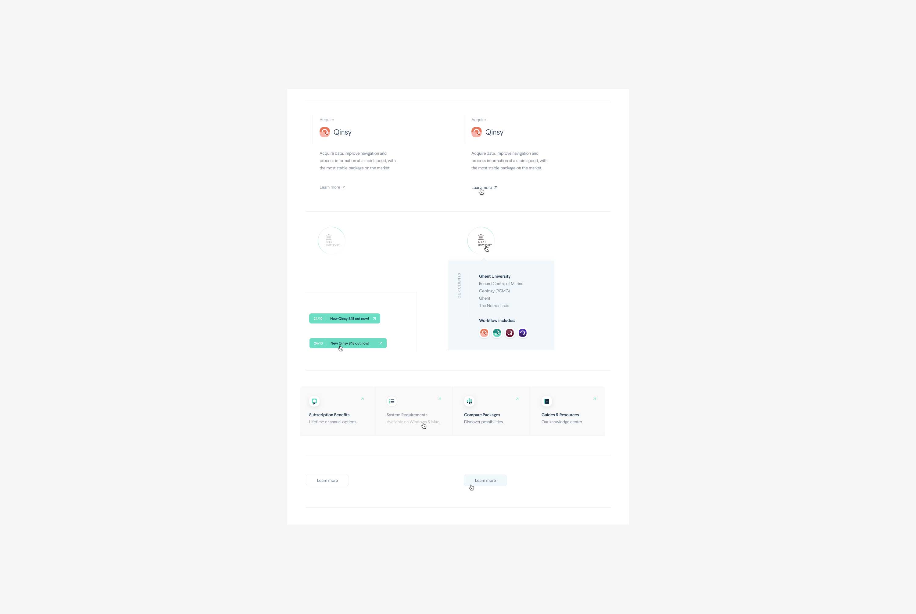
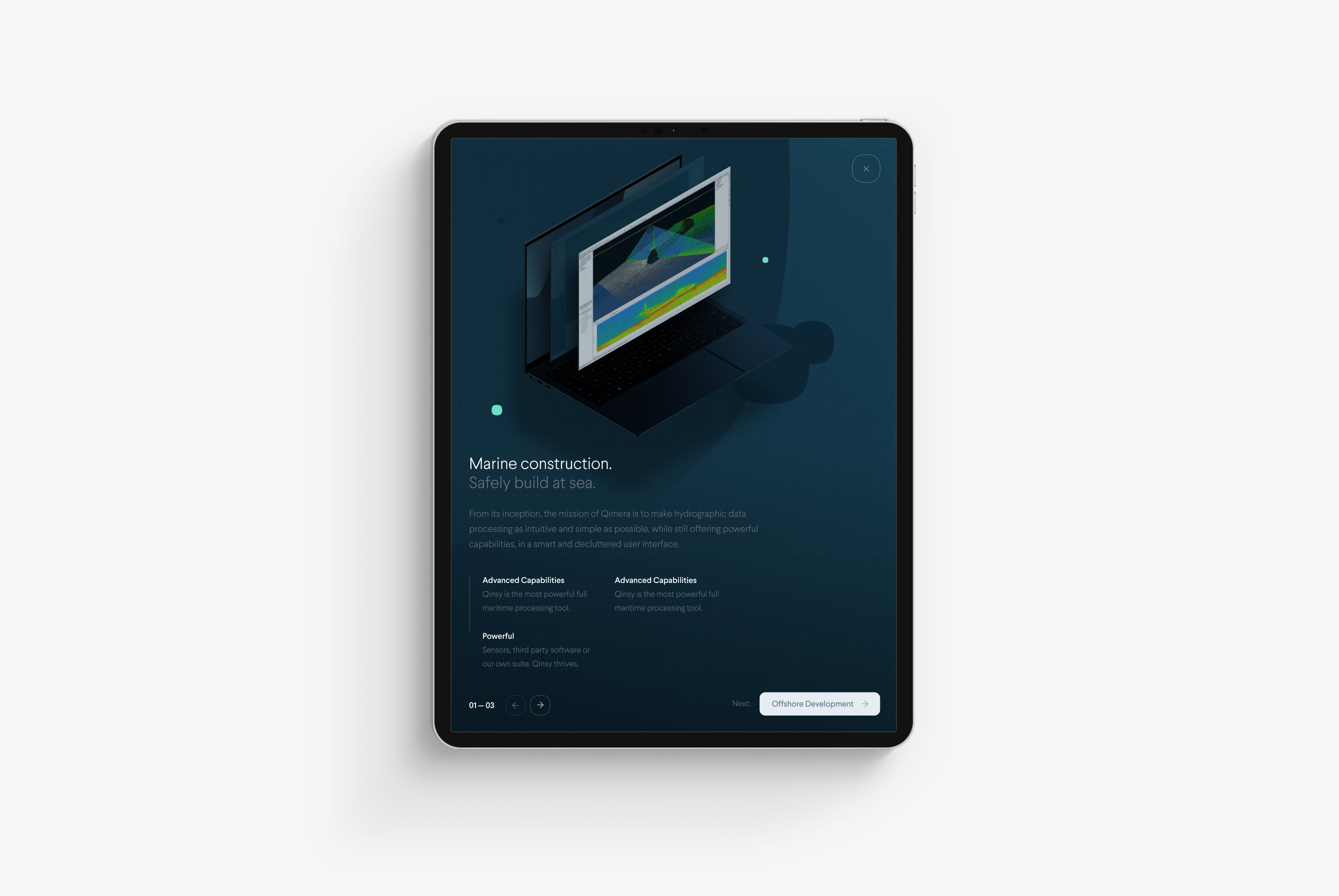
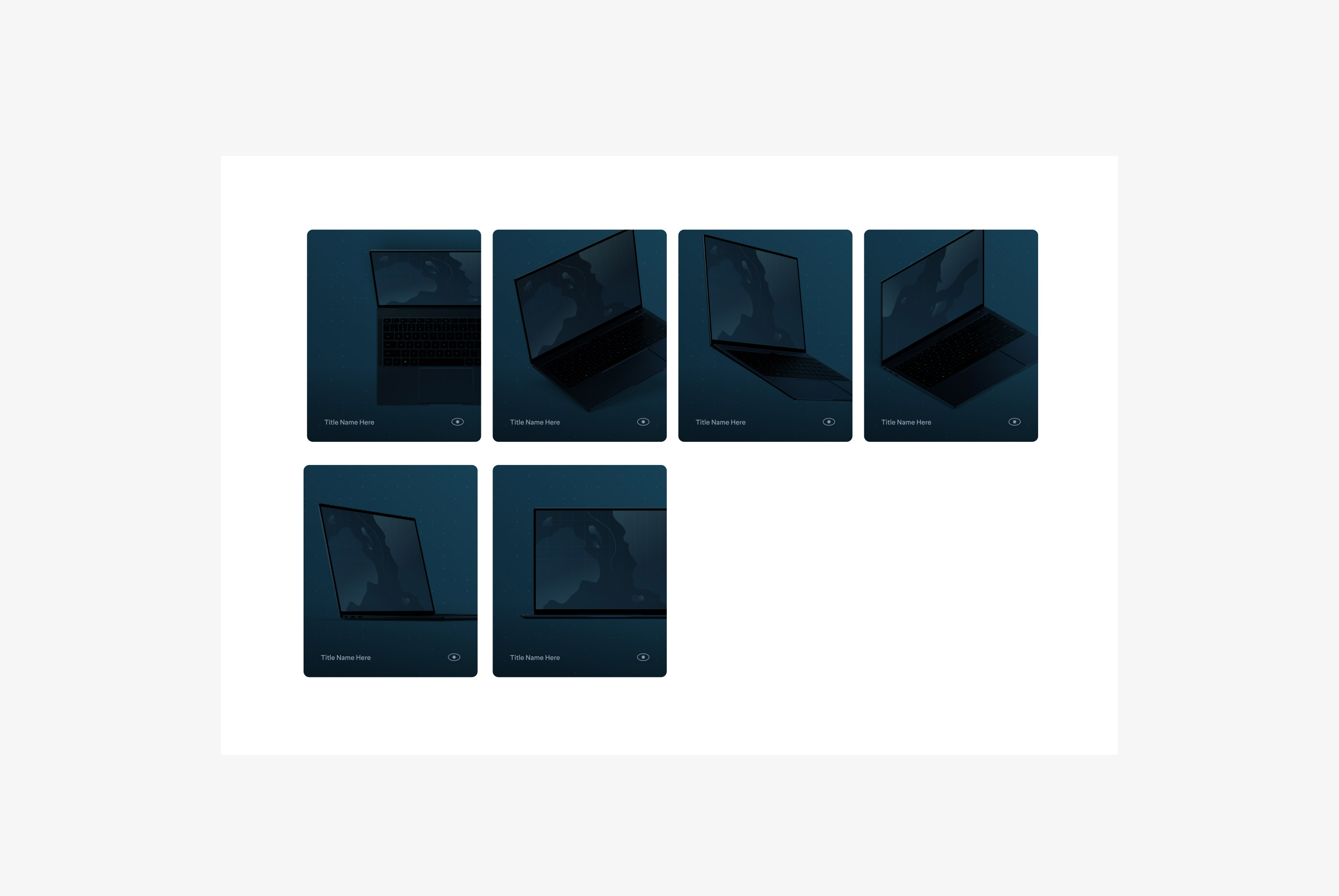
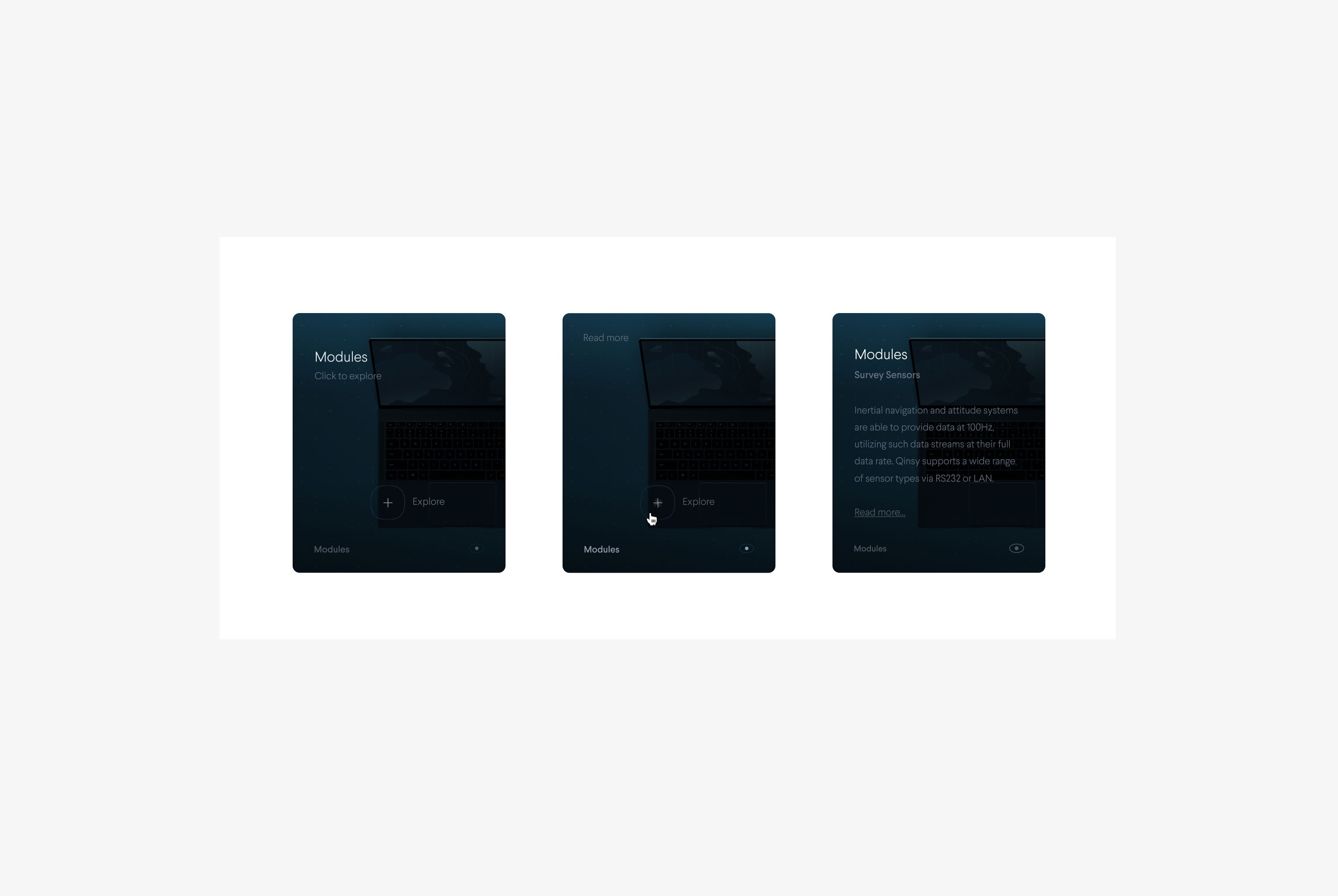
The card system we created for QPS is very versatile. It allows QPS to present information, news, updates, features, and more. Moreover, they come in various colors, depending on the card's function.
The dark blue device cards present screenshots from the various applications of the Q-Suite. When clicked, they open a pop-up containing in-depth information about the card's topic.
I've created multiple prototypes to help our developers structure and visualize the required micro-interaction animation for the cards. A video of the prototype is included in the section underneath.


The Device Library
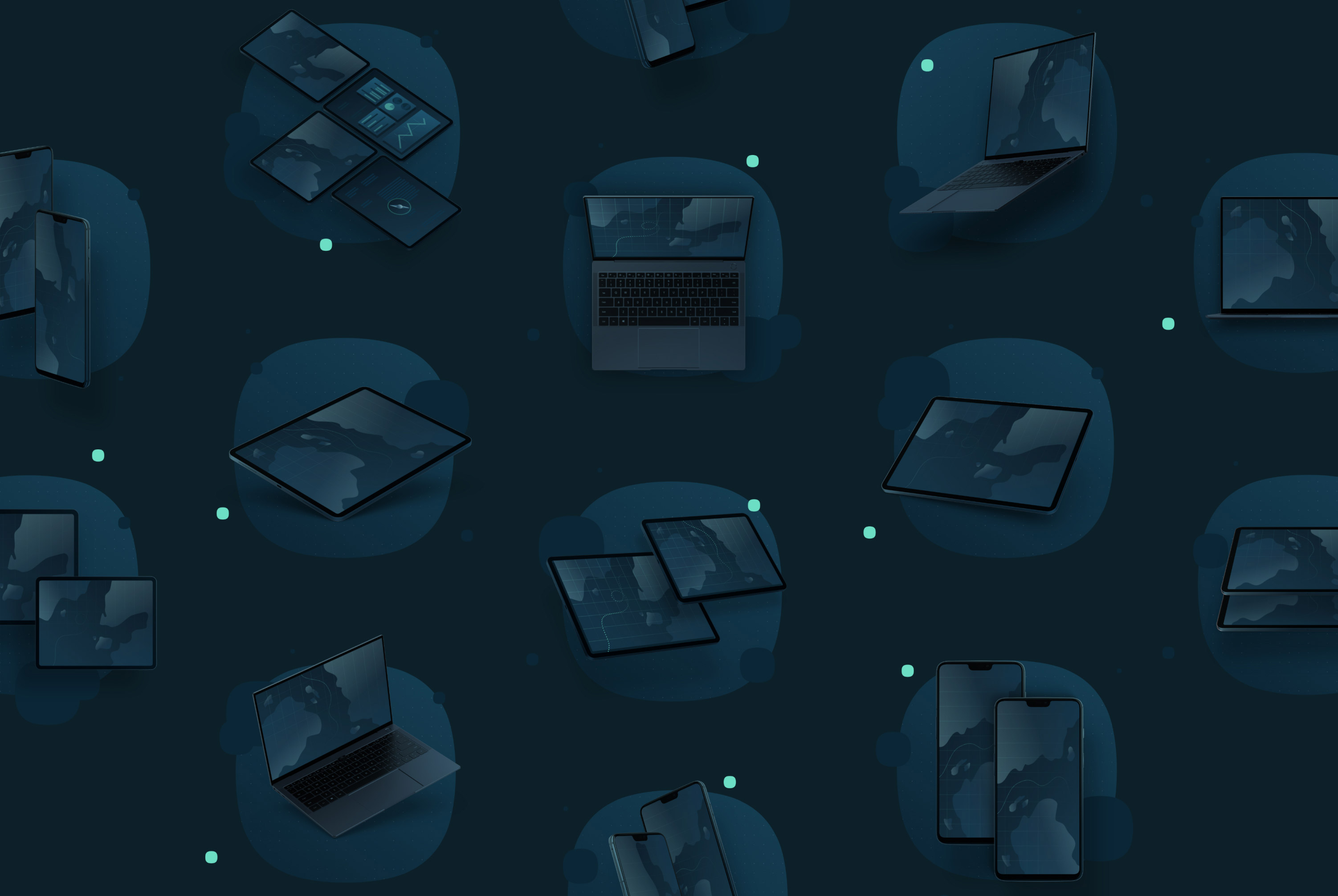
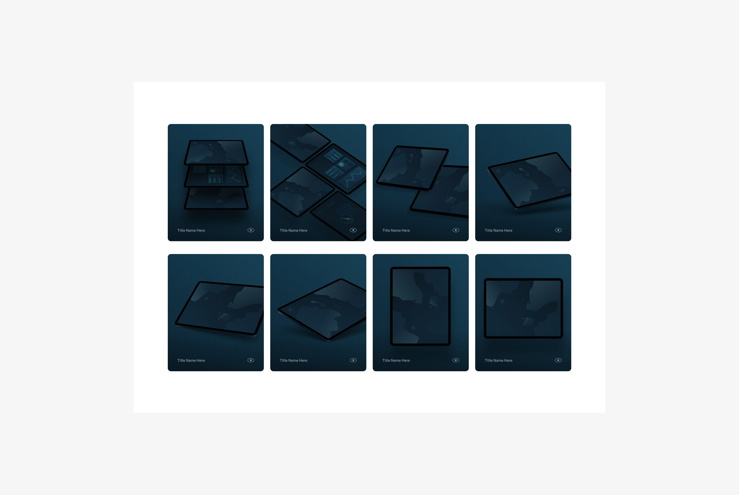
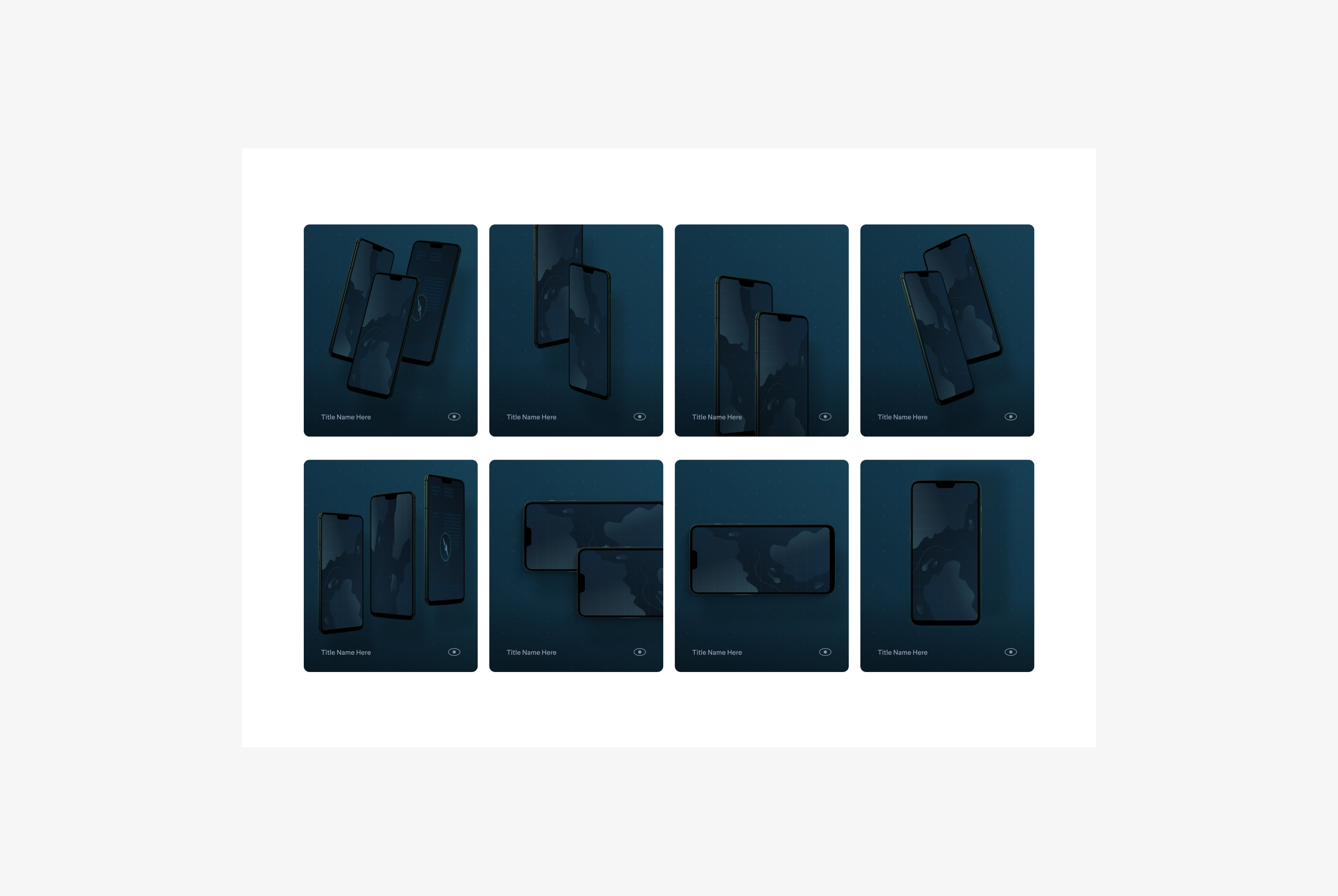
A big part of the Q-System is the collection of device assets. We designed them to visually bring together multiple screenshots from different Q-Suite applications in an art-directed mockup. As a result, the devices are an integral part of the card system and QPS's marketing efforts.
We've created over 60 different device mockups, with a careful selection of compositions containing a variety of laptop, tablet, and phone mockups.
Outcome
QPS, Naam, and I are delighted with the outcome and process. To quote Matt Wilson, head of marketing at QPS (US): "Our partnership with Naam has benefited our company tremendously. From their initial approach that was focused on effective brand positioning, to the ideal selection of visual elements, and finally, to the cutting edge technical implementations, we are thrilled with the collaboration, and we look forward to our continued partnership moving forward".
After delivering our services, QPS has strengthened its position in the market, and support tickets are reduced and resolved more quickly. Additionally, with the integration of Confluence and the downloadable trials, the requests amongst a younger audience that prefer to work with QPS have improved significantly. All-in-all, the singular focus across all intercontinental offices has resulted in a great project and result.
Today, Naam is still the leading design and strategy partner of QPS, and together, they have re-joined forces to work on the interface of Qastor, QPS's precision navigation software.
Prototyping
Creative Direction
Brand Strategy
Brand Identity
Design System
Naming
Joris Spiertz
Ellie MacLeod
Joris Spiertz
Joris Spiertz